CSS Grid
CdrGrid
Wrapper for working with CSS Grid
# Overview
CdrGrid is a simple wrapper for working with CSS Grid. Any valid CSS Grid properties can be applied to a CdrGrid or it's grid items, allowing for more flexible layouts to be built using less markup and CSS classes.
CdrGrid applies a default responsive gutter which can be customized using the gutter prop or overridden completely using CSS. The examples on this page are meant to illustrate some basic usage of CSS grid but are by no means exhaustive. Note that when constructing page layouts your entire page should be wrapped in a single cdr-container to ensure the proper outer margins are maintained.
New to or unfamiliar with CSS Grid? We recommend these resources for getting up to speed with CSS Grid:
- CSS Tricks guide (opens new window) for a handy glossary of examples for each CSS Grid related property.
- Wes Bos CSS Grid Course (opens new window) has videos and interactive grid examples you can work through.
- MDN CSS Grid Layout (opens new window) has many articles going in depth on CSS Grid features.
# Column Layout
Use rows and columns to lay out content by specifying equal widths for all columns. Columns have a minimum width, if columns cannot be spaced equally etc. new line
# Justify
Define x-axis alignment and distribute space for all columns per row. Containers may have set widths or may be flexible with max widths defined. This applies to all columns with left as the default value.
# Left
# Center
# Right
# Around
# Between
# Align
Define y-axis alignment per row and distribute space across all columns per row. This applies to all columns with stretch as the default value.
# Top
# Bottom
# Middle
# Stretch
# Varied Alignment
# Gutter
Defines gutter size for all columns on a row and maintains gutter size by breakpoint. This applies to all columns. When this value is not set, default sizes are used.
# Default
The default gutter value is medium@xs medium@sm large@md large@lg.
# Small
# None
# Custom Responsive Gutters
# Scrolling Grid
Scrollable grids can be created using the grid-auto-flow property set to column for horizontal scrolling or row for vertical scrolling.
# List Markup
For accessibility reasons it may make sense to construct your grid using list markup.
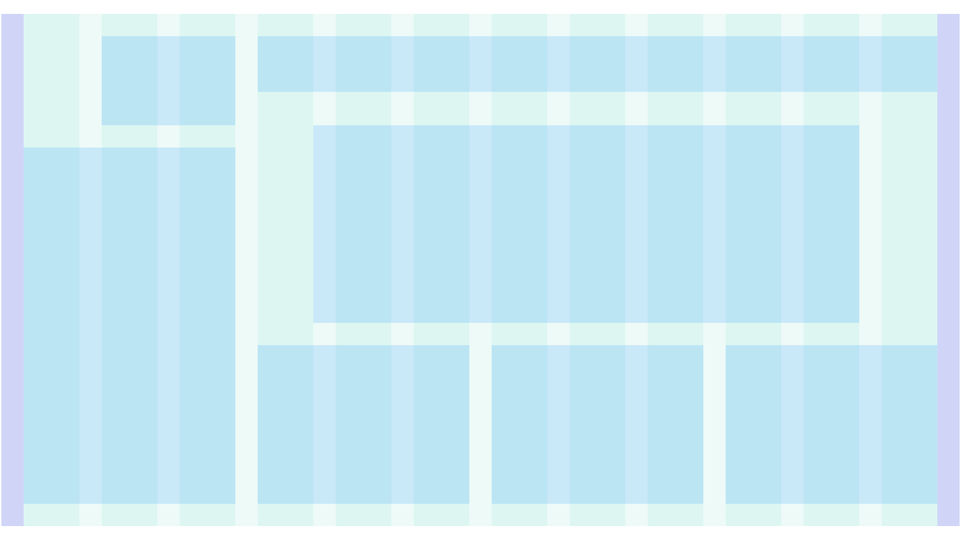
# Span
Column width can be controlled using the grid-template-columns property.
# Complex Span
Individual items can override their sizing with grid-column and grid-row;
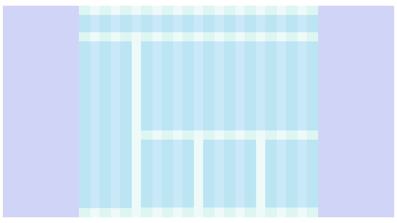
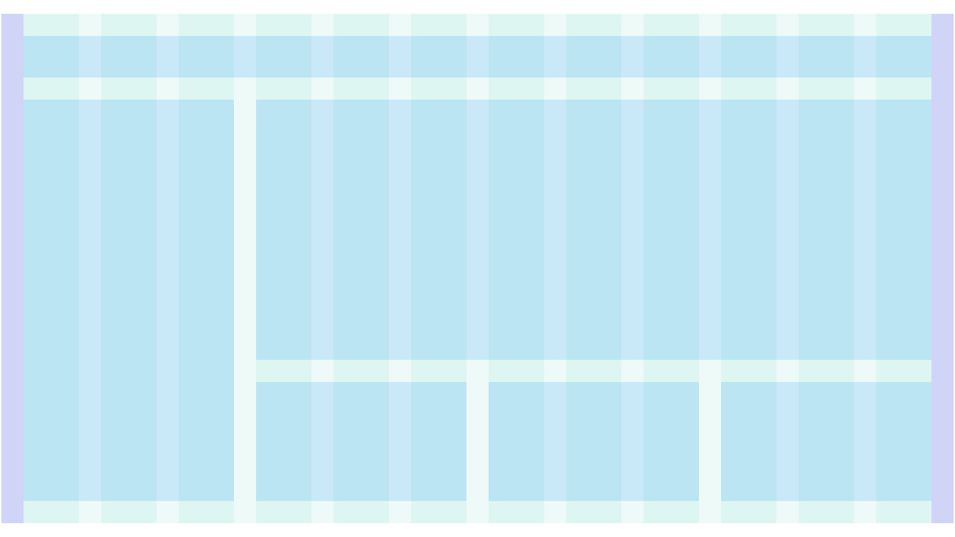
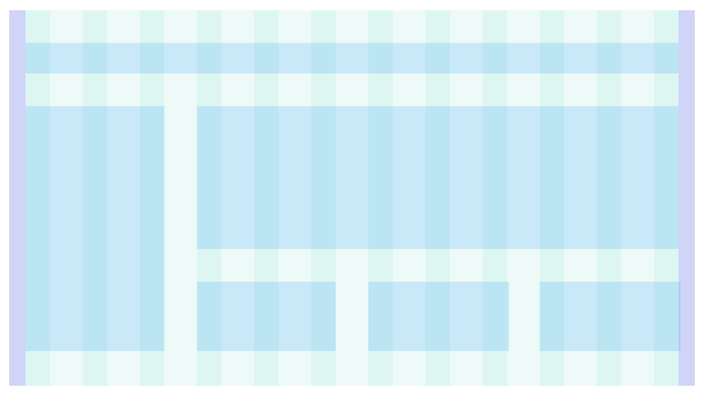
# Offset
Offsets can be created on grid items using the grid-column-start property.
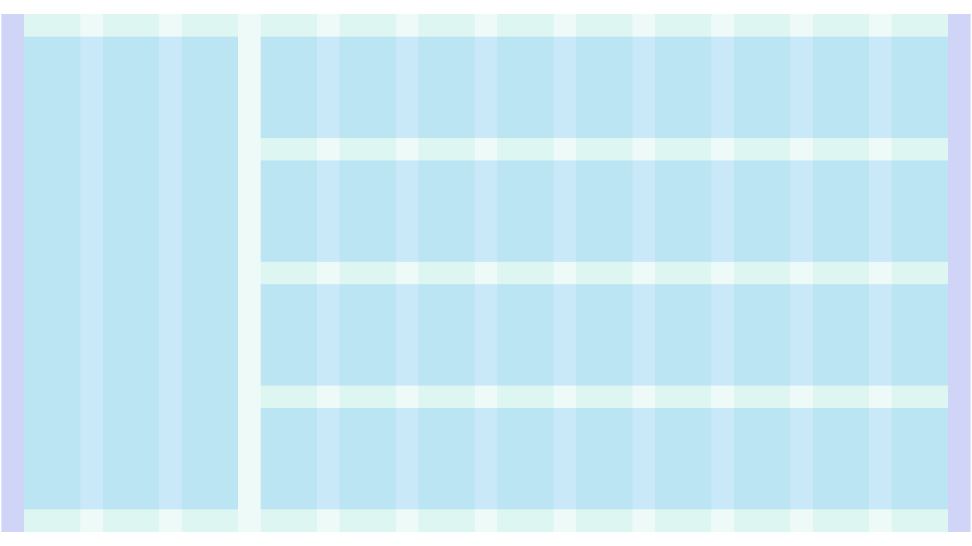
# Nested Grids
Grids can be nested to any depth by passing another CdrGrid in as a grid item.
# Responsive Grids
CSS grid layouts using fr units will be inherently responsive, however additional breakpoint-specific behaviors can be created using media queries.
.responsive-grid-example {
  grid-template-columns: '1fr 1fr 1fr';
  @include cdr-md-mq-down {
    grid-template-columns: '1fr';
  }
}
2
3
4
5
6
# Handling Leftover Columns
For grid layouts with an unknown number of items you may end up with an incomplete row at the end. These "leftover" or "orphan" columns can be styled using a combination of the last-child/nth-last-child and nth-child selectors depending on how many items are in your grid row.
/* Target leftover grid columns */

.orphan-grid-example-2x2 div:last-child:nth-child(2n + 1) {
  grid-column: 1 / span 2;
}
2
3
4
5
For grid layouts with an odd number of columns per row, make the grid-template and grid-items each twice as large so they can be offset as needed to center them.
/* Make grid columns take up twice as much space */
.orphan-grid-example-3x3 div { grid-column: span 2;}

/* If 2 columns are leftover, center them by moving the second to last element to the right by 1 */
.orphan-grid-example-3x3 div:nth-last-child(2):nth-child(3n + 1) {
  grid-column: 2 / span 2;
}

/* If 1 column is leftover, center it by moving it to the right by 2 */
.orphan-grid-example-3x3 div:last-child:nth-child(3n + 1) {
  grid-column: 3 / span 2;
}
2
3
4
5
6
7
8
9
10
11
12
13
# Named Grid Areas
Use grid-template-areas to layout grid items named using the grid-area property.
# Accessibility
To ensure that usage of this component complies with accessibility guidelines:
- Low-vision users should be able to increase the size of the text by up to 200 percent without breaking the layout
- Ensure the tab order for grid content makes sense. Avoid re-ordering the placement of items to differ from their order in the markup.
- Use list markup for content layout. List markup allow contents to be structured which makes it easier for assistive technologies
# Guidelines
# Use When
- Arranging content and components into rows and columns
- Laying out a page of 2+ rows of body content (apart from site navigation), some of which may or may not have columns
- Applying responsive rules to columns of a row and/or regions of a page layout, or a container of many components
- Arranging elements within a single component with two or more zones, including those aligned to the left or right edge
# Don't Use When
- Presenting a multi-row columnar data display, such as features or specs of a product. Instead, use Table
# The Basics
Columns, gutters, and margins scales as a fluid system as the device and viewport increases from a small devices to a large device:
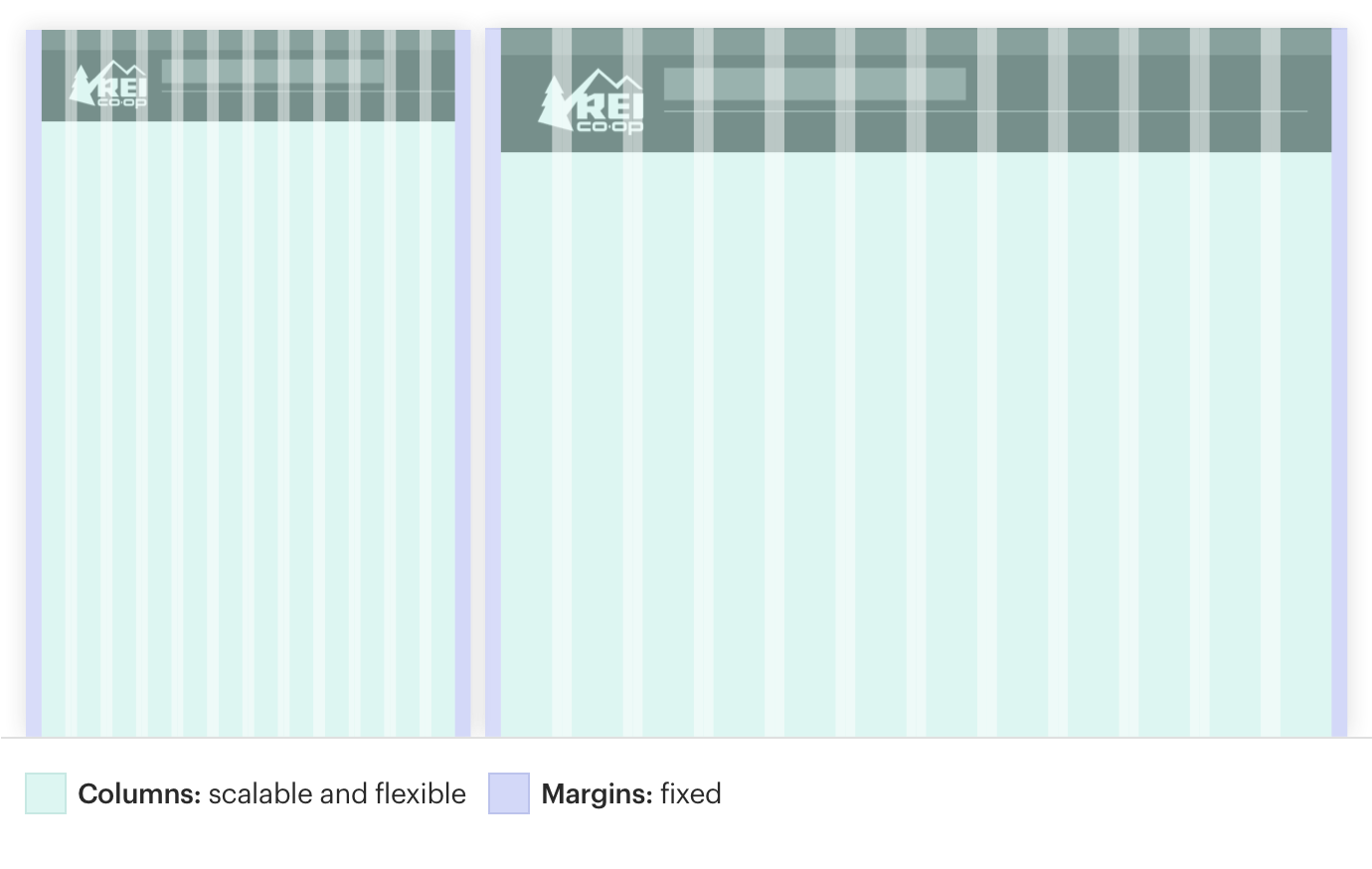
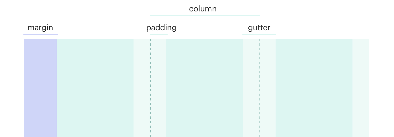
# Anatomy
| XS (Extra Small) | < 768px | 16px | 16px |
| SM (Small) | ≥ 768px | 16px | 16px |
| MD (Medium) | ≥ 992px | 32px | 32px |
| LG (Large) | ≥ 1232px | 32px | 32px |
# Content
- Prioritize your content by organizing content to highlight the most important information
- Use white space created by grid system because too much dense information can be disorienting and overwhelming
# Behavior
- Avoid breaking alignment or slightly oversizing a container to stick out for visual interest or to add emphasis
- Create relationships and hierarchy between content elements by using the margins and gutters in the grid shared by the page layout
# Do/Don't

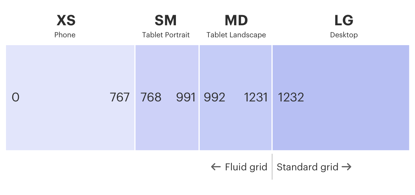
# Responsiveness
To build an effective responsive grid:
- Design mobile first:
- Use the XS (≤ 768px) viewport width applicable to small devices like a phone
- Start with a one column layout and add columns as needed
- Apply responsive media queries to the grid and its contained content at relevant breakpoints including SM (≥ 768px) and MD (≥ 998px)
- Complete and optimize the layout for the widest LG (≥ 1232px) viewport width
- Inspect responsive displays in between each breakpoint for how content responds across the fluid spectrum
# API
View it on Github: https://github.com/rei/rei-cedar-vue-2/tree/next/src/components/grid# Props
gutter
name
string
type
N/A
default
Defines gutter size. Default gutter size is 16px for @xs and @sm (medium) and 32px for @md and @lg (large). Possible values: { ‘none’ | ‘small’ | 'medium' | 'large' }. Also accepts responsive values @breakpoint: none@md’.
tag
name
string
type
div
default
Sets the tag type for the CdrGrid element. Accepts any HTML tag name that can function using `display: grid`. Useful for constructing list based layouts.
# Slots
Find more information about using Slots in the article Installing Cedar.
default
name
Slot for CdrGrid content.
# Usage
CdrGrid functions as a grid container, and it's immediate children are grid items.
- Use any native CSS grid properties on the CdrGrid or it's grid items
- Use media queries to add responsiveness to your grid layout
- Wrap your entire page layout in a single
cdr-container