Card
CdrCard
Linked, interactive surface that groups related information and/or actions associated with a singular subject or destination.
# Overview
CdrCard is a simple wrapper component that allows for composing various card layouts.
Cards should always be used to link to other content, and the cdr-card__link utility class should be used on the link element to ensure that the entire card functions as a click target.
# Customizing Cards
Because CdrCard is a simple wrapper component, its behavior can be customized or overridden in a variety of ways. For example, adding a border, inset padding, or modifying the link behavior.
# Accessibility
Many WCAG requirements are contextual to their implementation. To ensure that usage of this component complies with accessibility guidelines you are responsible for the following:
- Leave the default tag prop of
articleif the content includes a heading AND the content would be as useful on another web page - Set the tag prop to
sectionif the content contains a heading, but the content is dependent on its context to be meaningful - Set the tag prop to
divif your card title won’t be using a heading tag. This ensures it will not appear in the document’s outline - CdrCard must contain a linked title
- All actionable elements contained within CdrCard must follow the guidelines outlined within their accessibility sections
# Guidelines
# Use when
- Previewing bite-sized information about an article or activity—such as a class or event
# Don’t use when
- The card will not link to a destination or contains no actionable elements
- Displaying search results
- The information contained within the card is not related
- The visual presentation of a card is desired but the interaction pattern is not
# The Basics
- A card is a linked container with several pre-defined behaviors:
- Cards have a defined background color
- Cards resemble physical cards in that they have a defined area and visually sit above the background
- Cards are interactive and respond to a user's input by "lifting" off a page's background
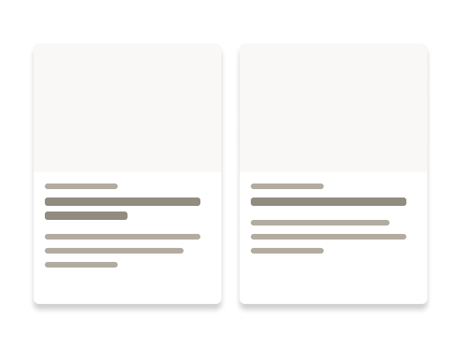
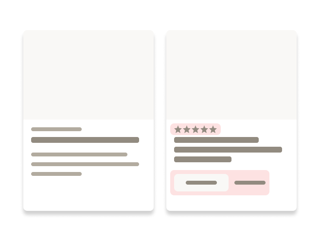
- Cards must be composed using different components. These components work together to provide details about a singular subject or destination
- For groups of cards:
- Separate each card by using the grid system
- Ensure the components used are consistent from card to card
- Use the same height and width for each card on the page
# Do / Don't


# API
View it on Github: https://github.com/rei/rei-cedar-vue-2/tree/next/src/components/card# Props
tag
name
string
type
'article'
default
Sets valid HTML container element tag.
# Slots
Find more information about using Slots in the article Installing Cedar.
default
name
Slot for CdrCard content.