Hand-off Process
The Cedar UI Toolkit provides tools and processes to communicate Cedar component and token usage in Figma design assets. Designers using the Cedar Toolkit to build mockups and redlines will be creating annotated, inspectable, web-sharable assets to facilitate the developer hand-off process.
# Developers
Developers can jump to the hand-off section of this article.
# Designers
We approach the hand-off process in a standardized way to ensure that any designer can communicate design specifications to any developer. Designs that leverage Cedar’s UI Toolkit are faster to build, easier to maintain, and quicker to hand-off than bespoke designs. Use the tips below to optimize your project hand-off with Cedar.
# Setup
# Artboards
To cover all supported breakpoints, you will need to use, at minimum, four artboards. We recommend using 400px, 784px, 992px, and 1232px artboard widths. These values play nicely with an eight pixel grid and create whole-number column and gutter integers.
To make starting your project easier, duplicate our Figma template file (opens new window). If using device-specific artboard sizes for native applications, be sure to apply a Layout Grid to the frame.
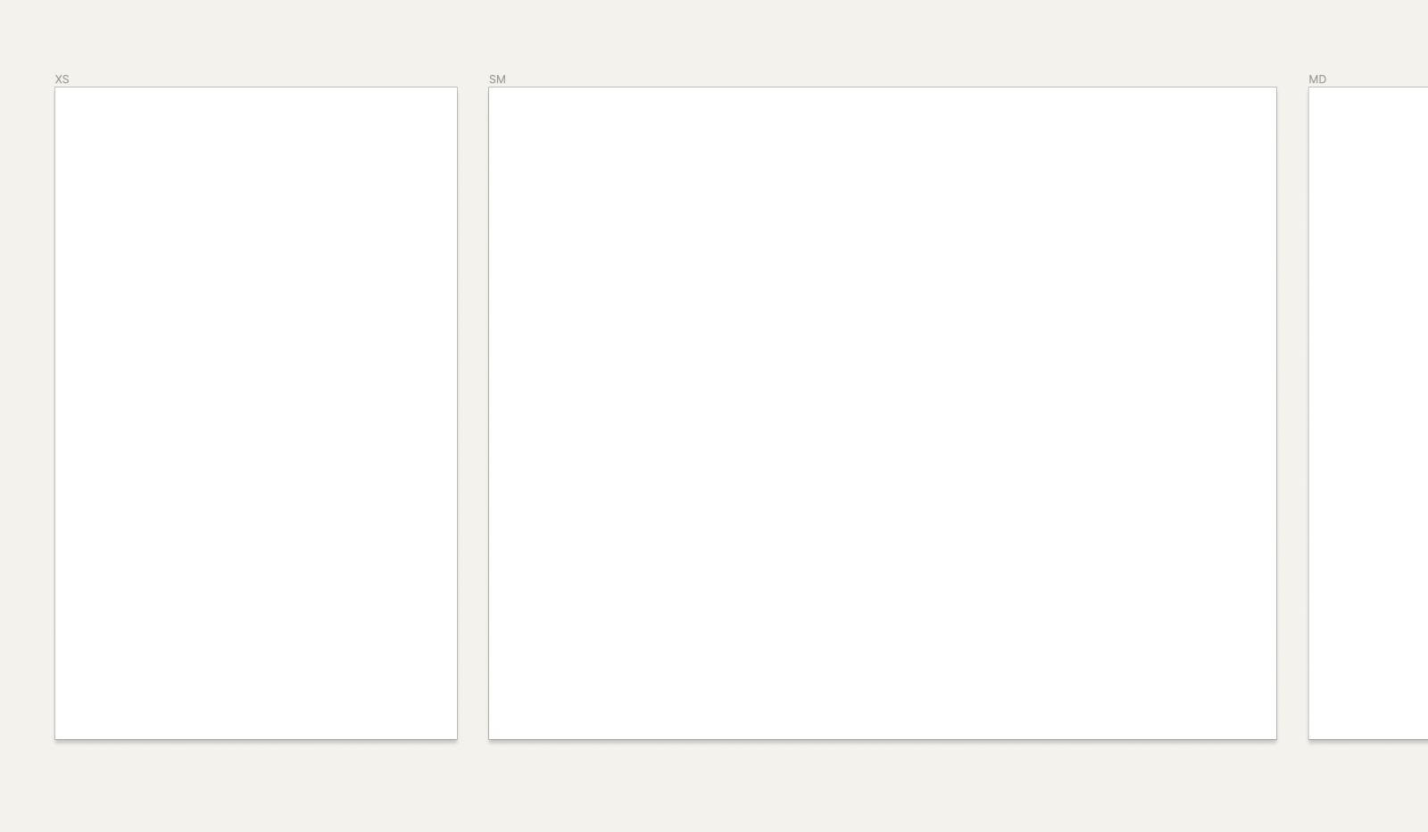
The template file contains the artboard widths you need to get started.
# Design
Toolkit libraries are automatically integrated into any new Figma project — simply drag-and-drop components from the asset tab or use shared styles for typography or color.
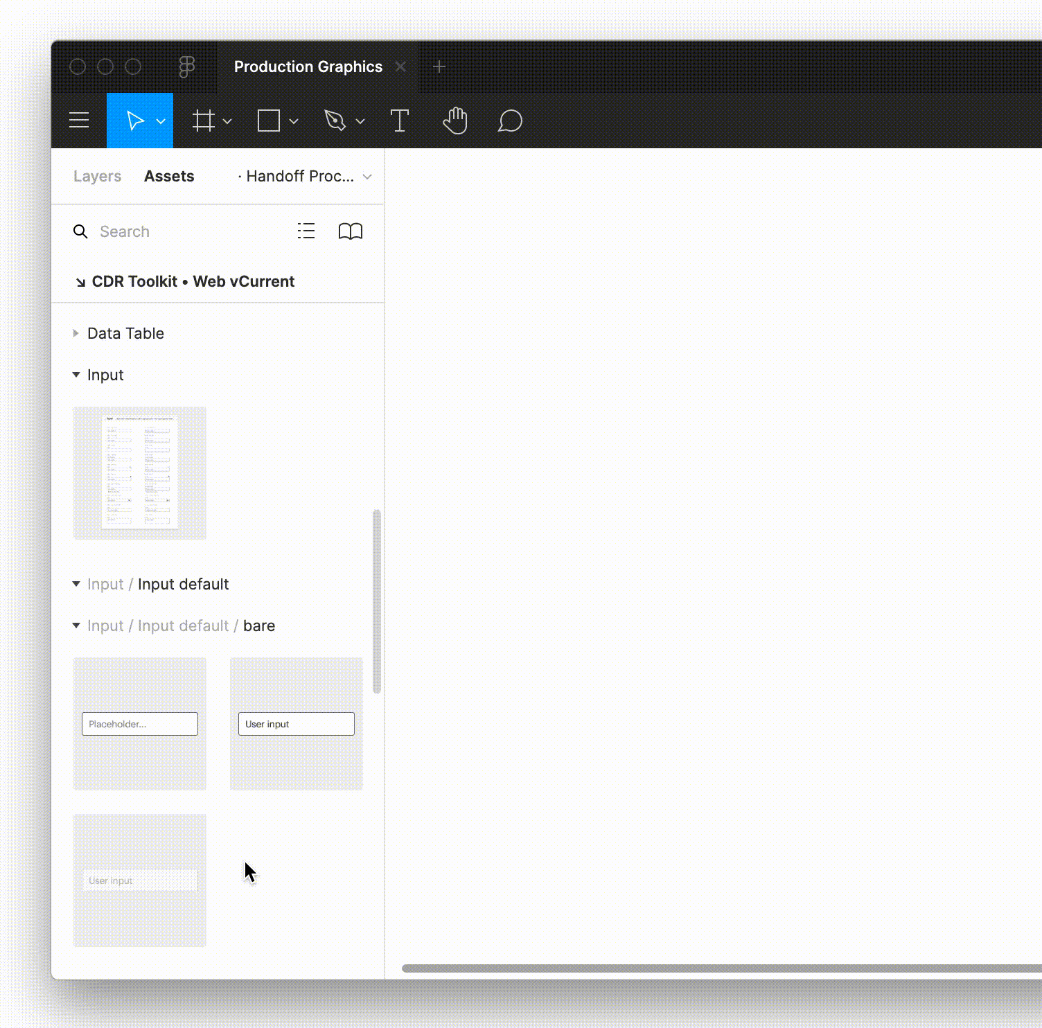
Components can be drag-and-dropped into your project from the assets panel in Figma.
For more information on getting set up with Figma, visit the For Designers guide.
# Page Headers and Footers
The global header and footer are available as shared components. Look for them under the assets tab in Figma.
# Redlining
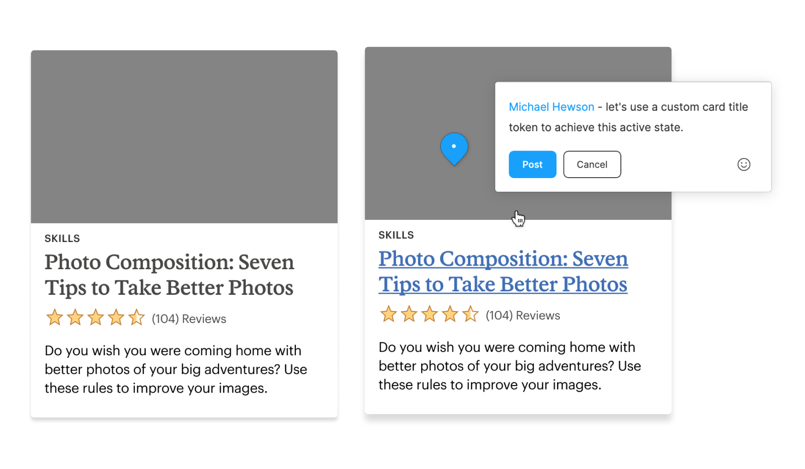
Effectively communicating specifications to a developer is the only way to ensure your design intention shows up in the delivered product. When you incorporate assets from the UI Toolkit into your designs, you’re also using the common language shared between the design assets in Figma and the code used to display them on the web.
Here, spacing symbols are used to show separation between components.
Component and token names are pre-embedded across the UI Toolkit to minimize the amount of redlining needed during this step. Developers can simply inspect the design assets to reference their coded counterparts.
# Organizing Design Specifications
We recommended teams keep all their design specifications together under one project. This lets developers know exactly where to find the most up-to-date assets and aligns closely to the single “source of truth” methodology.
- Do keep all design specifications consolidated under one project in Figma
- Don’t bury design specs within exploratory project files
# Hand-off
# Developer Review
As developers, you have view access to any project you’re invited to in Figma. The primary tools at your disposal will be the ability to comment and inspect.
Commenting directly in Figma is a great way to manage hand-off conversations with your designer.
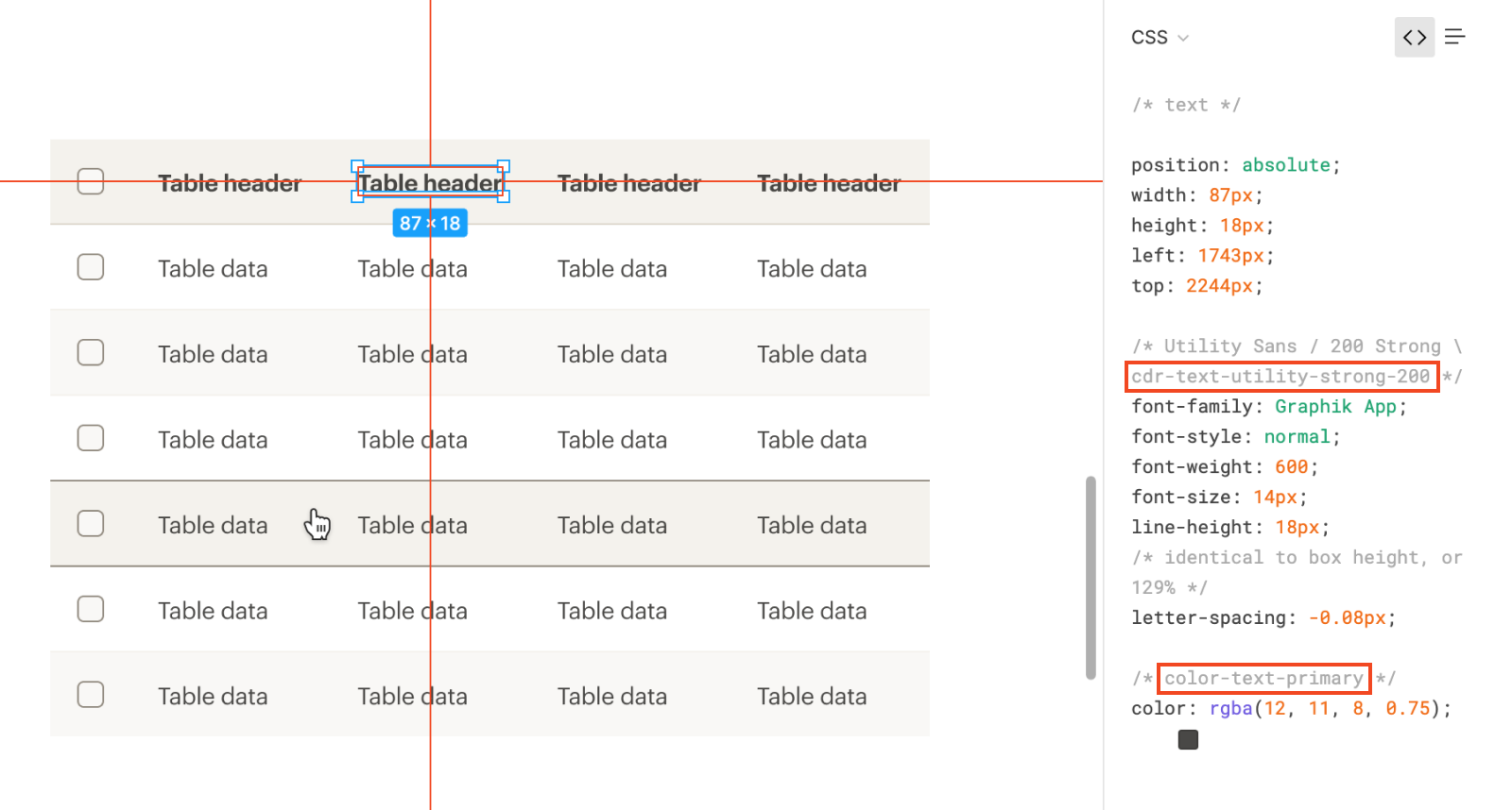
Use the inspect feature to discover component references or token names.
# Suggestions?
Does this process work for you? Do you have any suggestions for improvement? Please let us know using the #cedar-user-support (opens new window) slack channel.