Alerts
# Overview
Alerts inform users that something important has happened on the page. They need to be assertive and important messages with the intent to interrupt the user flow, even if not page blocking. They may communicate a critical error or request additional required input from our users.
# Alert Notifications
Persistent Alert Notifications provide brief, critical responses to changes in a page's data or user state. Their job is to keep users informed of important system or time-sensitive changes. These messages are displayed inline and are normally in close relation to the elements needing the user's attention.
As with other notifications, Alert Notifications are not provided as part of a page's content. Because of their assertive nature, Alert Notifications should be used sparingly and reserved for situations where the user's immediate attention is required. Dynamic notifications that are less urgent should use one of the appropriate Status Notification types.
| Priority | Prominent, high priority |
|---|---|
| Expectancy | Unexpected |
| Purpose |
|
| Interaction | Non-blocking, most often inline, required |
| Information | Critical or time-sensitive errors and warnings |
| Location | Inline on page, generally located in associated section of effected content |
| Options |
|
| Components |
# Use When
- The content added to the page is critical and needs immediate attention
- The application has made updates
- There are application failures, such as a lost connection to the server where local changes will not be saved
- The user is required to make a time-sensitive interaction
- The user is presented with a required option that is page blocking
# Don't Use When
- Confirming that a task or process initiated by the user was completed successfully (see Transient Status Notifications)
- Providing contextual information on the page processes (see Transient Status Notifications)
- Providing errors, warnings, or success messaging related to user-entered formatting, incomplete inputs, or invalid selections (see Validation Notifications)
- Page usage needs to be blocked until the user takes an action within the message or exits (see User Confirmation Alerts)
- User interaction is required or content is critical to the user flow (see Modal)
- The message contains a rich UI experience (see Modal)
- The user makes a selection that does not add or change content to the page
- Providing the only indication of an error, if needing to alert users on how to resolve the problem
# Use Caution When
- Using an alert rather than a status notification within form field validation. While not invalid, this may cause confusion to some users of assisted technology as it may read over the current or next form field label. It may be helpful however to use role alert to represent a validation summary which would populate after a user attempts to submit the form.
# Anatomy of an Alert Notification
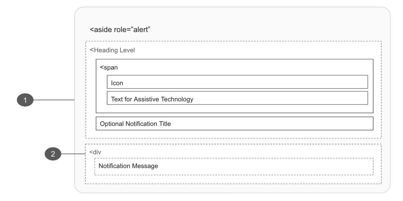
# Alert Notification Container
- Must
- Add
role=”alert”to the container on activation, interrupting the page flow of the user without interfering with their ability to continue working - Add an ID to the container
- Pass the alert ID to the causing control if this alert was caused by an in-page action
- Ensure the notification container is able to receive focus
- Add
- Must Not
- Move focus automatically to the alert notification
- Open as a blocking overlay window
- Direct the user to a new page or window
- Overuse alert notifications. Frequent interruptions (opens new window) inhibit usability for people with visual and cognitive disabilities
- Should
- Make the relationship between page controls and the notification explicit with the
aria-controlsattribute if another part of the page controls what appears in the alert
- Make the relationship between page controls and the notification explicit with the
- Should not
- Reuse bespoke UI intended for other message or navigation types
- May
- Auto-dismiss once originating cause has been resolved
- Display notifications in unique UI to create distinction around themselves and the the page content
- Update a live region of the page
- Use the HTML
<aside>tag, denoting the section that, though related to the main element, doesn't belong to the main flow
# Alert Notification Message
- Should
- Clearly communicate what has happened and how to proceed
- May
- May provide anchors directing users to error origin
# Implementation
# User Confirmation Alerts
These alerts require the user to interact with additional options provided within the message and request user confirmation of a task or process initiated by the user or the application itself.
| Priority | Prominent, high priority |
|---|---|
| Expectancy | Unexpected |
| Purpose |
|
| Interaction | Blocking, required |
| Information | Required user conditions or acceptance |
| Location |
|
| Options |
|
| Components |
# Use When
- The message content provides actionable options, which are critical and need immediate attention
- The message is dismissible by a user
- Page usage is blocked until the user takes an action within the message or exits
# Don't Use When
- There is no action the user must take
- The alert provides context to the page or page section (see Alert Notifications)
- Providing errors, warnings, or success messaging related to user entered formatting, incomplete inputs, or invalid selections (see Validation Notifications)
- Confirming that a task or process initiated by the user was completed successfully (see Transient Status Notifications)
- The message contains a rich UI experience where users interaction is not required (see Modal)
# Anatomy of a User Confirmation Alert
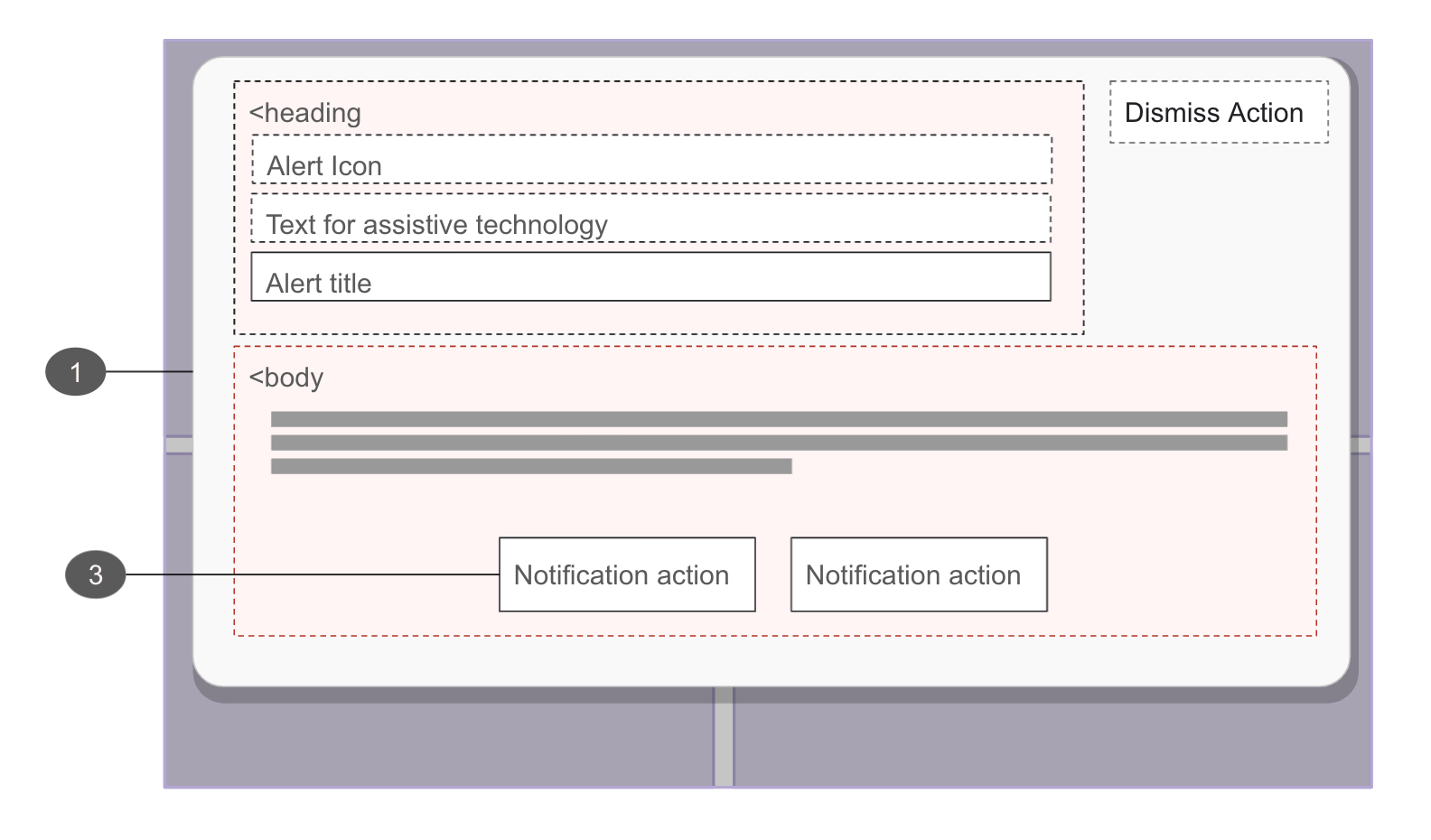
User confirmation alerts are urgent, blocking interactions that use a special type of modal called an alert dialog
The following are additive requirements to what the Cedar Modal component provides by default:
# Alert Container
- Must
- Apply the
role="alertdialog"to the modal dialog property, review Modal component documentation for more instruction
- Apply the
# Alert Actions
- May
- Assign focus to the most appropriate actionable element within the alert