Switch
CdrSwitch
Permits users to select from two opposing options
# Overview
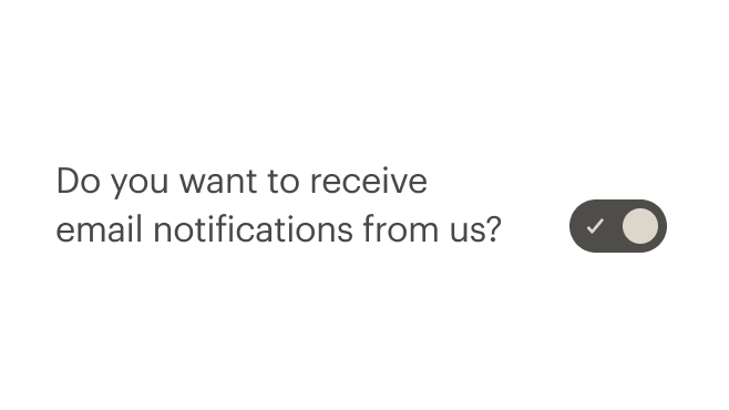
Switch is a system-wide control that is used to quickly change between two possible states. This component is only used for binary actions that occur immediately after the user makes any changes.
# Default
Default switch with medium size and standard spacing.
# Full-width spacing
Displays at full-width of its container.
# Large
Size can be changed to large based on where the component is being used.
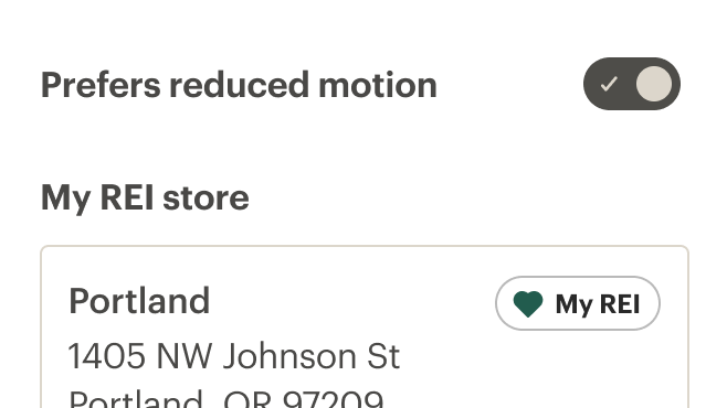
# Custom labels
A label with custom styling.
# Accessibility
To ensure that usage of this component complies with accessibility guidelines:
- Always provide a descriptive label as a slotted element to the
cdr-switchelement - Always provide an
idto the label of the switch
This component complies with WCAG guidelines by:
- Referencing the
idof the switch label by using thearia-labelproperty - Setting the
roleof the switch button element toswitch - Applying the
aria-checkedattribute
# Guidelines
# Use When
- Displaying two options (yes or no; on or off)
- Changing system-level settings, preferences, or other functions
- The change needs to take immediate effect
# Don't Use When
- Requiring the user to save or submit to apply the state. Instead, use checkboxes or radio buttons
- Showing more than one option. Instead, use checkboxes
- Allowing users to filter. Instead, use checkboxes or chips
# Choosing the right component
Switches, checkboxes, radio buttons, and toggle buttons are all similar types of selection controls, but are generally not interchangeable. If you're not sure which one to use for a certain scenario, here's a table that might help.
| Radio Button | Checkbox | Single Checkbox | Switch | Toggle Button | |
| Selections available | At least two | At least one | Just one | Only two (on or off) | At least two (this or that) |
| Default option | Yes | No | Yes | Yes | Yes |
| Choices | Mutually exclusive | Independent of each other | Mutually exclusive | Mutually exclusive | Mutually exclusive |
| Takes effect | After a user clicks a submit button | After a user clicks a submit button | After a user clicks a submit button | Immediately | Immediately |
# Content
- Keep labels short and direct
- The label should describe what the control will do when the switch is on
- Labels should describe the state of the system when the switch is on (when in doubt, say the label aloud and append “on/off” to the end)
- Start labels with a capital letter and use sentence case
- Labels should have one or two words, preferably nouns, that describe the functionality of the switch
# Do / Don't

# API
# Props
id
name
string
type
default
Id for the CdrSwitch element. Required for accessibility.
# Slots
Find more information about using Slots in the article Installing Cedar.
default
name
Slot for CdrSwitch label.
# Events
switch
name
event
arguments
$emit event fired when the switch is toggled.