Icons
CdrIcon
Communicates meaning through the use of graphics
# Overview
# Inline Icon Components
The inline icon components are the recommended method for using Cedar icons in a Vue application. Cedar exports a component version of every SVG Icon in the Cedar Icon Library. These components are named using PascalCase, for example account-profile becomes IconAccountProfile or camping becomes IconCamping.
# SVG Sprite
A collection of SVG icon files composed into a single file. This method provides a single server download request and caches icons for display. This is the most efficient way of displaying large numbers of icons, but has an added maintenance cost in that every icon used in the application must be manually added to it's sprite sheet. We recommend using the inline icon components, and optimizing to use a sprite only if it would provide a measurable performance benefit.
Visit the Cedar Icon Sprite Creator (opens new window) to generate a sprite sheet for your project. You will need to ensure that your sprite contains all the Cedar icons used in your application, including those used in shared components. The generated sprite sheet should be rendered inline at the root of your HTML. You should avoid rendering the sprite sheet in JavaScript/Vue, as that will cause it to be included twice (once in the server rendered HTML, and once in the client side bundle).
# Non-Cedar SVG
Create a new SVG icon using any valid SVG markup. The wrapping SVG element can be stripped (below) or maintained. Ensure that ID is not a used attribute in your icon to avoid introducing non-unique ID's on a page that may use this icon several times. Note that if it is not stripped, then viewBox, role, and xmlns attributes will not be preserved. Whereas, all other attributes will be preserved. This method creates an outer SVG wrapper for accessibility and styles. This is not recommended if using a large number of icons. See the icon overview page for more details on building SVG for use with Cedar.
# Accessibility
CdrIcon by default adds aria-hidden="true" to the root SVG element. If your usage of CdrIcon is purely decorative, or if the icon is already explained by the text surrounding it, then there are no other accessibility steps needed.
- For a button that only contains an icon, add an
aria-labelto the button element describing what the button does.
<cdr-button :icon-only="true" aria-label="Add to Cart">
  <icon-cart/>
</cdr-button>
2
3
- For a link that only contains an icon, include screenreader-only text inside of the link element using the
cdr-display-sr-onlymixin from@rei/cdr-tokens.
<cdr-link href="/cart">
  <icon-cart/><span class="sr-only">Go to cart page</span>
</cdr-link>
2
3
For a button or link that contains text alongside an icon:
- If the text provides sufficient description on it's own (for example, "Add to cart" with a cart icon) there is no need to add any additional accessible text.
<cdr-button>
  <icon-cart/> Add to Cart
</cdr-button>
2
3
- If the icon has meaning that is not conveyed by the text, add
aria-hidden="true"to the icon and use thecdr-display-sr-onlymixin from@rei/cdr-tokensto insert screenreader-only text into the button or link in the appropriate place.
<cdr-link>
  <icon-check-lg/><span class="sr-only">Available For</span> Curbside Pickup
</cdr-link>


<cdr-button>
  <icon-check-lg/><span class="sr-only">Available for</span> Curbside Pickup
</cdr-button>
2
3
4
5
6
7
8
For an icon that exists outside of a link, button, or other actionable element, there are 2 ways to apply accessible text to the icon:
- Include screenreader only text alongside the icon describing it's meaning. This is the simplest approach for applying accessible text to an icon and has the best support across browsers and screenreaders.
<icon-virtual-outfitting/>
<span class="sr-only">Virtual Outfitting</span>
2
- Pass a
<title>and<desc>into the default slot of the icon component, each with unique ids. Addrole="img"andaria-labelledby="titleid descid"to the icon component, replacingtitleidanddescidwith the IDs that correspond to the<title>and<desc>elements. If using CdrIcon with custom SVG, make sure title is the first child element. Note that this approach should be used to visually describe the icon as if it were an image, and should not be used to add contextual description of the icon's meaning.
<icon-ski role="img" aria-labelledby="skiTitle skiDesc">
  <title id="skiTitle">Skiing</title>
  <desc id="skiDesc">A stick figure skiing downhill</desc>
</icon-ski>
2
3
4
Recommendations for writing screen reader text:
- Be succinct. Exclude unnecessary words
- Be informative and accurate
- Write in the active voice
- Avoid technical jargon
# Guidelines
# Use When
- Communicating simple actions and concepts that are easily understood, such as printing a receipt or sending an email
- Making navigation easier for common actions, such as return to home page or search
- Representing an action, object, or concept at a high level of abstraction, such as using the snowflake icon to represent snow sports
- Notifying users about status, such as the number of items in a shopping cart or a warning message
- Conserving space for concepts that are difficult to depict, such as the progress icon or the 3-line “hamburger” menu
# The Basics
# Sizes
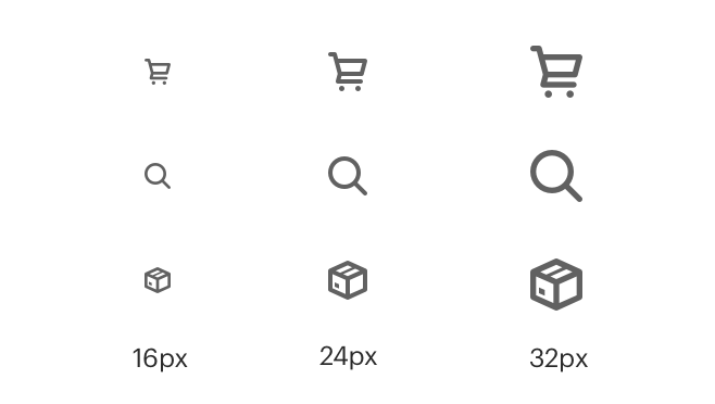
Icons are available in three sizes: small (16px), medium (24px), and large (32px). Default size is medium (24px); however, designers can choose a different size.
# Color
Ensure that icons use the ratio of 4.5:1 contrast between icon color and background color. Follow recommendations in the Color Foundation article for pairing color tokens.
# Clearance
Adequate space around the icon allows for legibility and touch. A minimum touch target area of 40px is recommended for standalone iconography.
When the mouse and keyboard are the primary input methods or when icons are paired inline with text, measurements may be condensed to accommodate denser layouts. Icon size should align to the line-height of the paired text element.
# Icon Library
For a list of all available icons and their names, visit the Cedar Icon Library (opens new window).
# Behavior
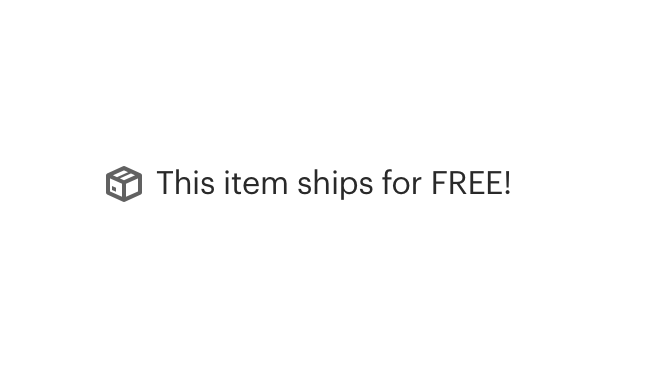
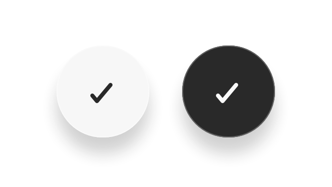
When using icons with links or buttons, ensure that the icon communicates intended meaning.
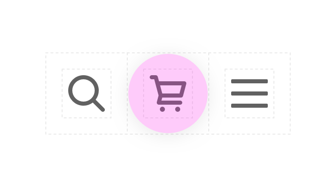
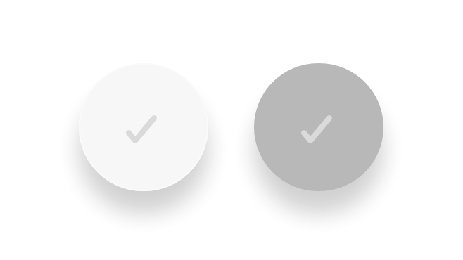
Ensure that icons are sized to provide a minimum click or touch target.
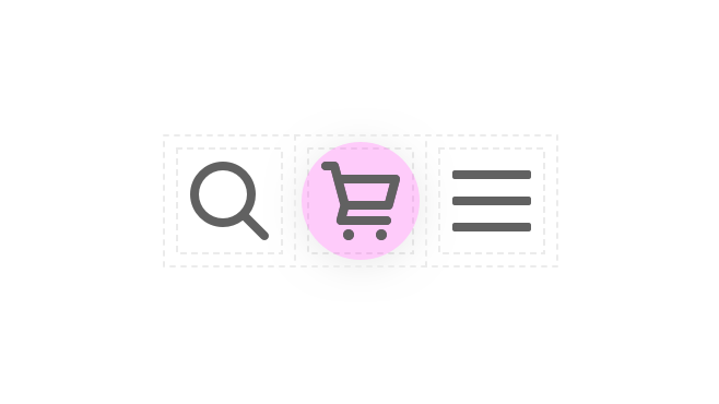
Ensure that icons use contrast ratio of 4.5:1 between icon color and background color.
# API
View it on Github: https://github.com/rei/rei-cedar-vue-2/tree/next/src/components/icon# Props
use
name
string
type
none
default
Only on CdrIcon. Sets the href attribute for use with SVG symbol sprite (see @rei/cedar-icons).
size
name
string
type
medium
default
Modifies the icon size; values can target responsive breakpoints. Breakpoint values are: xs, sm, md, and lg. Examples: { 'small' | 'medium' | 'large' | 'large@sm' }
inherit-color
name
boolean
type
false
default
Sets icon fill color to 'inherit'.
# Slots
Find more information about using Slots in the article Installing Cedar.
default
name
Sets the innerHTML of SVG element. This includes <title>, <desc>, or any other valid SVG xml.
# Usage
For a list of all available icons and their names, visit the Cedar Icon Library (opens new window).
There are 2 different options to display SVG icons on your page using the CdrIcon package.
# 1. SVG Sprite
Requires:
- Icon sprite inline on page
Icon sprites can be generated using the Cedar Icon Sprite Creator (opens new window).
The sprite needs to be available on any page where the icons are being used. Add the sprite component at the base layout or index:
App.vue (base template)
<template>
  <div id="main">
    <div v-html="iconSprite" style="display: none;" />

    <router-view></router-view> // rest of app
  </div>
</template>

<script>
/* NOTE: you should create your own optimized sprite file for your project, `all-icons.svg` is only used here for convenience */
import { iconSprite } from '@rei/cedar-icons/dist/all-icons.svg';

...
data() {
  return {
    iconSprite
  }
}
...
</script>
2
3
4
5
6
7
8
9
10
11
12
13
14
15
16
17
18
19
20
Child.vue (any descendant component of App.vue above)
<template>
  <div>
    <cdr-icon use="#caret-right" />
  </div>
</template>

<script>
import { CdrIcon } from '@rei/cedar';

...
components: {
  CdrIcon
}
...
</script>
2
3
4
5
6
7
8
9
10
11
12
13
14
15
# 2. Non-Cedar SVG
The CdrIcon package is simply an SVG with default attributes set for accessibility and styling.
- Any SVG markup can be used
- All attributes, event listeners, classes, etc. will be carried over with the exception of
viewBox,role, andxmlns - This method will increase HTML file size and slow down performance if using a lot of icons.
Requires:
- None
Use any valid SVG markup in the CdrIcon slot.
The svg element in this example will be stripped, but the class and data atrribute will be preserved (and could be moved to cdr-icon also).
<template>
  ...
  <cdr-icon>
    <svg class="my-class" data-example="this stays">
      <title>My icon</title>
      <path d="M12 12c1.9329966 0 3.5-1.5670034 3.5-3.5C15.5 6.56700338 13.9329966 5 12 5S8.5 6.56700338 8.5 8.5c0 1.9329966 1.5670034 3.5 3.5 3.5zm6.7621385 7c-.8850139-2.8946791-3.5777143-5-6.7621387-5-3.1844245 0-5.87712493 2.1053209-6.76213876 5H18.7621385zM4 21c-.55228475 0-1-.4477153-1-1h-.00754862a9.07963802 9.07963802 0 0 1 .01314502-.1064258c.00185549-.0175393.0041644-.0349433.00691478-.0522001.43595408-3.2192393 2.56090871-5.9021068 5.45328094-7.1270196C7.26398091 11.7054407 6.5 10.191939 6.5 8.5 6.5 5.46243388 8.96243388 3 12 3c3.0375661 0 5.5 2.46243388 5.5 5.5 0 1.6919391-.763981 3.2054409-1.9657923 4.2143547 2.8923661 1.2249103 5.0173178 3.9077692 5.4532779 7.1269995.0027529.0172699.0050636.0346873.0069201.0522401A9.07834213 9.07834213 0 0 1 21.0075481 20H21c0 .5522847-.4477153 1-1 1H4z"/>
    </svg>
  </cdr-icon>
  ...
</template>

<script>
import { CdrIcon } from '@rei/cedar';

...
  components: {
    CdrIcon
  }
...

</script>
2
3
4
5
6
7
8
9
10
11
12
13
14
15
16
17
18
19
20
21
You can also omit the wrapping svg element.
<template>
  ...
  <cdr-icon>
    <title>My icon</title>
    <path d="M12 12c1.9329966 0 3.5-1.5670034 3.5-3.5C15.5 6.56700338 13.9329966 5 12 5S8.5 6.56700338 8.5 8.5c0 1.9329966 1.5670034 3.5 3.5 3.5zm6.7621385 7c-.8850139-2.8946791-3.5777143-5-6.7621387-5-3.1844245 0-5.87712493 2.1053209-6.76213876 5H18.7621385zM4 21c-.55228475 0-1-.4477153-1-1h-.00754862a9.07963802 9.07963802 0 0 1 .01314502-.1064258c.00185549-.0175393.0041644-.0349433.00691478-.0522001.43595408-3.2192393 2.56090871-5.9021068 5.45328094-7.1270196C7.26398091 11.7054407 6.5 10.191939 6.5 8.5 6.5 5.46243388 8.96243388 3 12 3c3.0375661 0 5.5 2.46243388 5.5 5.5 0 1.6919391-.763981 3.2054409-1.9657923 4.2143547 2.8923661 1.2249103 5.0173178 3.9077692 5.4532779 7.1269995.0027529.0172699.0050636.0346873.0069201.0522401A9.07834213 9.07834213 0 0 1 21.0075481 20H21c0 .5522847-.4477153 1-1 1H4z"/>
  </cdr-icon>
  ...
</template>

<script>
import { CdrIcon } from '@rei/cedar';

...
  components: {
    CdrIcon
  }
...

</script>
2
3
4
5
6
7
8
9
10
11
12
13
14
15
16
17
18
19