Icon Overview
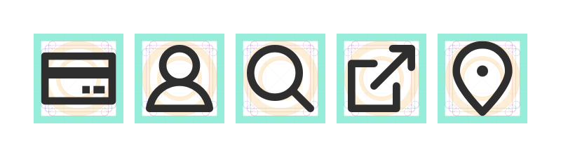
UI icons or glyphs symbolize commands, navigation, utility, or common actions and provide additional visual context and enhance usability. Icons offer a form of “visual shorthand”, lowering cognitive load and better utilizing space. Icons use familiar shapes and metaphors to communicate concepts in simple graphic forms.
# Characteristics
# Grid
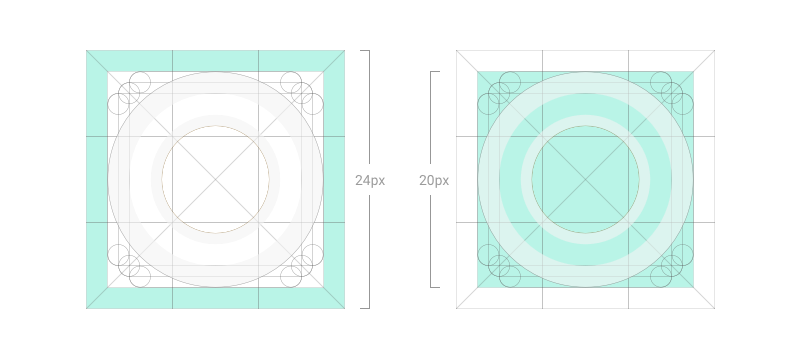
Design icons on a 20px grid and export on a 24px artboard. Constrain the content of an icon to the “live area” of the icon grid. The live area and padding ensure sufficient display room and consistent scaling of the icon set.
# Shapes
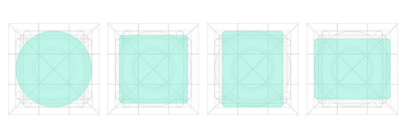
Create icons on the grid using basic foundational shapes. Adhering to these shapes ensures consistent proportionality of iconography throughout the icon set.
# Sizes
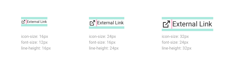
Icons scale to display across three sizes: small (16px), medium (24px), and large (32px).
# Clearance
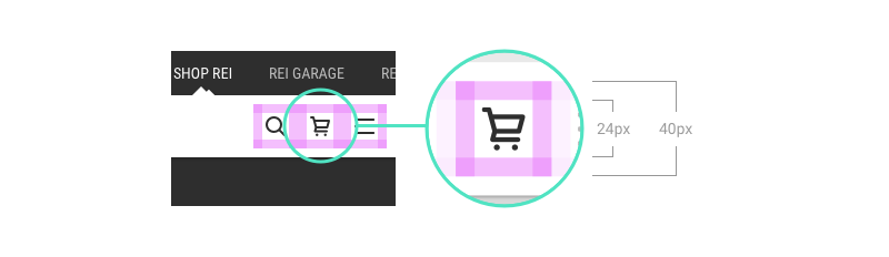
Adequate space around the icon allows for legibility and touch. A minimum touch target area of 40px is recommended for standalone iconography.
When the mouse and keyboard are the primary input methods or when icons are paired in-line with text, measurements may be condensed to accommodate denser layouts. Icon size should align to the line-height of the paired text element.
# Style
Icons are built from foundational shapes within the icon grid and align to the pixel grid to ensure clarity when scaling. Optical corrections can be made where necessary.
Minimize use of depth or implied perspective unless necessary to convey the relationship of grouped items.

Constructed with a 2px stroke. Strokes have a 1px rounded terminus or butt-cap.

Square and rectangular shapes have 1px rounded exterior corners and sharp interior angles.

Filled versions of select icons are available and typically represent an “on” or active state of the action, feature, or validation colors. When icons are paired with a complex or noisy background, consider using a filled icon (e.g. a filled location pin on a map environment).

Inverse display is available when paired with darker backgrounds.

# Icons in Cedar
Icons are symbols or visual expressions that communicate meaning through the use of graphics.
The Cedar Icon Library contains simple, functional icons to use across the REI digital platform to help make navigation easier for common actions.
Icons are available in SVG format at 24px, and can be displayed using the Icon Component.
# Icon Component
The Cedar Icon component (cdr-icon) is intended to consume icons hosted in the Cedar Icon Library.
For information about using the Cedar Icon API, design guidelines, and accessibility considerations, visit the Icon component article.
# Icon Library and Naming
Cedar has a library of reusable icons with names and descriptive tags.
Visit the Cedar Icon Library for a complete list of icons.
# Naming Convention
Cedar icons follow the kebab-case naming convention. For example, {group(s)}-{name}-{variation}-{size}.svg where:
- {groups}: A namespace for alphabetized grouping. Could be more than one
- {name}: The name of the icon
- {variation}: Variations of the same icon - fill vs stroke - horizontal vs vertical
- {size}: sm for 16px and lg for 32px. 24px icons don't have a size suffix
File name examples:
arrow-down.svg
arrow-left.svg
arrow-right.svg
arrow-up.svg
check-fill.svg
check.svg
check-lg.svg
check-sm.svg
check-stroke.svg
menu.svg
gear-tent.svg
gear-tent-outline.svg
gear-backpack.svg
gear-backpack-stroke.svg
gear-sleeping-bag.svg
gear-bike.svg
gear-boating-kayak.svg
gear-boating-canoe.svg
gear-boating-paddleboard.svg
# Using Inline Cedar Icons
The @rei/cedar component package exports an inline Vue component for every icon in the Cedar library. The inline icon components are the easiest way to make use of the Cedar icon library if you are building an application using Vue. These components are prefixed with the word Icon and are named using PascalCase, for example: IconCaretDown, IconExperiencesBackpacking.
# Creating a Cedar Icon Sprite
Icon sprite sheets should be avoided in favor of using the inline cedar icon components, as maintaining sprite sheets is difficult and usually has minimal impact on performance. However we do offer a sprite option for teams that need to optimize their icon usage.
The Cedar Icon Library has an easy to-use sprite creator (opens new window). Alternately, the icon library API also provides sprite generation (opens new window). The sprite can then be referenced using the CdrIcon component
# Contribution Process
Cedar welcomes and encourages contributions to the icon library that are consistent with the REI style.
# Cedar Icon Guidelines
Single Path
Each Cedar icon must composed of a single path object.
Style
These rules are subjective, and can be bent or broken.
- 2px stroke weight
- 1px radius rounded edges and terminals
- Pixel aligned for proper anti-aliasing and rasterizing
Dimensions
Icons must be created at 24x24px size format. However, they can be displayed in any one of three sizes:
- sm: 16x16px
- md: 24x24px
- lg: 32x32px
# Adding an Icon to the Cedar Icon Library
Contact the Cedar team using the #cedar-user-support (opens new window) Slack channel for assistance in adding a new icon to the library.