Text
CdrText
Text container used for any text element such as paragraphs, headings, and lists. Establishes vertical spacing and optimizes the reading experience
# Overview
The CdrText component is a simple wrapper for text elements that applies default type styles. Type styling should be applied by using the design tokens and a custom CSS class.
# Headings
A heading helps users to identify and create a hierarchical structure within a page. Headings are typically the largest text on the screen and should be short and include important information. Cedar headings include display, serif, and sans-serif options.
# Display
Display headings, set in REI Stuart, include the largest type styles available and are intended to be used for emotional and impactful messages on top of the funnel experiences (i.e., homepage, brand pages, or landing pages). Because display styles are lighter in weight than other heading styles, they are meant for sizes 800 and above. However, it is recommended to reserve sizes 800 and 900 for mobile breakpoints.
<template>
  <cdr-text class="custom-heading-class">
    When you gear up, we give back
  </cdr-text>
</template>
<style>
  @import '~@rei/cdr-tokens/dist/scss/cdr-tokens.scss';
  .custom-heading-class {
    @include cdr-text-heading-display-1600;
  }
</style>
2
3
4
5
6
7
8
9
10
11
# Serif
Serif headings, set in REI Stuart, work best in large sizes (cdr-text-heading-serif-600 and above) and are intended to be used for functional messages on middle to bottom of funnel experiences (i.e., product detail pages or checkout experiences). It’s also available for areas where space is limited but an important distinction or callout needs to be made, such as a card title or aligning to marketing collateral.
<template>
  <cdr-text class="custom-heading-class">
    When you gear up, we give back
  </cdr-text>
</template>
<style>
  @import '~@rei/cdr-tokens/dist/scss/cdr-tokens.scss';
  .custom-heading-class {
    @include cdr-text-heading-serif-1200;
  }
</style>
2
3
4
5
6
7
8
9
10
11
# Serif Strong
Serif strong headings, set in REI Stuart with a greater font weight than display or serif, work best in larger sizes (cdr-text-heading-serif-strong-600 and above). Like serif headings, these styles are intended to be used for functional messages on middle to bottom of funnel experiences. It’s recommended to use serif strong headings very minimally throughout the page and should generally be reserved for important page titles, in cases where type overlays an image, or in situations where additional emphasis is needed.
<template>
  <cdr-text class="custom-heading-class">
    When you gear up, we give back
  </cdr-text>
</template>
<style>
  @import '~@rei/cdr-tokens/dist/scss/cdr-tokens.scss';
  .custom-heading-class {
    @include cdr-text-heading-serif-strong-1200;
  }
</style>
2
3
4
5
6
7
8
9
10
11
# Sans
Sans headings, set in Graphik, should play a supporting role to serif headings. Sans headings work best in smaller sizes (cdr-text-heading-serif-strong-600 and below). Sans headings are not recommended for page titles or other prominent placements. Instead, use serif or serif strong headings.
<template>
  <cdr-text class="custom-heading-class">
    When you gear up, we give back
  </cdr-text>
</template>
<style>
  @import '~@rei/cdr-tokens/dist/scss/cdr-tokens.scss';
  .custom-heading-class {
    @include cdr-text-heading-sans-600;
  }
</style>
2
3
4
5
6
7
8
9
10
11
# Guidelines
# Use When
- Creating a hierarchical structure of information on a page
# Don’t Use When
- Tagging as a semantic heading when an element only needs to be highlighted or emphasized within your content. Instead, use the type scale to alter the size or prominence of the text
- Showcasing long form content. Instead, use body
# The Basics
- When using this component with semantic headings from
<h1>to<h6>, typographic styles set up a visual hierarchy created within CSS that helps to establish the order of importance - Identify headings at the beginning of a section
- Position headings at, or near, the top of a section
- Consider cdr-color-text-primary, cdr-color-text-secondary, cdr-color-text-emphasis, cdr-color-text-brand, or cdr-color-text-inverse when choosing heading colors
- Minimize text overlaid on images and multicolored background, which can degrade legibility. If text is overlaid on an image:
- Ensure an accessible contrast between text and the background
- Implement image text with proper HTML markup and use CSS to embed any special fonts
- Consider using heading-serif-strong styles
# Do / Don’t
# Content
- Be specific. Provide facts or information that pique user interest. Avoid broad and generic headings
- Start heading titles with strong and familiar keywords to increase scannability
- Ensure the heading works out of page context, such as search results, social media streams, blog posts, and news feeds
- Start with most descriptive word. For example, instead of “Preparation for floods”, use “Flood preparation”
- Avoid duplicating headings (e.g. "More Details")
- Omit needless words. Be clear and concise
- Limit heading length for improved scale across variable container widths
- Headings must:
- Start with a capital letter
- Capitalize proper nouns
- Use sentence case
- Left-align multi-line headings
# Responsive Headings
Cedar does not offer pre-styled responsive headings. Instead, construct responsive headings by defining a heading style for specific breakpoints. For instance, if the heading style is cdr-text-heading-serif-900 @lg, @md, and @sm sizes, set the heading style to cdr-text-heading-serif-800 at the @xs size. This helps to create optimal readability, spacing, and proportions for various breakpoint sizes. An examples in practice:
<template>
  <cdr-text class="custom-heading-class">
    When you gear up, we give back
  </cdr-text>
</template>
<style>
  @import '~@rei/cdr-tokens/dist/scss/cdr-tokens.scss';
  .custom-heading-class {
    @include cdr-text-heading-serif-900;
    @include cdr-xs-mq-only {
      @include cdr-text-heading-serif-800;
    }
  }
</style>
2
3
4
5
6
7
8
9
10
11
12
13
14
# Resources
# Subheadings
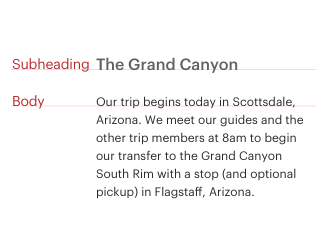
Subheadings give support or add meaning to a heading, and are intended to be paired with headings. Never position a subheading on a page without pairing it with a heading style. Because subheadings are supportive, they should always be smaller in size than the heading they reinforce.
# Sans
Sans-serif subheadings are set in Graphik. They are intended to be paired with serif or serif strong headings. Pairing a sans subheading with a sans heading is also acceptable.
<template>
  <cdr-text class="custom-subheading-class">
    When you gear up, we give back
  </cdr-text>
</template>
<style>
  @import '~@rei/cdr-tokens/dist/scss/cdr-tokens.scss';
  .custom-subheading-class {
    @include cdr-text-subheading-sans-600;
  }
</style>
2
3
4
5
6
7
8
9
10
11
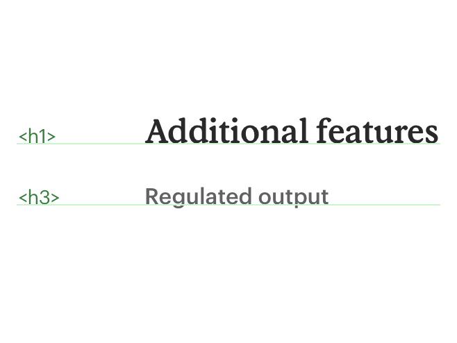
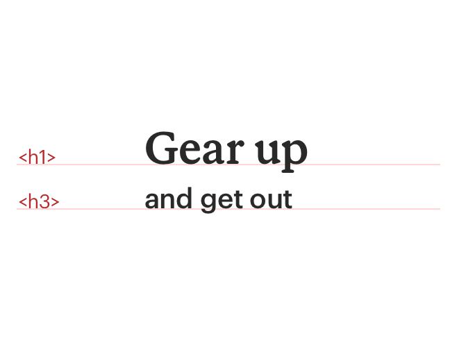
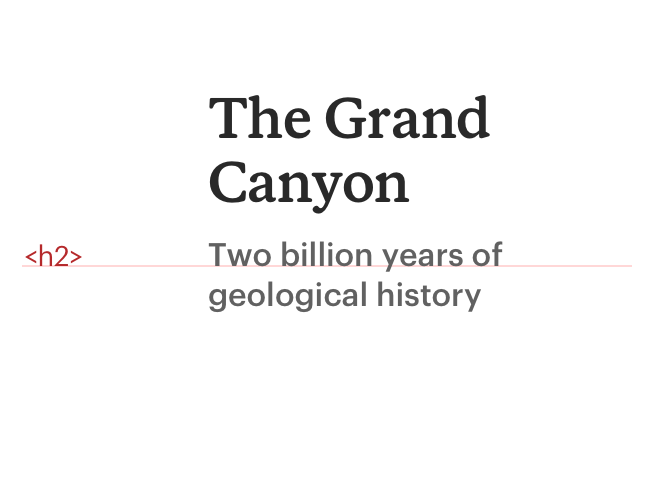
# Heading and Subheading Combinations
Heading and subheading combinations should have the appropriate contrast and hierarchy. Headings should always be larger than the accompanying subheading.
Serif headings should only accompanied by sans subheadings.
<template>
  <cdr-text class="custom-heading-class">
    When you gear up, we give back>
    <cdr-text class="custom-subheading-class">
      Treat yourself to sweet gear
    </cdr-text>
  </cdr-text>
</template>
<style>
  @import '~@rei/cdr-tokens/dist/scss/cdr-tokens.scss';
  .custom-heading-class {
    @include cdr-text-heading-serif-strong-900;
  }

  .custom-subheading-class {
    @include cdr-text-subheading-sans-500;
    padding-top: $cdr-space-one-and-a-half-x;
  }
</style>
2
3
4
5
6
7
8
9
10
11
12
13
14
15
16
17
18
19
Sans headings also work best with sans subheadings.
<template>
  <cdr-text class="custom-heading-class">
    When you gear up, we give back>
    <cdr-text class="custom-subheading-class">
      Treat yourself to sweet gear
    </cdr-text>
  </cdr-text>
</template>
<style>
  @import '~@rei/cdr-tokens/dist/scss/cdr-tokens.scss';
  .custom-heading-class {
    @include cdr-text-heading-sans-600;
  }

  .custom-subheading-class {
    @include cdr-text-subheading-sans-300;
    padding-top: $cdr-space-one-x;
  }
</style>
2
3
4
5
6
7
8
9
10
11
12
13
14
15
16
17
18
19
# Guidelines
# Do / Don’t


# Body
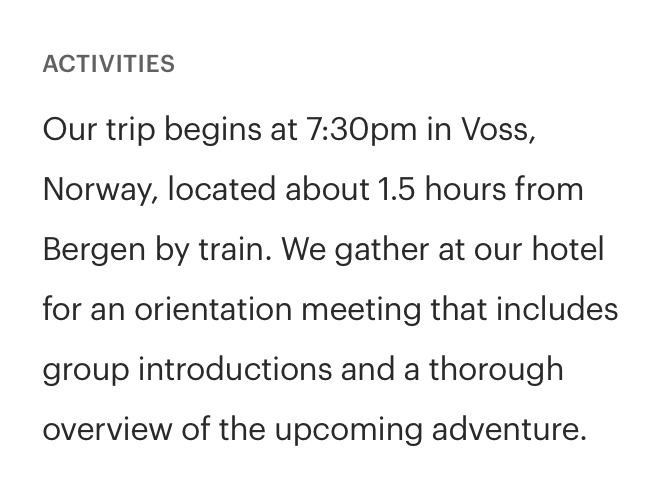
Body styles work best for long-form copy like articles, customer reviews, or legal messages. Body styles have a generous line height and wider letter spacing for optimal reading. For tighter, more compact styles, use utility styles.
<template>
  <cdr-text class="custom-body-class">
    Cross-country skiing (sometimes called classic skiing) encompasses several styles, from touring or racing on groomed ski tracks to gliding through deep backcountry snow.
  </cdr-text>
</template>
<style>
  @import '~@rei/cdr-tokens/dist/scss/cdr-tokens.scss';
  .custom-body-class {
    @include cdr-text-body-500;
  }
</style>
2
3
4
5
6
7
8
9
10
11
# Strong
Body strong is also intended for long-form copy but should be used minimally. Use body strong styles when emphasizing a subset of copy and never for the entire length of copy.
<template>
  <cdr-text class="custom-body-class">
    Cross-country skiing (sometimes called classic skiing) encompasses several styles, from touring or racing on groomed ski tracks to gliding through deep backcountry snow.
  </cdr-text>
</template>
<style>
  @import '~@rei/cdr-tokens/dist/scss/cdr-tokens.scss';
  .custom-body-class {
    @include cdr-text-body-strong-500;
  }
</style>
2
3
4
5
6
7
8
9
10
11
# Guidelines
# Use When
- Displaying articles for long-form content, such as Expert Advice articles or Co-op Journal entries
- Displaying member or legal messages, such as on the PDP
- Displaying product descriptions
- Displaying customer reviews, such as on the PDP
# Don't Use When
# The Basics
Body styles should be used for:
- Legal messages
- Shipping messages
- Customer reviews
- Product, class, event, or trip descriptions
- Editorial copy
- Long articles
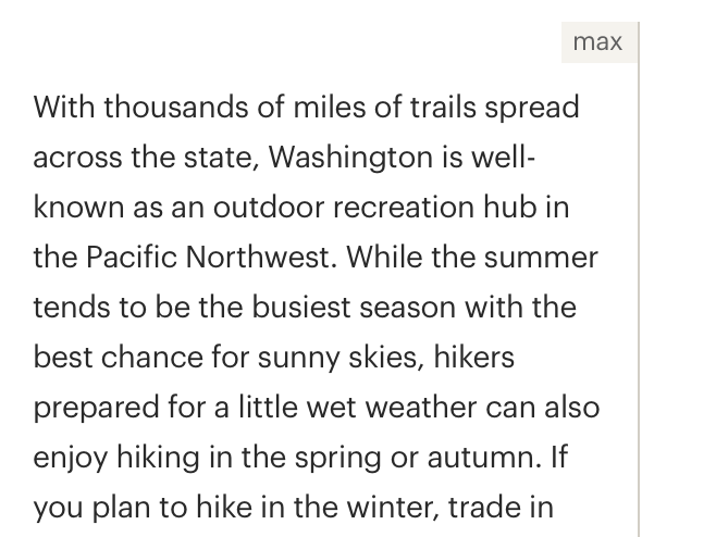
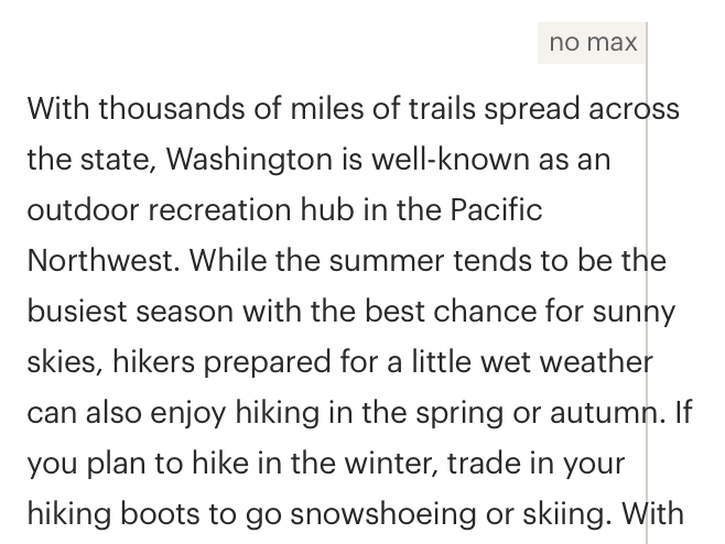
Max-width for paragraph containers is 634px or line length should not exceed 75 characters per line
Use standard (dark) text colors on light backgrounds for article text
Consider cdr-color-text-primary, cdr-color-text-secondary, cdr-color-text-emphasis, or cdr-color-text-inverse when choosing body colors. If needed, cdr-color-text-sale is also available. Avoid cdr-color-text-brand for body styles
# Content
- Use adjacent text, a definition list, a glossary, or other method to supplement words that are ambiguous
- Abbreviations:
- Follow REI Copy Guidelines (opens new window) for dates, time, dimensions, measurements, electrical units, and geographic reference
- Expand abbreviations by explaining the definition the first time it is used
- Use the
<abbr>element, or link to a definition or glossary
- For ease of reading, readability level should be about Grade 7. To test the body text, use the Hemingway Editor (opens new window).
- When possible, write the first sentence as an introduction to the paragraph. With screen readers, users can jump from paragraph to paragraph, listening to the first sentence or two before moving on to the next paragraph
# Applying Strong to Body Styles
Body styles include a set of strong options: cdr-text-body-strong-500, cdr-text-body-strong-400, and cdr-text-body-strong-300. However, there might be times when a set of words within a sentence needs to be bold. In those cases, use the generic cdr-text-strong. The set of strong options have a lighter font weight than the generic cdr-text-strong.
# Do / Don’t
# Resources
- Article: Which Are More Legible: Serif or Sans Serif Typefaces? (opens new window)
- WebAIM Article: Evaluating Cognitive Web Accessibility (opens new window)
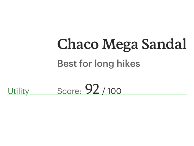
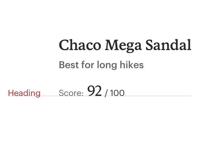
# Utility
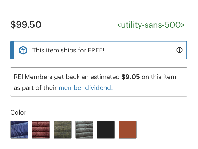
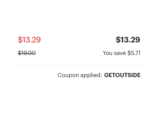
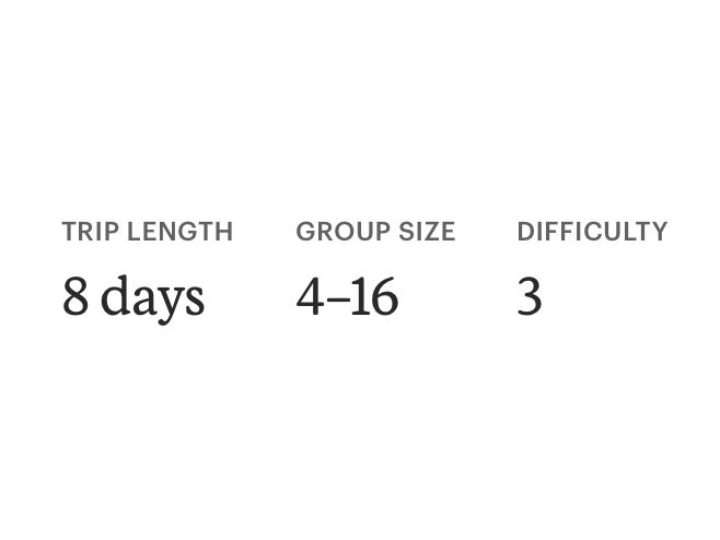
Utility styles are used to communicate functionality or descriptive information. Shorter content is a good candidate for the more condensed and compact utility styling. Utility styles should not be replaced with headings. While headings help group and categorize content, utility styles help to label elements or give users information on how to take action. Cedar utility styles are available in both serif and sans serif (opens new window) options. Additionally, each utility style has a strong option.
# Serif
Utility serif styles should be used when additional brand emphasis is needed.
<template>
  <cdr-text class="custom-utility-class">
    Mon–Fri, 7am–5pm PT
  </cdr-text>
</template>
<style>
  @import '~@rei/cdr-tokens/dist/scss/cdr-tokens.scss';
  .custom-utility-class {
    @include cdr-text-utility-serif-800;
  }
</style>
2
3
4
5
6
7
8
9
10
11
# Serif Strong
Utility serif strong styles should be used when additional emphasis is needed over utility serif.
<template>
  <cdr-text class="custom-utility-class">
    Mon–Fri, 7am–5pm PT
  </cdr-text>
</template>
<style>
  @import '~@rei/cdr-tokens/dist/scss/cdr-tokens.scss';
  .custom-utility-class {
    @include cdr-text-utility-serif-strong-800;
  }
</style>
2
3
4
5
6
7
8
9
10
11
# Sans
Utility sans styles typically make up the majority of utility styles used on a given page.
<template>
  <cdr-text class="custom-utility-class">
    Mon–Fri, 7am–5pm PT
  </cdr-text>
</template>
<style>
  @import '~@rei/cdr-tokens/dist/scss/cdr-tokens.scss';
  .custom-utility-class {
    @include cdr-text-utility-sans-800;
  }
</style>
2
3
4
5
6
7
8
9
10
11
# Sans Strong
Utility sans styles should be used when additional emphasis is needed.
<template>
  <cdr-text class="custom-utility-class">
    Mon–Fri, 7am–5pm PT
  </cdr-text>
</template>
<style>
  @import '~@rei/cdr-tokens/dist/scss/cdr-tokens.scss';
  .custom-utility-class {
    @include cdr-text-utility-sans-strong-800;
  }
</style>
2
3
4
5
6
7
8
9
10
11
# Guidelines
- Utility styles should be used to label elements or give users information on how to take action. For instance, on error messages or pricing information
- Consider all cdr-color-text colors with the exception of cdr-color-text-brand for utility styles
# Do / don’t

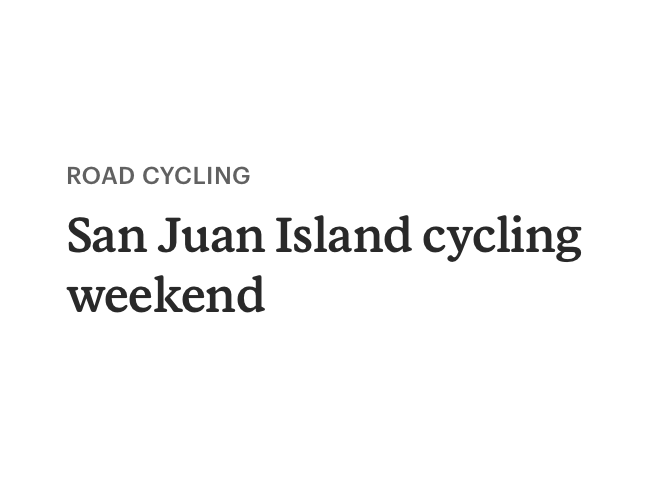
# Eyebrow
Eyebrows introduce a topic or show how an item is categorized. Content tags or certain label styles are two examples. Eyebrow text styles should not be used as headings or used for brand names.
<template>
  <cdr-text class="custom-eyebrow-class">
    Mon–Fri, 7am–5pm PT
  </cdr-text>
</template>
<style>
  @import '~@rei/cdr-tokens/dist/scss/cdr-tokens.scss';
  .custom-eyebrow-class {
    @include cdr-text-eyebrow-100;
  }
</style>
2
3
4
5
6
7
8
9
10
11
# Guidelines
# Do / don’t
# Italic and Strong Generic Classes
In addition to the specific type options listed above, we have provided two generic emphasis styles allowing you to make text italic or bold.
<template>
  <cdr-text class="custom-body-class">
    REI Co-op’s Trailsmith line was featured in
    <cdr-text
    tag="em"
    class="custom-italic-class">
    Field & Stream’s
    </cdr-text>
    “10 Best Pants for Working Outside”
  </cdr-text>
</template>
<style>
  @import '~@rei/cdr-tokens/dist/scss/cdr-tokens.scss';
  .custom-body-class {
    @include cdr-text-body-300;
  }
  .custom-italic-class {
    @include cdr-text-italic;
  }
</style>
2
3
4
5
6
7
8
9
10
11
12
13
14
15
16
17
18
19
20
<template>
  <cdr-text class="custom-body-class">
    This trip is rated as
    <cdr-text
    tag="strong"
    class="custom-strong-class">
    Vigorous [4]
    </cdr-text>.
  </cdr-text>
</template>
<style>
  @import '~@rei/cdr-tokens/dist/scss/cdr-tokens.scss';
  .custom-body-class {
    @include cdr-text-body-300;
  }
  .custom-strong-class {
    @include cdr-text-strong;
  }
</style>
2
3
4
5
6
7
8
9
10
11
12
13
14
15
16
17
18
19
# Accessibility
# Headings
To ensure that usage of this component complies with accessibility guidelines:
- Use h1-h6 to identify headings (
<h1>,<h2>,<h3>,<h4>,<h5>, and<h6>) - Headings are used to label page regions
- Use the aria-label attribute to associate headings with their page region, as described in the label page regions (opens new window) tutorial
- Subheadings are not semantic headings. Subheadings may be visually styled as a heading, but will not be navigable using a screen reader
- Assistive technologies skim the structure of a page:
- Allow users to navigate to or skip over sections through the use of heading levels
- Avoid skipping heading levels (e.g.,
<h2>to<h4>)
This component has compliance with WCAG SC 2.1.1 (opens new window) guidelines by:
- Defining semantic heading levels with the ability to assign predefined visual heading styles to each level
# Paragraphs
To ensure that usage of this component complies with accessibility guidelines:
- Text container does not exceed 634px or line length does not exceed more than 75 characters
- Minimize use of reversed-out body copy (light copy on a dark background) because it’s harder to read
- When possible, use the first sentence as an introduction to the paragraph. With screen readers, users can listen to the first sentence and then jump to the next paragraph
- Break long pages into shorter sections by organizing content into well-defined groups or chunks
This component has compliance with following WebAIM’s accessibility guidelines:
- WCAG SC 1.4.8: Visual presentation (opens new window): Cedar Design System text component provides for spacing for:
- Within paragraphs, line spacing is at least 1.5 times font height
# Implementation
Cedar uses design tokens to store typographic attributes that represent the fundamental decisions of Cedar’s visual language.
For more information about design tokens and a complete list of tokens available in Cedar, visit the Design Tokens overview.
# API
View it on Github: https://github.com/rei/rei-cedar-vue-2/tree/next/src/components/texttag
name
string
type
'p'
default
Sets valid HTML element tag.
# Slots
Find more information about using Slots in the article Installing Cedar.
default
name
Set the innerHTML for CdrText content. This includes text and html markup.
# Usage
The CdrText component allows for styling any HTML element with available text styles. Visual style and semantic meaning are managed independently by providing:
- A
tagproperty to control which type of element is rendered - Styling which can be applied with a custom CSS class and a text mixin
This method decouples the semantic meaning of a heading level from the visual representation.
With this decoupling, you can style other markup to look like a heading that semantically isn’t a heading.
When creating page headers, apply the correct semantic tag.
<template>
  <cdr-text tag="h1" class="custom-heading-class">
    A navigable semantic heading
  </cdr-text>
</template>
<style>
  @import '~@rei/cdr-tokens/dist/scss/cdr-tokens.scss';
  .custom-heading-class {
    @include cdr-text-heading-700;
    @include cdr-sm-mq {
      <!-- `cdr-sm-mq` mixin applies styling at small breakpoint and above -->
      @include cdr-text-heading-800;
    }
  }
</style>
2
3
4
5
6
7
8
9
10
11
12
13
14
15
Note that heading styles do not always need to be paired with heading tags. Heading tags should be used for accessibility purposes to describe the page hierarchy.
<template>
  <cdr-text class="custom-heading-class">
    Text styled as a heading for display only
  </cdr-text>
</template>
<style>
  @import '~@rei/cdr-tokens/dist/scss/cdr-tokens.scss';
  .custom-heading-class {
    @include cdr-text-heading-700;
    @include cdr-sm-mq {
      <!-- `cdr-sm-mq` mixin applies styling at small breakpoint and above -->
      @include cdr-text-heading-800;
    }
  }
</style>
2
3
4
5
6
7
8
9
10
11
12
13
14
15
CdrText components can be extended with other Cedar or custom classes.
<template>
  <cdr-text class="custom-body-class">
    This paragraph is adding a bottom margin to provide space between it and the paragraph below
  </cdr-text>
</template>
<style>
  @import '~@rei/cdr-tokens/dist/scss/cdr-tokens.scss';
  .custom-body-class {
    @include cdr-text-body-300;
    margin-bottom: $cdr-space-one-x;
  }
</style>
2
3
4
5
6
7
8
9
10
11
12
# Text Options
Heading Display
| UI toolkit | Token |
|---|---|
heading-display-800 | cdr-text-heading-display-800 |
heading-display-900 | cdr-text-heading-display-900 |
heading-display-1100 | cdr-text-heading-display-1100 |
heading-display-1200 | cdr-text-heading-display-1200 |
heading-display-1300 | cdr-text-heading-display-1300 |
heading-display-1400 | cdr-text-heading-display-1400 |
heading-display-1500 | cdr-text-heading-display-1500 |
heading-display-1600 | cdr-text-heading-display-1600 |
Heading Serif
| UI toolkit | Token |
|---|---|
heading-serif-200 | cdr-text-heading-serif-200 |
heading-serif-300 | cdr-text-heading-serif-300 |
heading-serif-400 | cdr-text-heading-serif-400 |
heading-serif-500 | cdr-text-heading-serif-500 |
heading-serif-600 | cdr-text-heading-serif-600 |
heading-serif-700 | cdr-text-heading-serif-700 |
heading-serif-800 | cdr-text-heading-serif-800 |
heading-serif-900 | cdr-text-heading-serif-900 |
heading-serif-1100 | cdr-text-heading-serif-1100 |
heading-serif-1200 | cdr-text-heading-serif-1200 |
Heading Serif Strong
| UI toolkit | Token |
|---|---|
heading-serif-strong-600 | cdr-text-heading-serif-strong-600 |
heading-serif-strong-700 | cdr-text-heading-serif-strong-700 |
heading-serif-strong-800 | cdr-text-heading-serif-strong-800 |
heading-serif-strong-900 | cdr-text-heading-serif-strong-900 |
heading-serif-strong-1100 | cdr-text-heading-serif-strong-1100 |
heading-serif-strong-1200 | cdr-text-heading-serif-strong-1200 |
Heading Sans
| UI toolkit | Token |
|---|---|
heading-sans-200 | cdr-text-heading-sans-200 |
heading-sans-300 | cdr-text-heading-sans-300 |
heading-sans-400 | cdr-text-heading-sans-400 |
heading-sans-500 | cdr-text-heading-sans-500 |
heading-sans-600 | cdr-text-heading-sans-600 |
Subheading Sans
| UI toolkit | Token |
|---|---|
subheading-sans-300 | cdr-text-subheading-sans-300 |
subheading-sans-400 | cdr-text-subheading-sans-400 |
subheading-sans-500 | cdr-text-subheading-sans-500 |
subheading-sans-600 | cdr-text-subheading-sans-600 |
Eyebrow
| UI toolkit | Token |
|---|---|
eyebrow-100 | cdr-text-eyebrow-100 |
Body
| UI toolkit | Token |
|---|---|
body-300 | cdr-text-body-300 |
body-400 | cdr-text-body-400 |
body-500 | cdr-text-body-500 |
Body Strong
| UI toolkit | Token |
|---|---|
body-strong-300 | cdr-text-body-strong-300 |
body-strong-400 | cdr-text-body-strong-400 |
body-strong-500 | cdr-text-body-strong-500 |
Utility Sans
| UI toolkit | Token |
|---|---|
utility-sans-100 | cdr-text-utility-sans-100 |
utility-sans-200 | cdr-text-utility-sans-200 |
utility-sans-300 | cdr-text-utility-sans-300 |
utility-sans-400 | cdr-text-utility-sans-400 |
utility-sans-500 | cdr-text-utility-sans-500 |
utility-sans-600 | cdr-text-utility-sans-600 |
utility-sans-700 | cdr-text-utility-sans-700 |
utility-sans-800 | cdr-text-utility-sans-800 |
Utility Sans Strong
| UI toolkit | Token |
|---|---|
utility-sans-strong-100 | cdr-text-utility-sans-strong-100 |
utility-sans-strong-200 | cdr-text-utility-sans-strong-200 |
utility-sans-strong-300 | cdr-text-utility-sans-strong-300 |
utility-sans-strong-400 | cdr-text-utility-sans-strong-400 |
utility-sans-strong-500 | cdr-text-utility-sans-strong-500 |
utility-sans-strong-600 | cdr-text-utility-sans-strong-600 |
utility-sans-strong-700 | cdr-text-utility-sans-strong-700 |
utility-sans-strong-800 | cdr-text-utility-sans-strong-800 |
Utility Serif
| UI toolkit | Token |
|---|---|
utility-serif-200 | cdr-text-utility-serif-200 |
utility-serif-300 | cdr-text-utility-serif-300 |
utility-serif-400 | cdr-text-utility-serif-400 |
utility-serif-500 | cdr-text-utility-serif-500 |
utility-serif-600 | cdr-text-utility-serif-600 |
utility-serif-700 | cdr-text-utility-serif-700 |
utility-serif-800 | cdr-text-utility-serif-800 |
Utility Serif Strong
| UI toolkit | Token |
|---|---|
utility-serif-strong-200 | cdr-text-utility-serif-strong-200 |
utility-serif-strong-300 | cdr-text-utility-serif-strong-300 |
utility-serif-strong-400 | cdr-text-utility-serif-strong-400 |
utility-serif-strong-500 | cdr-text-utility-serif-strong-500 |
utility-serif-strong-600 | cdr-text-utility-serif-strong-600 |
utility-serif-strong-700 | cdr-text-utility-serif-strong-700 |
utility-serif-strong-800 | cdr-text-utility-serif-strong-800 |
Helpers
| UI toolkit | Token |
|---|---|
italic | cdr-text-italic |
strong | cdr-text-strong |
Native Mobile App Tokens
Headings
Android: Display 1
iOS: Large Title
Suggested Usage: Frequently used as the largest title for phone apps and can be used for page titles for larger devices.
font-size | 34.00sp |
line-height | 40.00dp |
font-family | Stuart-App-Medium.otf |
Android: Title 1
iOS: Title 1
Suggested Usage: Content titles, level 1.
font-size | 26.00sp |
line-height | 36.00dp |
font-family | Stuart-App-Semibold.otf |
Android: Title 2
iOS: Title 2
Suggested Usage: Content titles, product names, level 2.
font-size | 24.00sp |
line-height | 32.00dp |
font-family | Stuart-App-Semibold.otf |
Android: Title 3
iOS: Title 3
Suggested Usage: Content titles, product names, product prices, level 3.
font-size | 19.00sp |
line-height | 28.00dp |
font-family | Stuart-App-Semibold.otf |
Android: Headline
iOS: Headline
Suggested Usage: Heading primarily used with body copy, list items, table headers.
font-size | 17.00sp |
line-height | 24.00dp |
Android: Subhead
iOS: Subhead
Suggested Usage: Subheading primarily used with body copy.
font-size | 15.00sp |
line-height | 20.00dp |
Body
Android: Body 1
iOS: Body
Suggested Usage: Default for body content.
font-size | 15.00sp |
line-height | 20.00dp |
Android: Body 2
iOS: Footnote
Suggested Usage: Secondary text intended for informational and supplemental body content.
font-size | 12.00sp |
line-height | 18.00dp |
Android: Caption 1
iOS: Caption 1
Suggested Usage: Tertiary text, also intended for informational and supplemental body content. Also used for bottom action bar text for larger devices.
font-size | 12.00sp |
line-height | 16.00dp |
Android: Caption 2
iOS: Caption 2
Suggested Usage: Smallest text size, use sparingly or for bottom tab bar text.
font-size | 11.00sp |
line-height | 16.00dp |
Buttons
Android: Button
iOS: N/A
Suggested Usage: Button text has a thicker weight than body copy.
font-size | 15.00sp |
line-height | 24.00dp |