Motion
# Overview
Cedar provides easy-to-use, preset values to apply consistent motion for components. Motion tokens help maintain a cohesive experience across all REI properties by:
- Storing motion attributes for duration or timing using variable names, not hard-coded values such as cubic-bezier (0.15, 0, 0.15, 0)
- Specifying a hierarchical and semantically-defined system
Motion tokens are primarily used with web applications. Motion tokens for mobile devices are not currently available.
# Duration
- Animated components use short time durations so interactions feel responsive and succinct
- Recommended range for animated durations is from 100ms to 600ms
- Striking a balance is key - slow enough to comprehend and fast enough to respect the customer’s time
- From Nielsen Norman Group research:
- 100ms is perceived as instant. Users feel that they are directly causing something to happen on the screen
- Delays between 100ms and 1 second gives users the impression that the website is working and causing the result to appear
| cdr-duration-1-x |
|
Value: 0.10s Usage: Perceived as instant or very fast. Often used for selection controls such as radio buttons, checkboxes, or toggle buttons. |
| cdr-duration-2-x |
|
Value: 0.20s Usage: Perceived as fast. Often used for hover or fading effects or icons that change shape, such as switching between a play button and a pause button. |
| cdr-duration-3-x |
|
Value: 0.30s Usage: Perceived as normal. Often used for revealing content, such as the opening of a panel for the accordion component. |
| cdr-duration-4-x |
|
Value: 0.40s Usage: Perceived as slow. Often used for revealing content on a tablet device because the screen is bigger than a phone or wearable device. |
| cdr-duration-5-x |
|
Value: 0.50s Usage: Perceived as slower. Often used for icons with detailed animation, such as a ringing alarm clock or opening and closing a lock icon. |
| cdr-duration-6-x |
|
Value: 0.60s Usage: Perceived as very slow. Often used for larger movement, such as revealing page content when switching tabs for the tabs component. |
# Easing
Cedar’s collection of easings are based on physics found in the natural world. They respond quickly when invoked and slow down over time to ease into their final position. This communicates a sense of physicality and reflects the customer's expectation of objects moving in the real world. Best used with any UI element that opens or closes, such as the accordion or modal components.
| cdr-timing-function-ease-out |
|
Value: cubic-bezier(0.32, 0.94, 0.60, 1) Specifies a transition effect that will feel responsive. This timing effect moves quickly at the beginning with a slow end. Use this animation when users expect an immediate response to their action such as clicking on an accordion or button. |
| cdr-timing-function-ease |
|
Value: cubic-bezier(0.15, 0, 0.15, 0) Specifies a transition effect that is known as ease-in-out. This timing function can be quite satisfying for users because it has a slow start, a fast middle, and a slow end. Use this effect when users do not expect motion to occur. A suitable duration is 300-500ms for this timing function. |
| cdr-timing-function-linear |
|
Value: cubic-bezier(0, 0, 1, 1) Specifies a transition effect with the same speed from start to end. Be cautious using this effect because objects in the real world don’t usually move with a linear motion. Best for things like opacity fades. |
# Comparison of Timing Tokens
| cdr-timing-function-ease-out | |
| cdr-timing-function-ease | |
| cdr-timing-function-linear |
# Guidelines
Cedar motion is purposefully designed to enhance the customer's understanding of REI’s digital products. Components use animated interface patterns to reduce cognitive load and imbue a natural interactivity. It’s an important part of building customer trust and affinity for our products.
# Use When
- Reducing cognitive load. For example, when a product image slides to reveal the next or previous product image after a user clicks on a directional arrow
- Attracting the user’s attention. For example, when a toast message moves down from the top browser bar for region-specific warning messages
- Providing context with transitions of a single object. For example, rotating an arrow icon to show an accordion panel opening and closing
- Showing continuity through the system with transitions between objects. For example, using animation to reveal a modal window
- Keeping users interested during loading or long processing times by providing delightful animations
# Don't Use When
- Adding the animation could waste the user’s time
- Entertaining the user, rather than helping them to accomplish their goals
# Accessibility
- Do not cause the screen to flash more than three times a second
- For any animation that starts automatically and plays for more than 5 seconds, provide pause controls. For example, auto-updating content and ambient videos
# Interface Patterns
# Transitions
Use the transition pattern when:
- Moving users from one page to another page
- Transition out of one task to another
- Replacing large portions of information
| Accordion | |
 | The arrow icon rotates using ease out timing with 300ms duration. When opening, the Accordion content is revealed using the ease timing with 300ms duration. When closing, the duration changes to 200ms to hide content. When opening or closing, the panel content fades on and off using linear timing at 100ms. View Accordion component. |
| Tabs | |
 | Ease out timing is used for updating the tab bar and revealing new content. Duration was initially set at 600ms. During the development phase, the duration was updated to 500ms. View Tabs component. |
# Supplements
Use the supplements pattern when:
- Bringing information on or off of the page without changing the user's location
- Adding or updating bits of additional content on the page
There are currently no components in the Cedar Design System that use supplemental animation. Common examples of this type of animation are:
- Modals
- Popovers
- Tooltips
# Feedback
Use the feedback pattern when:
- Giving users direct feedback about their interactions
- Linking a human action to an interface's reaction
- Keeping the user interested during slow page-loading times
| Buttons | |
|---|---|
 | When user hovers on or off, color changes instantaneously. View Button component. |
| Breadcrumb | |
|---|---|
 | When users hovers on or off, an underline style is applied to the link text. View Breadcrumb component. |
# Demonstrations
Use the demonstrations pattern when:
- Explaining how something works
- Showing a process through action, instead of telling what's happening
There are currently no animations on the REI site that are demonstrations. An example of this type of animation is when a group of files emerge from the downloads icon on the Mac dock interface.
# Decorations
Use the decorations pattern when:
- Creating an emotional connection between the interface and the user
- Sparking visual interest by keeping the user engaged
- Delighting a user's experience without conveying new information
There are no animations on the REI site that are decorative. For examples of decorative animations, view 15 Latest and Best Loading Animations to Make User Enjoy Waiting (opens new window).
# Creating New Motion Tokens
CSS animation frame rate for interface elements is dependent on the speed of the browser and computer:
- For animations running at less than 15fps, users will not be able to see continuous motion
- Most devices refresh their screen at 60 times a second
For smooth and responsive animation, use CSS attributes for:
- Position: Using transform property for
translate(), to reposition an element in the horizontal or vertical directions - Scale: Using transform property for
scale(), to resize an element on 2D plane - Rotation: Using transform property for
rotate(), to rotate an element on x, y, or z axis - Skew: Using transform property for
skew(), to distort an element on the 2D plane - Opacity: Specifies the opacity or transparency of an element with values from 0.0 - 1.0. Lower values cause the element to be more transparent
For more information, visit Adding Tokens to the Repository.
# Glossary
| Glossary Term | Description |
|---|---|
| animation | An illusion of movement created by displaying a series of pictures or frames. |
| aspect ratio | 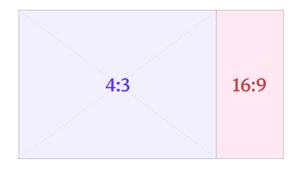 The relationship between the width of an image to its height. Standard ratios are 16:9 for widescreen and 4:3 for television. |
| Bézier curve | A method of defining curved lines invented by French mathematician Pierre Bézier. For animation, a Bézier curve can be used to specify the velocity over time of an object such as an icon moving from A to B. Bézier curves are often used to replicate the physics found in the natural world. For the animation function, cubic-bezier (p1, p2, p3, p4), the p1 and p3 values must be in the range of 0 to 1. |
| cross dissolve | A transition effect used to fade one image into a different image simultaneously: one fades in while the other fades out. |
| ease-in | 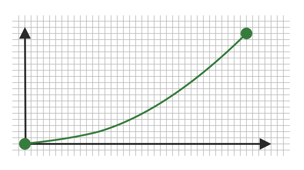 Specifies a gradual acceleration in the action with a slow start and quick ending. Ease-in is not recommended because it may negatively impact the user's perception of your site's responsiveness by feeling sluggish at the start. A common value for the cubic-bezier is (0.25, 0.1, 0.25, 1.0). Also known as slow-in. |
| ease-in-out | 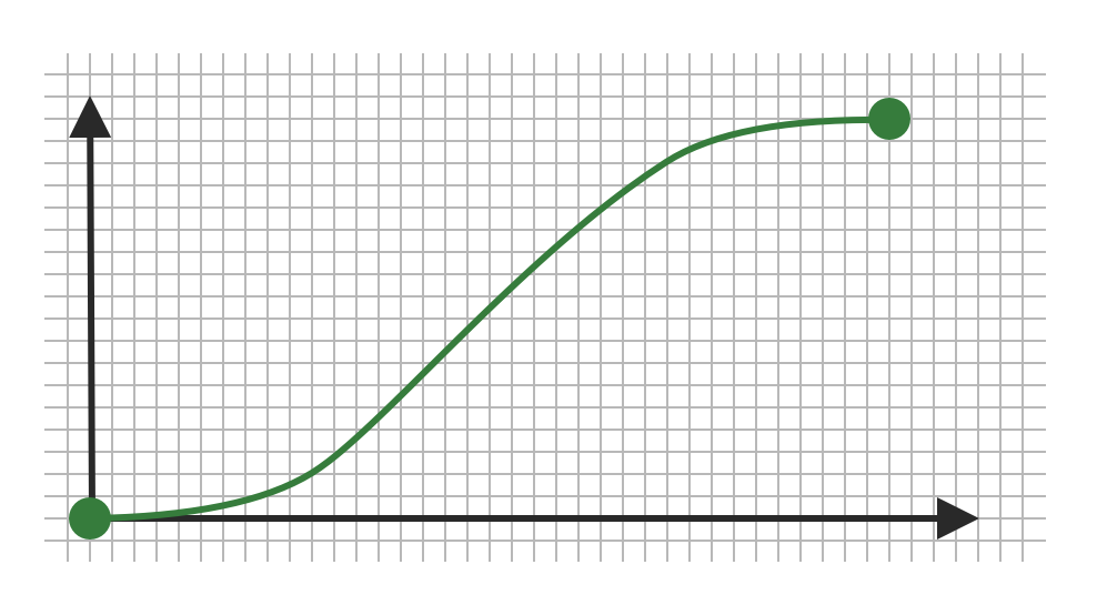 Specifies a gradual acceleration at the start until the middle of the action. Then, a gradual deceleration in the action at the end. This timing function can be quite satisfying for users because it has a slow start, a fast middle, and a slow end. Do not use this timing function for a long animation duration because of the sluggishness of the ease-in start. A suitable duration is 300-500ms for this timing function. Cedar’s token cdr-timing-function-ease uses this function. |
| ease-out | 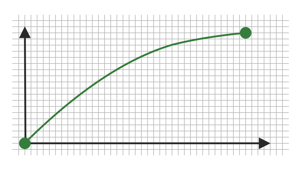 Specifies a gradual deceleration in the action with a fast start and slow ending. Ease-out is recommended because it gives the animation a feeling of responsiveness. It also allows a natural slowdown at the end. A common value for the cubic-bezier is (0, 0, 0.58, 1.0). Also known as slow-out. Cedar’s token cdr-timing-function-ease-out |
| fade in | Specifies a transition effect used to open a sequence. The first image gradually appears from complete transparency to its complete opacity. |
| fade out | Specifies a transition effect used to close a sequence. The last image gradually disappears, going from complete opacity to complete transparency. |
| frame rate | The frame rate is measured by the number of frames recorded or played back each second. It is denoted as fps (frames per second). For example, an animation could be played back at 12, 15, 24, 25, 30 or 60 frames per second or any other number. |
| linear | 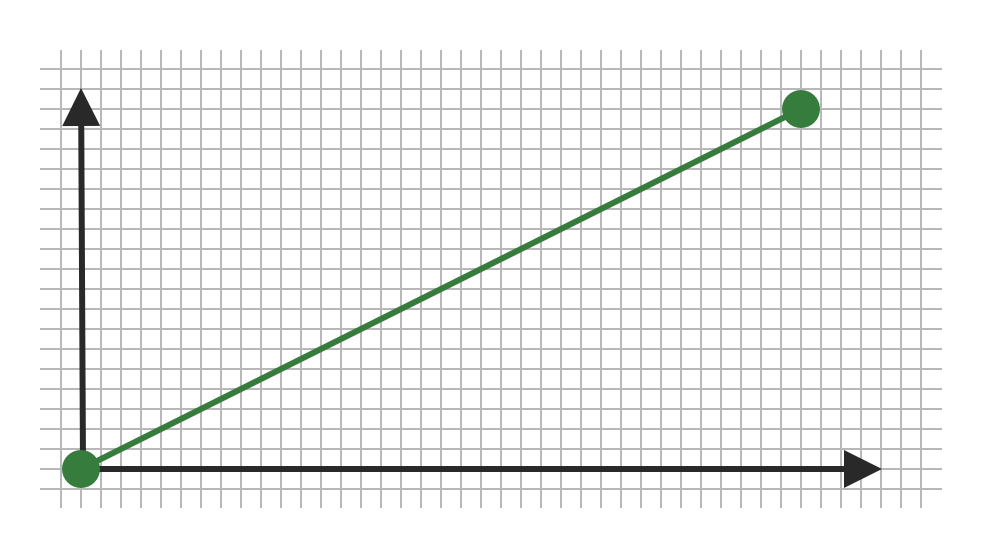 Specifies an even speed in the action. A common value for the cubic-bezier is (0.0, 0.0, 1.0, 1.0). This is commonly used for opacity transitions. Cedar’s token cdr-timing-function-linear |
| path of action | Specifies direction that the action will follow. |
| slow-in | Specifies a gradual acceleration in the action with a slow start and a quick ending. Also known as ease-in. |
| slow-out | Specifies a gradual deceleration in the action with a fast start and a slow ending. Also known as ease-out. |
| timeline | A horizontal representation of a scene's elements, timing, and keyframes. |
| transition | An effect that happens between two images or scenes. Common transition effects are cross-dissolve and wipe. |