Checkboxes
CdrCheckbox
Permits user to make one or more selections from a list
# Overview
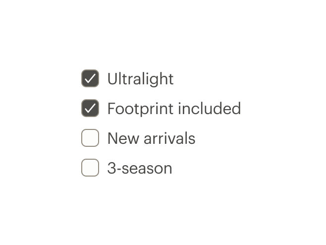
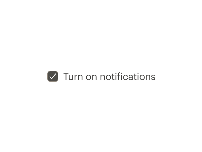
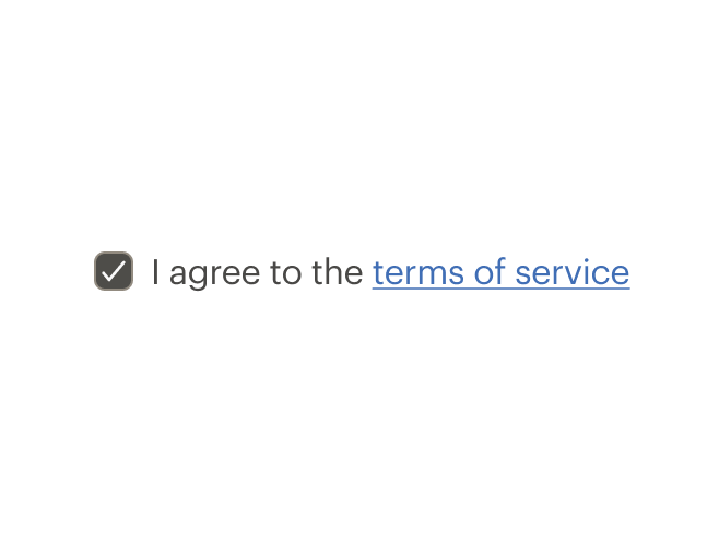
# Default (Medium)
Default and standard spacing for checkboxes.
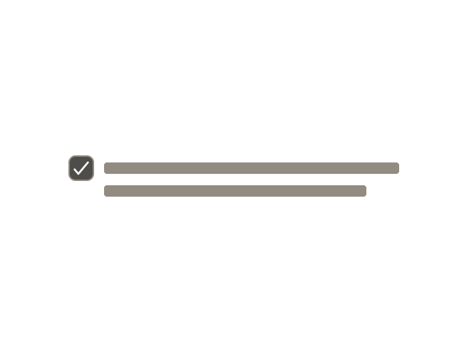
# Size
Different sizing for checkboxes.
# Custom True/False Value
Use a custom value in place of true/false checked state.
# Custom Model Value
Use an array as the model to track a list of custom values.
# Handling Change Events
Pass checkbox data into change handlers.
# Indeterminate
Displays status for checkbox group by indicating that some of the sub-selections in a list are selected. Provides user with ability to select or unselect all items in the list’s sub-group.
Note the usage of aria-controls, id, role, aria-label, and aria-labelledby.
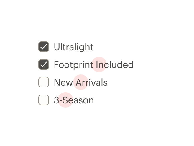
# Custom
Custom styles for checkboxes.
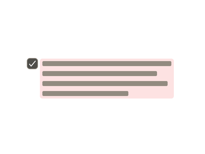
# Validation
Render a checkbox group with validation and error state
# Accessibility
Many WCAG requirements are contextual to their implementation. To ensure that usage of this component complies with accessibility guidelines you are responsible for the following:
- Each checkbox must be focusable and keyboard accessible:
- When the checkbox has focus, the Space key changes the selection
- Tab key moves to next element in list
CdrFormGroupshould be:- Used when associating group of checkboxes
- Identified or described as a group using the
labelproperty or slot
- Avoid nesting
CdrFormGroup - Single checkboxes:
- May be interchangeable with a toggle or Radio Button
- Write labels to be self-explanatory
- Custom checkboxes maintain accessibility requirements. The checkbox icon is only visually hidden and replaced with custom style
This component has compliance with WCAG guidelines by:
- Wrapping the input in a label element and label is automatically associated with it
For more information, review techniques and failures for:
- WCAG 2.0, 1.3.1 Info and Relationships (opens new window)
- WCAG 2.0, 3.3.2 Labels and Instructions (opens new window)
# Guidelines
# Use When
- Selecting one or multiple choices from a list
- Selecting options from a list that contains sub-selections
- Choosing "yes" or "no" when there is a single option (stand-alone checkbox)
- Viewing all available options is needed
- Comparing between a list of selections is desired
# Don't Use When
- Selecting from a list when only one choice is allowed. Instead, use Radio Buttons
# Content
When using checkboxes in a list:
- Use a logical order, whether it’s alphabetical, numerical, or time-based
- Labels should have approximately equal length
- Clearly communicate the effect of selecting the option
- Provide a link or include a subtitle for more information. Don’t rely on tooltips to explain a checkbox
Checkbox labels should:
- Start with a capital letter
- Use sentence case
- Use positive phrasing so that the label describes the selected state
- Avoid long labels
- Be written as sentence fragments
- No terminal punctuation
# Do/Don't
# Behavior
Checkboxes work independently from each other:
- Selecting one checkbox shouldn’t change the selection status of another checkbox in the list
- When parent checkbox is used for a bulk selection action, all child checkbox items will be selected or not selected
- Use a standalone checkbox for a simple toggle selection. Don’t use radio buttons or toggles
# Resources
# API
View it on Github: https://github.com/rei/rei-cedar-vue-2/tree/next/src/components/checkbox# Props
This component will bind any attribute that a native HTML checkbox element (opens new window) accepts.
labelClass
name
string
type
N/A
default
Adds CSS class to the label for custom styles.
inputClass
name
string
type
N/A
default
Adds CSS class to the input for custom styles.
contentClass
name
string
type
N/A
default
Adds CSS class to the slot wrapper for custom styles.
indeterminate
name
boolean
type
false
default
Shows checkbox in indeterminate state. This is a visual-only state with no logic for when to show it.
trueValue
name
string, number, boolean, object, array, symbol, function
type
true
default
The value when checked.
falseValue
name
string, number, boolean, object, array, symbol, function
type
false
default
The value when unchecked.
customValue
name
string, number, boolean, object, array, symbol, function
type
false
default
The value when used in a checkbox group. Replaces `trueValue` and `falseValue`.
modifier
name
string
type
N/A
default
Modifies the style variant for this component. Possible values: { ‘hide-figure’ }
size
name
string
type
'medium'
default
Sets the checkbox size; values can target responsive breakpoints. Breakpoint values are: xs, sm, md, and lg. Examples: { 'small' | 'medium' | 'large' | 'large@sm' }
# Slots
Find more information about using Slots in the article Installing Cedar.
default
name
Sets the innerHTML for CdrCheckbox. This is the readable text for the <label> element.
# Events
change
name
newValue, event
arguments
$emit event fired on check/uncheck.
# Component Variables
# Usage
The CdrCheckbox component requires v-model to track :checked values.
This example uses true-value and false-value props to change what’s saved to the model.
<template>
  <cdr-checkbox
    v-model="model"
    true-value="checked"
    false-value="unchecked"
  >
    Option 1
  </cdr-checkbox>
</template>
2
3
4
5
6
7
8
9
Use custom-value with a shared model to create a checkbox group that will track multiple checkbox values.
<template>
  <cdr-checkbox
    v-model="groupModel"
    :custom-value="{ value: ‘D’ }"
  >
    Option 1
  </cdr-checkbox>
  <cdr-checkbox
    v-model="groupModel"
    :custom-value="[ 9, 10 ]"
  >
    Option 2
  </cdr-checkbox>
</template>
2
3
4
5
6
7
8
9
10
11
12
13
14
If both values are checked, the model would be [ { value: ‘D’ }, [ 9, 10 ] ]. Unchecking either checkbox would remove its value from the model array.
Default checkbox to checked/unchecked state by setting the model in Javascript.
<template>
  <cdr-checkbox
    v-model="groupModel"
    :custom-value="{ value: ‘D’ }"
  >
    Option 1
  </cdr-checkbox>
  ...
</template>
<script>
  ...
  data() {
    return {
      groupModel: [ { value: ‘D’ } ],
    };
  },
}
</script>
2
3
4
5
6
7
8
9
10
11
12
13
14
15
16
17
18
Set the indeterminate prop to true to generate an indeterminate checkbox, which looks different than the default. This is a visual styling only; it does not include any of the functional aspects of an indeterminate checkbox. To see a functioning example see the indeterminate example.
<template>
  <cdr-checkbox
    v-model="groupModel"
    :indeterminate="true"
  >
    Option 1
  </cdr-checkbox>
  ...
</template>
2
3
4
5
6
7
8
9
# Modifiers
Following variants are available to the cdr-checkbox modifier attribute:
| Value | Description |
|---|---|
| 'hide-figure' | Hides the checkbox icon |
Use the hide-figure modifier to hide the checkbox itself, which leaves the text label as the clickable element. Add appropriate custom styles to convey selected and unselected states.
<template>
  <cdr-checkbox
    v-model="model"
    name="model"
    value="model"
    modifier="hide-figure"
    input-class="no-box"
    content-class="no-box__content"
  >
    Add to cart
  </cdr-checkbox>
</template>

<style>
.no-box:checked ~ .no-box__content {
   color: green;

   &::after {
     content: '(checked)';
   }
 }
</style>
2
3
4
5
6
7
8
9
10
11
12
13
14
15
16
17
18
19
20
21
22