Popover
CdrPopover
Small overlay used to display contextual information
# Overview
CdrPopover is a wrapper component that accepts a trigger element and popover content. When the trigger element is clicked, the popover content is rendered. Event bindings between the trigger and the popover are set up automatically. The popover will dynamically update its position property to ensure that it renders on screen, though this functionality can be disabled by setting autoPosition to false.
# Custom Trigger
CdrPopover can also be controlled programmatically using the open prop. However, doing so means that you must implement certain behavior yourself:
- The CdrPopover element and the trigger element must be wrapped in a div with
position: relativeandwidth: max-content. - The
openproperty should be toggled to true when the trigger element is clicked. - You will need to add an event listener on the CdrPopover element for the
@closedevent. In the example below we use@closed="open = false"to change the value passed to theopenprop. - The trigger element should have it's
aria-controlsproperty set to the ID of the CdrPopover, and it'saria-haspopupproperty set to "dialog".
# Accessibility
To ensure your usage of this component complies with accessibility guidelines you are responsible for the following:
- Set an
idproperty on the CdrPopover. The component will automatically link thatidto the trigger element. - Content passed in to the
triggerslot must be an actionable element such as a button. - Popovers can contain complex content structures such as headers, lists, and actionable items that provide related additional content to the section of the triggering element.
This component complies with WCAG guidelines by:
- Adds click handler to trigger element that manages popover state.
- When opened, moves focus to the first actionable element inside the popover.
- When closed, restores focus to the last active element before the popover was opened.
- Dynamically sets
aria-controlson the trigger element to point to the id of the tooltip. - Sets
aria-haspopup="dialog"on the trigger element. - Dynamically sets
aria-expandedon the popover content. - Adds
role="dialog"to the tooltip content. - Popover content is not visible to screen readers when it is closed.
- Popover can be closed by pressing the close button in the top right corner, by pressing the
esckey, or by clicking anywhere outside of the popover content.
# Guidelines
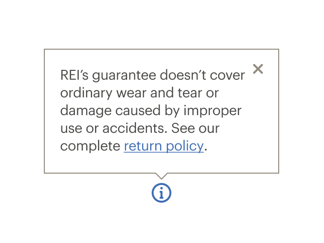
A popover is a floating container useful for communicating small amounts of clarifying information. It's revealed through acting upon a trigger, like a button, but can also be used to preemptively bring attention to new interface features.
# Use when
Use a popover when a subset of users require additional information.
Example:
- When the co-op requests a user’s email, a popover is used to explain why an email is required and the ways in which it might be used.
- Some users aren’t familiar with a credit card security field. Using a popover, describe specifically where to find the information being asked for the identified card type.
# Don’t use when
- Don’t put critical information in a popover. Instead, place the information inline so that it’s always visible to users.
- Don’t put excessive content into popover. Instead, use a Modal.
Example:
- The terms and conditions of a free shipping offer needs to be easily viewed, if desired. Place the lengthy details of the offer in a modal, not a popover.
# Do / Don't
# API
View it on Github: https://github.com/rei/rei-cedar-vue-2/tree/next/src/components/popover# Props
id
name
string
type
default
Id for the CdrPopover element. Required for accessibility.
position
name
string
type
'top'
default
Sets the position where the popover will render relative to the trigger element. Possible values: 'top' | 'bottom' | 'left' | 'right'
autoPosition
name
boolean
type
true
default
If set to `true`, popover will attempt to dynamically set it's position to ensure it renders within the visible browser window. If `false` the popover will always render in the provided `position`.
contentClass
name
string
type
default
Adds a custom class to the popover content wrapper. Allows for overriding it's size, styling, etc.
open
name
boolean
type
default
Used to programmatically control the popover state. Does not need to be set if you are using the `trigger` slot. See the Custom Trigger examples for more info.
# Slots
Find more information about using Slots in the article Installing Cedar.
default
name
Slot for CdrPopover content.
trigger
name
Slot for the element that triggers the popover. Element should be a button and must be the first and only child of this slot. Event handlers are bound to this element automatically.
# Events
closed
name
$emit event fired when tooltip is closed.
opened
name
$emit event fired when tooltip is opened.