Select
Dropdown, CdrSelect, cdr-select
Allows a user to select one or more options from a dropdown list
# Overview
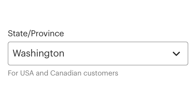
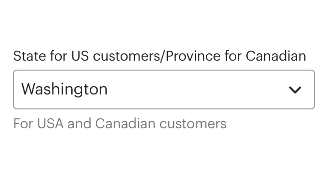
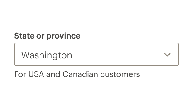
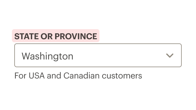
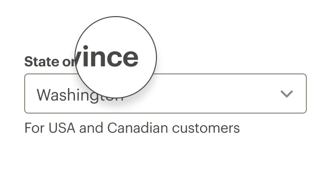
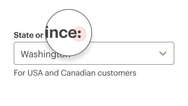
# Default (Medium)
Basic select control with label.
# Bare
Basic select control with no label.
# Select with Link Text
Select control with link text on right.
# Select with Info Action
Select control with icon outside select field on right.
# Select with Helper Text
Input field with helper or hint text below the input field.
# Validation
Error prop and slot can be used to render the select in an error state
# Multiple Select
CdrSelect can be rendered as a multi-select by passing the native HTML select multiple attribute. The multipleSize prop can be used to control the height of the multi-select.
# Nested Options
CdrSelect can be rendered with nested options using the optgroup tag.
# Accessibility
To ensure that the usage of Select component complies with the accessibility guidelines:
- Always provide a label for each select control
- The
hide-labelproperty can be used to visually hide the label text while still leaving it available to screen readers
When using the aria-describedby:
aria-describedbyattribute does not override the select label- Use this attribute in addition to a label
- Can be used to reference descriptions that appear as 'tooltips'
- Content passed into the
helper-textslot is automatically linked to thearia-describedbyattribute
This component has compliance with WCAG guidelines by:
- Requiring a value for the
labelfield - When hiding a label, the
aria-labelattribute is set to thelabelvalue - Links
helper-textcontent to the input field using thearia-describedbyattribute
# Guidelines
# Use When
- Choosing an option from a predefined set of values
- Recommending a default option for most users
# Don't Use When
- Viewing or comparing all options is needed. Instead, use Radio Buttons
- Displaying a limited number of options. Instead, use Radio Buttons
- Displaying a "yes" or "no" selection. Instead, use Radio Buttons
- Turning an option on or off. Instead, use Checkboxes
- Setting a value is required. Instead, use Radio Buttons
- Displaying more than 10 options. Instead, use Inputs
- Sending the user to other areas of the site. Instead, use Links
# The Basics
Select and dropdown components tend to look similar, but have different functionality. While select is used for selecting from a list of options and submitting that data, dropdowns contain links and take users elsewhere. Also, the select appearance is owned by the browser, whereas dropdowns can be styled.
Select components should be:
- Identifiable: Select fields should indicate that users can change its value
- Findable: It should be easy to find a select field among other elements
- Legible: Select fields indicate their state such as enabled, focused, or disabled
# Options
- Define width using CSS styles
- Height options are medium and large. These variations can be used for creating media queries for responsive layouts, or to call more or less attention to the component.
# Content
# Labels
- Use concise and consistent labels that describe the meaning of the select field
- Limit labels to 1–3 words and fewer than 20 characters, including spaces
- Use sentence case only. Do not use all caps, title case, or lowercase
- Don’t use colons after labels
# Prompt Text
- Limit prompt text to 1–3 words
- Use descriptive prompt text for accessibility users who use screen readers to fill out forms
# Menu or List Text
- Use sentence case
- Simplify the list. If an option is rarely selected, consider removing it from the list
- Use common sort order for menu items. Options include:
- Frequency of use (recommended): For example, commonly-used credit cards would be listed first
- Alpha: For example, state or city locations
- Numeric: For example, distances or sizes
# Helper Text
- Use helper text for hints or suggestions
- Be succinct. Too much helper text can make a form look and feel difficult to use
# Icon
- Use icons to trigger a popover or tooltip for hints or suggestions
- Reference Cedar's icon guidelines for additional information
# Link Text
- Use a link in the
infoslot when moving or navigating to another page or to a different portion of the same page - Use if navigating user to long or complex information
- Reference the Links component article for more information
# Do / Don’t
# Behavior
- Avoid changing options in a dropdown menu based on the input from a different select field
- Use a prompt in the format of “Select a…” or “Select category…”
# Required Fields
- An asterisk will appear next to the input label if the status is required and the input field will have
aria-requiredset
# Validation
- Validate the user’s data before form submission. The
errorproperty and slot can be used to render a message on error.
# API
View it on Github: https://github.com/rei/rei-cedar-vue-2/tree/next/src/components/select# Props
This component will bind any attribute that a native HTML select element (opens new window) accepts.
id
name
string
type
auto-generated
default
`id` for the select that is mapped to the label `for` attribute. If one is not provided, it will be generated.
label
name
string
type
N/A
default
Sets the text value for the select label. Required for a11y compliance. Use ‘hideLabel’ if the label display is not desired. Required.
hideLabel
name
boolean
type
false
default
Visually hides the label element, but leaves it available to screen readers for a11y compliance.
prompt
name
string
type
null
default
Adds an option that is disabled and selected by default to serve as a `placeholder` for the select.
options
name
array
type
null
default
Build options programatically with data. Provide an array of objects [{ text: String, value: String}] for greater control or provide an array of strings ['String'] for simpler setup (value and text will be the same).
required
name
boolean
type
false
default
Sets aria-required on the input field and displays an asterisk next to the select label
optional
name
boolean
type
false
default
Displays '(optional)' text next to the select label.
error
name
boolean
type
false
default
Sets the select to an error state, displays the `error` slot if one is present.
errorRole
name
string
type
status
default
Sets the `role` attribute for the embedded error state messaging.
size
name
number
type
medium
default
Sets the select field size. Possible sizes are: { ‘medium’ | ‘large’ }. Also works with responsive breakpoints. Breakpoint values are: xs, sm, md, and lg. Examples: { 'small' | 'medium' | 'large' | 'large@sm' }
multiple
name
boolean
type
false
default
Turns CdrSelect into a multi-select element.
multipleSize
name
number
type
null
default
Sets the height of the CdrSelect when using the multiple option. This number corresponds to the number of select options that will be visible without scrolling.
background
name
string
type
primary
default
Set which background color the select is being rendered on. Adjusts styling to ensure accessibility. Possible options are: { ‘primary’ | ‘secondary’ }.
# Slots
default
name
Sets the innerHTML for CdrSelect, used to pass in `<option>` tags. Leave empty if using the `options` prop.
error
name
Error messaging text that is displayed when the `error` prop is true.
info
name
Location for information link or icon markup to the right above the select field.
info-action
name
Location for icon button rendered to the right outside the input field
pre-icon
name
Location for icon markup to the left inside the select field.
helper-text
name
Location for helper or information text to the left above the select field.
# Events
All event listeners are passed through to the <select> element.