Status Notifications
Page and section errors, warnings, success or status responses based on user input
# Overview
Status Notifications inform users that something on the page has changed. These responses help users understand page processes, actions they have competed, additional options available, or actions still needing attention. Common examples include success and warning messages.
Depending on the information being communicated, status notifications can be persistent or transient. While it’s important to keep users informed when there is an update or status change, these notifications should not be page blocking.
# Persistent Status Notifications
Persistent Status Notifications are 'in page messages' presented to the user based on conditions the user has created via a selection of product or adjustment of settings.
| Priority | Prominent, medium priority |
|---|---|
| Expectancy | Unexpected |
| Purpose |
|
| Interaction | Non-blocking, not required |
| Information | Advisory ancillary information |
| Location | Inline on page, generally located in associated section of effected content |
| Options |
|
| Components |
|
# Use When
- Exposing a status change to a product caused by user selection
- Providing confirmation when updating and removing items that provides navigation or other actions
- To increase visibility of existing errors
- When valid form options cause invalid selections
# Don't Use When
- Changing inline content based on user selection (see Update Notifications)
- The notification relates to an actionable element in a busy state (see Loading Notifications)
- Confirming that a task or process initiated by the user was completed successfully (see Transient Status Notifications)
- Providing contextual information on the page processes (see Transient Status Notifications)
- Providing errors, warnings, or success messaging related to user entered formatting, incomplete inputs, or invalid selections (see Validation Notifications)
- Providing summaries of errors, warnings, or success messaging related to form submission (see Validation Summaries)
- The content added to the page is critical and needs immediate attention (see Alerts)
- Page usage should be blocked until the user takes an action within the message or exits (see User Confirmation Alerts)
- User interaction is required or content is critical to the user flow (see Modal)
- The message contains a rich UI experience (see Modal)
- The user makes a selection that does not change or add content to the page
- As the only indication of an error
# Implementation
# Anatomy of a Persistent Status Notification
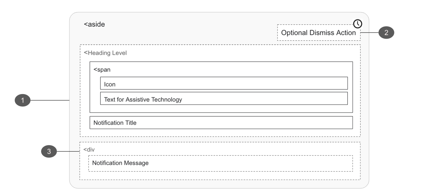
# Status Container
- Must
- Add
role=”status”to the markup on activation, announcing the notification without interrupting the page flow of the user - Add ID to be referenced via
aria-controlson the element which is causing the notification - Ensure the notification container is able to receive focus
- If moving focus to the notification, the notification content container must be dismissible
- Add
- Should
- Ensure an element with role status does not receive focus as a result of change in status
- Make the relationship between page controls and the notification explicit with the
aria-controlsattribute if another part of the page controls what appears in the status
- Should not
- Open as a blocking overlay window
- Move focus automatically to the notification
- Direct the user to a new page or window
- Overuse notifications as they may interrupt the user experience
- Reuse bespoke UI intended for other message or navigation types
- May
- Display notifications in unique UI to create distinction around themselves and the the page content
- Open or update content in locations unrelated to the action which caused the notification to appear
- Update a live region of the page
- Use the HTML
<aside>tag, denoting the section that, though related to the main element, doesn't belong to the main flow
# Optional Dismiss Action
- Must
- Ensure the notification will not be removed if keyboard focus or mouse hover is within or over the notification
- Return user focus to a logical location
- Provide at least one focusable UI element (i.e. Close button, primary button)
- Should not
- Create notifications that disappear automatically
# Message
- Should
- Clearly communicate what is happening
# Transient Status Notifications
Transient Status Notifications are temporary messages that come and go without user input. They indicate the completion of a task or process initiated by the user or the application itself.
| Priority | Low, minimally disruptive |
|---|---|
| Expectancy | Unexpected |
| Purpose |
|
| Interaction |
|
| Information | Advisory ancillary information |
| Location |
|
| Options |
|
| Components | Toast |
| Examples |
|

# Use When
- Confirming that a task or process initiated by the user was completed successfully
- Providing contextual information on the page processes
# Don't Use When
- Changing inline content based on user selection (see Update Notifications)
- The notification relates to an actionable element in a busy state (see Loading Notifications)
- Exposing a status change to a product caused by user selection (see Persistent Status Notifications)
- Providing error or warnings on the status of items in the users cart (see Persistent Status Notifications)
- Providing confirmation when updating and removing items that provides navigation or other actions (see Persistent Status Notifications)
- Notifying users of a potential problem, outside of a form, that may require their attention (see Persistent Status Notifications)
- Providing errors, warnings, or success messaging related to user entered formatting, incomplete inputs, or invalid selections (see Validation Notifications)
- The content added to the page is critical and needs immediate attention (see Alerts)
- Page usage should be blocked until the user takes an action within the message or exits (see User Confirmation Alerts)
- User interaction is required or content is critical to the user flow (see Modal)
- The message contains a rich UI experience (see Modal)
- The user makes a selection that does not change or add content to the page
# Anatomy of a Transient Status Notification
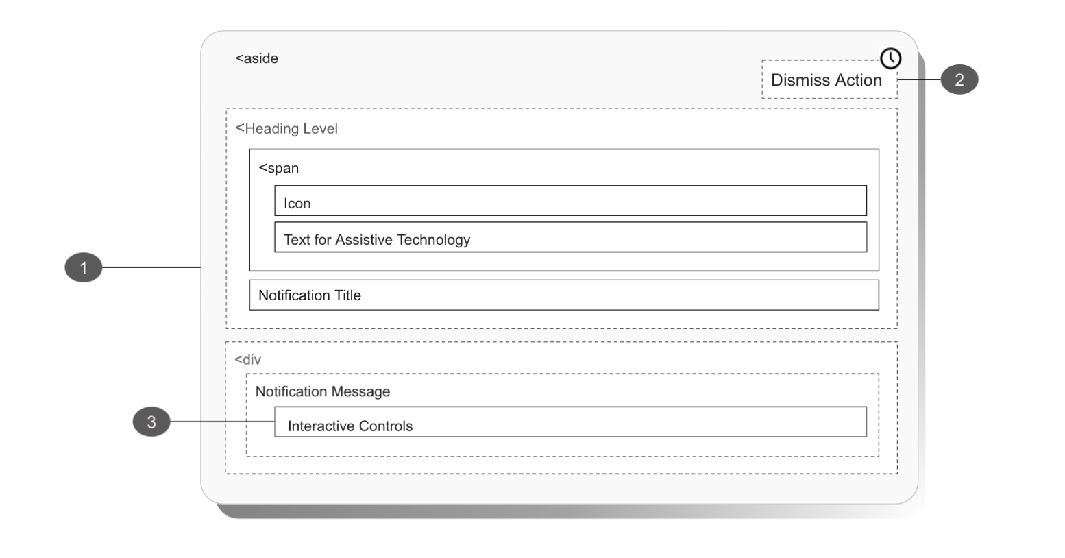
Transient Status Notifications have the following requirements in addition to the requirements for Persistent Status Notifications (TODO should requirements that are pertinent be additive or all inclusive?)
# Status Notifications as an overlay
The concise messages contained within Status Notifications are not required for a user to interact with, may open unexpectedly, and should not be blocking. Note that opening in an overlay may disrupt or confuse users and may not be seen at all by users at some breakpoints.
- Must
- Not block page content
- Return user focus to a logical location
- If moving focus to the notification, the notification:
- Must provide at least one focusable UI element (i.e. close button, primary button)
- Content container must be dismissible
- On dismiss, must return focus to the next logical location in the page flow
- Meet the standard color ratio requirements for both text (4.5:1) and activatable components (3.0:1)
- Should
- Be used for short messages to confirm an action
- Should not
- Be located near or on top of navigation area
- Contain interactive controls if notification is displayed as an overlay
- Open as a blocking overlay window
- May
- Appear as a timed display
If opening a Status Notification consider the following:
- A blocking window can introduce obstruction issues for people who have zoomed in browsers or for users at smaller breakpoints
- A non-blocking window may be completely missed by those who are using screen magnification software, but who are not using a screen reader
# Automatic Dismissal
In some scenarios status notifications may be displayed for a set amount of time rather than become a lasting feature of a page. In these cases there should be no negative impact on their current activities or the status that the message conveyed. Ignoring a timed notification would still mean that the action is completed successfully.
For example, an item would still be added to a cart regardless of a user's engagement with the notification informing them of the successfully added item.
# Interactive Controls
Interactive controls within notifications produce several hurdles for users of assistive technology.
Specifically, the Aria-live region will not preserve the semantics of elements being read aloud.
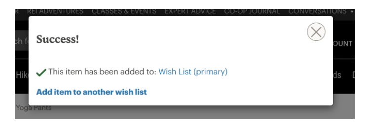
As an example, consider the virtual outfitting notification previously seen on the product page: a user will not know what the title, copy, or link are in the following text:
"Need help deciding? Schedule a free 1-on-1 virtual appointment with one of our experts. Book now".
Users may infer the "book now" text is a link - or just as likely search for a button or guess the entire text would be active.
Consider the following:
- When triggered, live regions only read out their content to assisted technologies. They will not distinguish text from actionable elements present within a notification
- Users may infer that actionable element is present, however a user will need to guess what element to search for. This is especially problematic for notifications that are automatically dismissed, as users will have limited time to correctly guess and act on this choice
If the notification must include an actionable element, you are responsible for the following:
- Must
- Return focus to next logical location in the page flow
- Contained action is also readily available on the page
- If the action is not available on page, the action should be added to a notification history page (see ARIA’s log role)