Images
CdrImg
Captures the user’s attention and communicate your message
# Overview
# Default (Medium)
Use for images with no responsive qualities.
# Managing Images
Apply rules to an image using ratio and crop properties. The below example is cropped using top alignment with the aspect ratio set as 9:16.
# Displaying Images as Backgrounds
Use the cover property to resize the background image to fill the entire container.
# Ratio Auto
To use cover or crop properties without a defined aspect ratio, set ratio="auto" and give the image an explicit height and/or width. This can be done in several ways:
- Apply
heightormin-heightto the CdrImg element directly - Apply
height: 100%to the CdrImg element to have it take up the full height of it's container (which must also have a height defined through some means) - Make the CdrImg be a grid item, in which case the image height would be determined by the height of the other grid items in the same row
# Shaping Images
Apply a radius to an image.
# Rounded
The below example is cropped using center alignment with the aspect ratio set as square and the radius set as rounded.
# Circle
The below example is cropped using center alignment with the aspect ratio set as square and the radius set as circle.
# Error Event Handler
CdrImg will bind any event handlers to the img element that it wraps. This is intended to support attaching an error handler function in case an image does not load, but can be used for any HTML/JS event. Note that because images are usually not "interactive" elements you should not bind click handlers to them.
<cdr-img
  src=""
  @error="eventHandler"
/>
2
3
4
# Lazy Loading
The CdrImg component accepts any valid HTML img attribute. CdrImg works with native lazy loading (opens new window) by setting the loading attribute.
# Accessibility
To ensure that usage of this component complies with accessibility guidelines, provide descriptive text for alt attribute for:
- Informative images:
- Convey a simple concept or information
- For more information, Web Accessibility Tutorials: Informative Images (opens new window)
- Functional images:
- Initiate an action, rather than to convey information (such as a printer icon)
- Describe functionality of the link or button, rather than the visual image
- For more information, Web Accessibility Tutorials: Functional Images (opens new window)
- Images of Text:
- Displays text that is intended to be read
- Avoid text in images, unless the image is a logo
- Text alternative should contain the same words that appear in the image
- For more information, Web Accessibility Tutorials: Images of Text (opens new window)
This component has compliance with WCAG guidelines by:
- Adding an empty
altattribute into the image element by default - An empty
altattribute is needed to meet accessibility requirements for decorative images
# Guidelines
# Use When
- Illustrating a product feature
- Allowing comparisons between similar items
- Capturing the user’s attention
- Telling a story
- Communicating the REI brand message
- Explaining a complex procedure or how to perform an action
# The Basics
REI image requirements are described on the Launch and DefaultShop Image Sizes (opens new window) page.
# Aspect Ratio
Use conventional aspect ratios:
- Square
- Portrait: 1:2, 2:3, 3:4, 9:16
- Landscape: 2:1, 3:2, 4:3, 16:9
# Quality
- Always maintain high image quality
- Choose the right file format when saving your images to ensure proper image quality and file size:
- For photos, use JPEG. Optimize JPEG files to find a balance between size and quality
- For bitmap/raster artwork, use PNG with 8-bit color palette
# Sizing
- Avoid small file sizes that pixelate the image
- Avoid unnecessarily large file sizes. Export images at the lowest file size possible without compromising quality
- Optimize high resolution images using TinyPNG (opens new window)
- Must display images at a proper pixel size compared to natural size
# Color and Contrast
- Test images for high contrast displays
- Ensure that no meaning is lost when colors are removed
- Include text only with sufficient contrast
# Cropping Images
- Specify the ratio of all cropped images
- Enable background image to use the entire container:
- Without stretching the image
- Cropped either vertically or horizontally without empty space
- Crop images by specifying the starting point:
- Adjust the starting background position on the x-axis of the image:
- Left: Orients the image to its horizontal left
- Right: Orients the image to its horizontal right
- X-center: Orients the image to its horizontal center
- Adjust the starting background position on the y-axis of the image:
- Top: Orients the image to its top
- Bottom: Orients the image to its bottom
- Y-center: Orients the image to its vertical center
- Adjust the starting background position on the x-axis of the image:
- Accepts x and y axis combination (e.g. crop="top left")
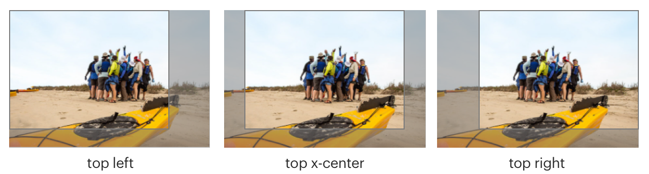
Images are cropped on y-axis with top value and on x-axis with left, x-center, and right values
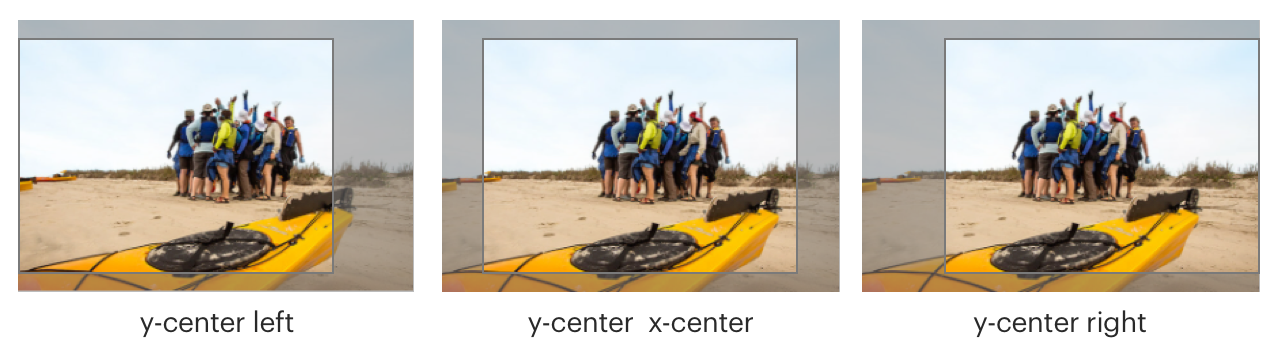
Images are cropped on y-axis with y-center value and on x-axis with left, x-center, and right values
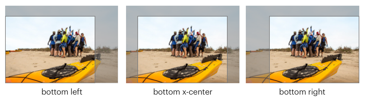
Images are cropped on y-axis with bottom value and on x-axis with left, x-center, and right values
# Content
# File Names
- Image file name should include primary keyword or what the page is targeting
- Showcase keyword targeting through file name and alt text
- For more information, view SEO How-to article Image Implementation (opens new window)
# Overlaid Text
- Only display heading text on non-solid backgrounds:
- Text should be at least 18px
- Never allow overlaid text to wrap. Longer strings of text can be harder to navigate when the background varies
- Consider adding a semi-transparent black gradient over the image in the CSS
- Apply only vertical gradient backgrounds. Avoid horizontal, diagonal, and radial gradients
- Always include a backup background color so that when the background image is disabled, text is still legible and passes contrast requirements
- For help in determining whether your text and image combination conforms to the required contrast ratio, use the Color Contrast Analyzer (opens new window) Chrome plugin
# Decorative Images
- Avoid using decorative images; instead present the image as a background image using CSS
- If using the HTML
<img>element, add:- An empty
altattribute - Attribute
role="presentation"
- An empty
# Alternative Text
- Use this decision tree (opens new window) to determine how to use the
altattribute - Be succinct. Ideally, one sentence or less
- Be informative and accurate
- If images of text are used, the
altattribute should contain the same words that appear in the image - Avoid repetitive labels. For example: “image of” or “picture of”
- Descriptions:
- Use short description that conveys the essential information presented by the image without burdening users with unnecessary details
- Use long descriptions for complex images, such as graphs, charts, or diagrams, to provide enough information
- For groups of images that convey a single piece of information, apply the
altattribute to only one image for the entire group - For image maps with multiple clickable areas:
- Must provide an overall context for the set of links using
altattribute - Each individual clickable area should have an
altattribute that describes the purpose or destination of the link
- Must provide an overall context for the set of links using
# Responsiveness
- Ability to control image display at small, medium, and large breakpoints
- Lazy loading of images is provided
- The
srcetandsizesattributes can be used to control which image loads at which screeen size
# Resources
- Chrome plugin, Color Contrast Analyzer (opens new window)
- Image compression service, TinyPNG (opens new window)
# API
View it on Github: https://github.com/rei/rei-cedar-vue-2/tree/next/src/components/image# Props
This component will bind any attribute that a native HTML img element (opens new window) accepts.
alt
name
string
type
empty
default
Sets the alternate text attribute for the image. Default value is empty.
src
name
string
type
empty
default
Sets image source URL.
ratio
name
string
type
N/A
default
Sets the aspect ratio and scales the image as large as possible without cropping or stretching the image. Possible values: { 'auto' | 'square' | '1-2' | '2-3' | '3-4' | '9-16' | '2-1' | '3-2' | '4-3' | '16-9' }
crop
name
string
type
N/A
default
Requires ‘ratio’ to define the starting position for cropping image. Image will overflow and not be displayed. Possible values: { ‘left’ | ‘x-center’ | ‘right’ | ‘top’ | ‘y-center’ | ‘bottom’ }
cover
name
boolean
type
N/A
default
Requires ‘ratio’ to scale the image to be as large as possible to fill the entire background area.
radius
name
string
type
N/A
default
Sets a border radius to the root element. Possible values: { 'circle' | ‘rounded’ }
modifier
name
string
type
N/A
default
Modifies the style variant for this component. Possible value: { ‘responsive’ }
containerClass
name
string
type
N/A
default
VUE 3 ONLY - Add a custom class to the `cdr-img-ratio` container div
# Slots
Find more information about using Slots in the article Installing Cedar.
default
name
Set the innerHTML for CdrImg. This includes text and html markup.
# Usage
# Ratio
- Positions the original image asset off-screen and replaces it with a background image
- CSS background property value is set to
containwhich resizes the background image to make sure it is fully visible - Shrinks the image and display additional padding to the requested ratio
- To manipulate background property and remove excess padding:
- Use
coverproperty - Use
cropproperty - Use both
coverandcropproperties together
- Use
# Cover
- Resizes the background image to cover the entire container
- Without stretching the image
- Cropped either vertically or horizontally without empty space
- Requires the
ratioproperty
# Crop
- Background image is displayed in its original size
- Requires the
ratioproperty - Defines the starting point of the overflow position
- Accepts a single x-axis and y-axis value (e.g.
crop=”top left”):- Adjust the starting background position on the x-axis of the image:
left: Orients the image to its horizontal leftright: Orients the image to its horizontal rightx-center: Orients the image to its horizontal center
- Adjust the starting background position on the y-axis of the image:
top: Orients the image to its topbottom: Orients the image to its bottomy-center: Orients the image to its vertical center
- Adjust the starting background position on the x-axis of the image:
# Radius
- Variants for this property:
circleorrounded(for rounded rectangle) - Uses preset values provided in
cdr-core.css
# Modifiers
Following variants are available to the cdr-img modifier attribute:
| Value | Description |
|---|---|
| 'responsive' | Sets the image to display block and 100% width |
# Performance
For internal applications with large images or images that would benefit from changes due to platform or breakpoint, use the loading="lazy" property to lazy load the images. The srcset and sizes properties can also be used to load the optimal image size for the user's screen. CdrImg supports any attribute that a native img element accepts, see the MDN img docs (opens new window) for more information on the loading, srcset, sizes, and other properties.