Inputs
Text field, CdrInput, cdr-input
Allows a user to enter data, edit data and search
# Overview
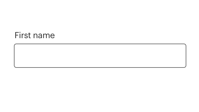
# Default (Medium)
Basic input field with label.
# Required
Basic input field with label and required tag.
# Optional
Basic input field with label and optional tag.
# Sizing
Change size for the input field. Default size is medium.
# Bare
Input field with no label.
# Validation
Input field with validation that runs on blur. Error state is controlled with the error prop. Setting the error prop to a string will render that message with default error styling. The error slot can be used to fully customize the error message.
Error messaging will override helper text rendered in the bottom position.
# Multi-Line Input
Multiple line input field with expander control in lower right. Note that the pre-icon, post-icon, and info-action slots will not work properly in multi-line inputs.
# Numeric Input
Input field designed to accept numerical input. Launches the numerical keyboard on mobile devices. Does not use the type="number" attribute as that is intended for values that are strictly "numbers" such as quantities and not values that contain numerical characters such as credit cards, security codes, month/year values, etc. Can be used in conjunction with input masking to handle formatting values like credit cards, or an input listener can be used to format or restrict input.
# Number/Quantity Input
Use the type="number" attribute only for input fields that reference a numerical value, for example a quantity of something. For input fields that are composed of numerical characters but are not strictly a number value, for example a credit card number or a month/year value, use a numeric input instead. An input field with type="number" set will only accept pure number values as input and rejects all other content, which can cause issues with a numeric identifier that has leading zeroes and may behave differently across browsers and devices.
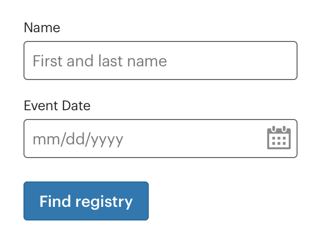
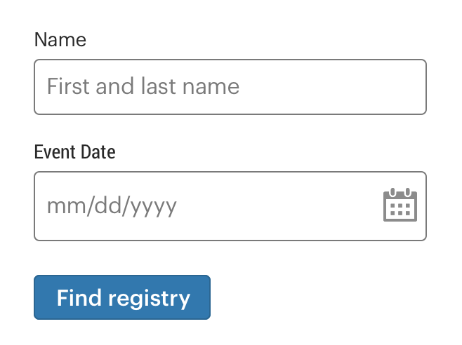
# Date input
Use type="date" to create input fields which allow users to enter a date, either with a validated text field and/or a simple calendar UI. Note: the presentation is dependent on the browser and largely unchangeable. Use this input field for applications where consistent presentation is less important than the functional benefits.
See the MDN web docs (opens new window) for type="date" to learn more.
# Input with Link Text
Input field with link text on right. The link should describe its relationship to the input field either through its text content or an aria-label.
# Input with Info Action
Input field with icon wrapped in an actionable element outside the input field on right. The actionable element should have an aria-label that explains it's relationship to the input field and what happens when you click on it.
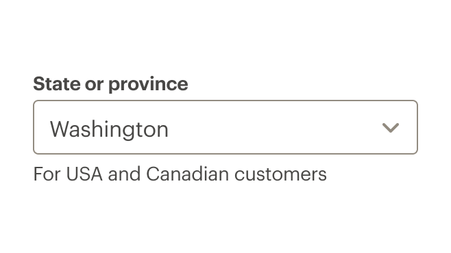
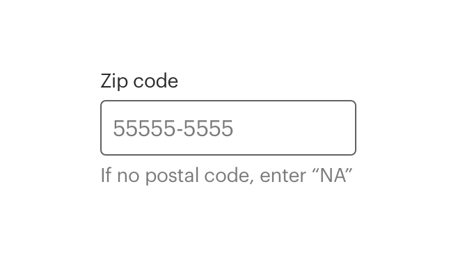
# Input with Helper Text
Input field with helper or hint text below the input field. If the input is in an error state, the error messaging slot will override this text. Helper text should be used instead of the HTML placeholder attribute to provide additional information or context about the input. Helper text is automatically linked to the input field through the aria-describedby attribute.
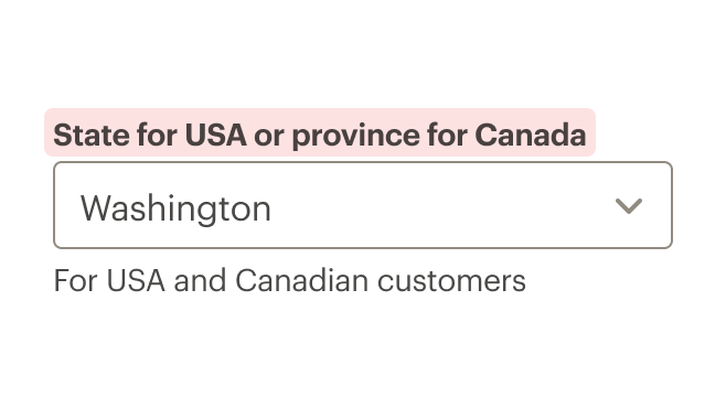
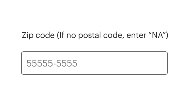
# Input with Helper Text Above
Input field with helper or hint text rendered above the input field. Helper text should be used instead of the HTML placeholder attribute to provide additional information or context about the input. Helper text is automatically linked to the input field through the aria-describedby attribute.
# Input with Icon Inserted Left
Input field with icon inserted into the input field on left. Icon is decorative and not intended for any action.
# Input with Icon Inserted Right
Input field with icon inserted into the input field on right. Icon is decorative and not intended for any action.
# Input with Actions
Input field with icon buttons inserted to the right. Up to 2 buttons can be passed into the post-icon slot. Each button should have the cdr-input__button utility class applied to it. Each button should indicate it's function and relationship to the input field through either an aria-label or a tooltip.
# Accessibility
This component has compliance with WCAG guidelines by:
- Requiring a value for the
labelfield - When hiding a label, the
aria-labelattribute is set to thelabelvalue
The HTML placeholder attribute should not be used as it creates an inaccessible experience when the placeholder content disappears as soon as the user begins typing into the input field. Instead the helper-text-top, helper-text-bottom, or info slots should be used to provide any additional information needed to complete the input.
Any additional actionable elements related to the input field, which may be external to the input component or passed in via the info, info-action, or post-icon slots, should indicate their function and relationship to the input field through their text content, and aria-label, or a tooltip.
# Guidelines
# Use When
- Entering data with a wide variety of responses
- Searching for content
# Don't Use When
- Selecting from a specific set of options. Instead, use Selects
# The Basics
- Identifiable - Input fields should indicate that users can enter information
- Findable - It should be easy to find an input field among other elements
- Legible - Input fields indicate their state such as enabled, focused, or disabled
# Options
- Define width using CSS styles
- Height options are medium or large.
- Ability to specify field type for text, email, number, password, search, and URL
# Multi-Line Input Fields
- Use when long free-form text is the desired user input such as a comment on a review or feedback form
- Overflow text wraps to a new line
- Scroll bar appears on right border when cursor reaches the bottom of the field
- Is defined by setting the number of rows for a recommended response length
- Resizing handle allows user to change the height of the input area
- Min and max limits are set by the product team for:
- Max-height of text area
- Maximum and minimum number of characters
# Content
# Labels
- Use concise and consistent labels that describes the meaning of the input field
- Limit labels to 1–3 words and fewer than 20 characters, including spaces
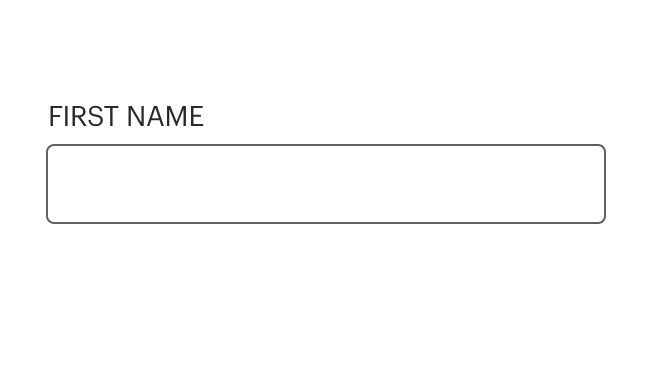
- Use sentence case. Do not use all caps, title caps, or all lowercase
- Don’t use colons after labels
# Helper Text
- Use helper text for hints or suggestions
- If help text is long or complex, use an icon or link above the input box
- Too much helper help text can make a form look and feel difficult to use
# Icon
- Use icons to trigger a popover for hints or suggestions
- Reference Cedar's icon guidelines for additional information
# Link Text
- Use a link when moving or navigating to another page or to a different portion of the same page
- Use if navigating user to long or complex information
- Reference the Links component article for more information
# Do / Don't


# Behavior
# Default Input Attrs
CdrInput sets some default attributes to make it easier to construct consistent and accessible forms. These default attributes can be overridden by passing the same attribute to the CdrInput component.
For all CdrInput elements:
spellcheckis set tofalseautocorrectis set to'off'autocapitalizeis set to'off'
For CdrInput elements with type="number" set, the following attributes are enabled to help ensure that numeric inputs behave consistently across browsers and devices:
patternis set to[0-9]*, which restrictsnovalidateis set totrueinputmodeis set tonumeric
Note that the maxlength attribute does not work in conjunction with numeric inputs as they are treated as numbers not strings. Instead, the length can be restricted using either an event listener or the min/max attributes:
<!-- restrict numeric input to 3 characters max with a listener -->
<cdr-input type="number" v-model="default" @input="() => {this.default = this.default.substring(0, 3)}"/>

<!-- restrict numeric input to 3 digit numbers -->
<cdr-input type="number" v-model="default" min="0" max="999"/>
2
3
4
5
6
# Input Masking
User input should be automatically formatted to make forms easier to comprehend and use, for example by adding parentheses and a dash to a phone number or inserting a space between every four digits of a credit card number.
Input masking has not been integrated directly into Cedar, however the CdrInput component implements the same API as a plain HTML text input element and can be used in conjunction with most input masking libraries.
We recommend using v-mask (opens new window) as a local directive in any components where you need input masking, as it provides a number of benefits:
- one of the smallest vue plugins for input masking
- can be loaded as a local directive directly in your component rather than as a global plugin that must be registered at the application level
- the API of
v-maskis extremely simple and easy to understand - if and when input masking support is built into CdrInput the
v-maskAPI is what we will implement, making it easier for you to migrate in the future
<script>
import { CdrInput } from "@rei/cedar";
import { VueMaskDirective } from "v-mask";

export default {
  name: "VueDirectiveExample",
  components: {
    CdrInput,
  },
  directives: {
    mask: VueMaskDirective,
  },
  data() {
    return {
      defaultModel: '',
    }
  }
};
</script>
<template>
<cdr-input
  v-model="defaultModel"
  type="tel"
  v-mask="'(###) ###-####'"
>
</template>
2
3
4
5
6
7
8
9
10
11
12
13
14
15
16
17
18
19
20
21
22
23
24
25
26
27
# Inputs with Icons
- Icons inserted into input fields are decorative, not intended for any action
# Required Fields
- The default status of an input field is “optional”. Setting the
optionalprop on the input will render a text label indicating it is optional - If the status is set to “required”, an asterisk will appear next to the input label with an aria-label indicating that the input is required and the input field will be marked
aria-required
# API
View it on Github: https://github.com/rei/rei-cedar-vue-2/tree/next/src/components/input# Props
This component will bind any attribute that a native HTML input element (opens new window) accepts.
id
name
string
type
auto-generated
default
Requires unique ID that is mapped to the label ‘for’ attribute. If this value is not set, it will be auto-generated.
type
name
string
type
text
default
Supports HTML5 <input> types for text, email, number, password, search, date, and URL.
label
name
string
type
N/A
default
Sets the text value for the input label. Required for a11y compliance. Use ‘hideLabel’ if the label display is not desired. Required.
hideLabel
name
boolean
type
false
default
Visually hides the label element, but leaves it available to screen readers for a11y compliance.
rows
name
number
type
null
default
Sets the number of rows for the input field and converts input field to textarea if the value of the ‘rows’ prop is greater than 1.
disabled
name
boolean
type
false
default
Sets the disabled state for the input field and label styling. Also, restricts user input.
numeric
name
boolean
type
false
default
Sets default attributes for an input that should launch a numeric keyboard but is not strictly a 'number' (credit card, security code, postal code, etc.). Should be used in conjunction with the default text type input. An `input` listener can be used to fully restrict input values to numerical characters only
required
name
boolean
type
false
default
Sets aria-required on the input field and displays an asterisk next to the input label.
optional
name
boolean
type
false
default
Displays '(optional)' text next to the input label.
error
name
boolean
type
false
default
Sets the input to an error state, displays the `error` slot if one is present.
errorRole
name
string
type
status
default
Sets the `role` attribute for the embedded error state messaging.
background
name
string
type
primary
default
Set which background color the input is being rendered on. Adjusts styling to ensure accessibility. Possible options are: { ‘primary’ | ‘secondary’ }.
size
name
string
type
medium
default
Sets the input field size. Possible sizes are: { ‘medium’ | ‘large’ }. Also works with responsive breakpoints. Breakpoint values are: xs, sm, md, and lg. Examples: { 'small' | 'medium' | 'large' | 'large@sm' }
labelClass
name
string
type
N/A
default
VUE 3 ONLY - Add a custom class to the `cdr-label-standalone` div
# Slots
error
name
Error messaging text that is displayed when the `error` prop is true.
info
name
Location for information link or icon markup to the right above the input field.
info-action
name
Location for icon button rendered to the right outside the input field
pre-icon
name
Location for icon markup to the left inside the input field.
post-icon
name
Location for icon markup to the right inside the input field.
helper-text-bottom
name
Location for helper or information text to the left below the input field.
helper-text-top
name
Location for helper or information text to the left above the input field.
# Events
All event listeners are passed through to the <input> element.