Responsive Layout
# The Cedar Container
The Cedar container cdr-container is the foundational layout mechanism on your page. It centers your content and provides the page with a left and right gutter helping you to separate your content and the edge of the browser window. The container should be added to the root wrapping element of your template using the cdr-container mixin from @rei/cdr-tokens, or the CdrContainer component can be used as your root element.
<template>
  <div>
    <div class="container-class">
      <div class="content">A cdr-container mixin</div>
    </div>

    <div class="container-fluid-class">
      <div class="content">A cdr-container-fluid mixin</div>
    </div>

    <cdr-container>
      <div class="content">A cdr-container component</div>
    </cdr-container>

    <cdr-container modifier="fluid">
      <div class="content">A cdr-container-fluid component</div>
    </cdr-container>
  </div>
</template>
<style>
  @import '~@rei/cdr-tokens/dist/scss/cdr-tokens.scss';
  .container-class {
    @include cdr-container;
  }
  .container-fluid-class {
    @include cdr-container-fluid;
  }
</style>
2
3
4
5
6
7
8
9
10
11
12
13
14
15
16
17
18
19
20
21
22
23
24
25
26
27
28
The container builds in its display settings for each of the breakpoints. This allows all pages to begin from the same layout context as each other. The container has two variants: standard container and fluid container.
# Standard vs. Fluid Container
The Cedar container allows flexible content width, up to a max width of 1232px. The fluid variant of the container does not have a max width. As shown below, pages can contain both fluid and standard containers.
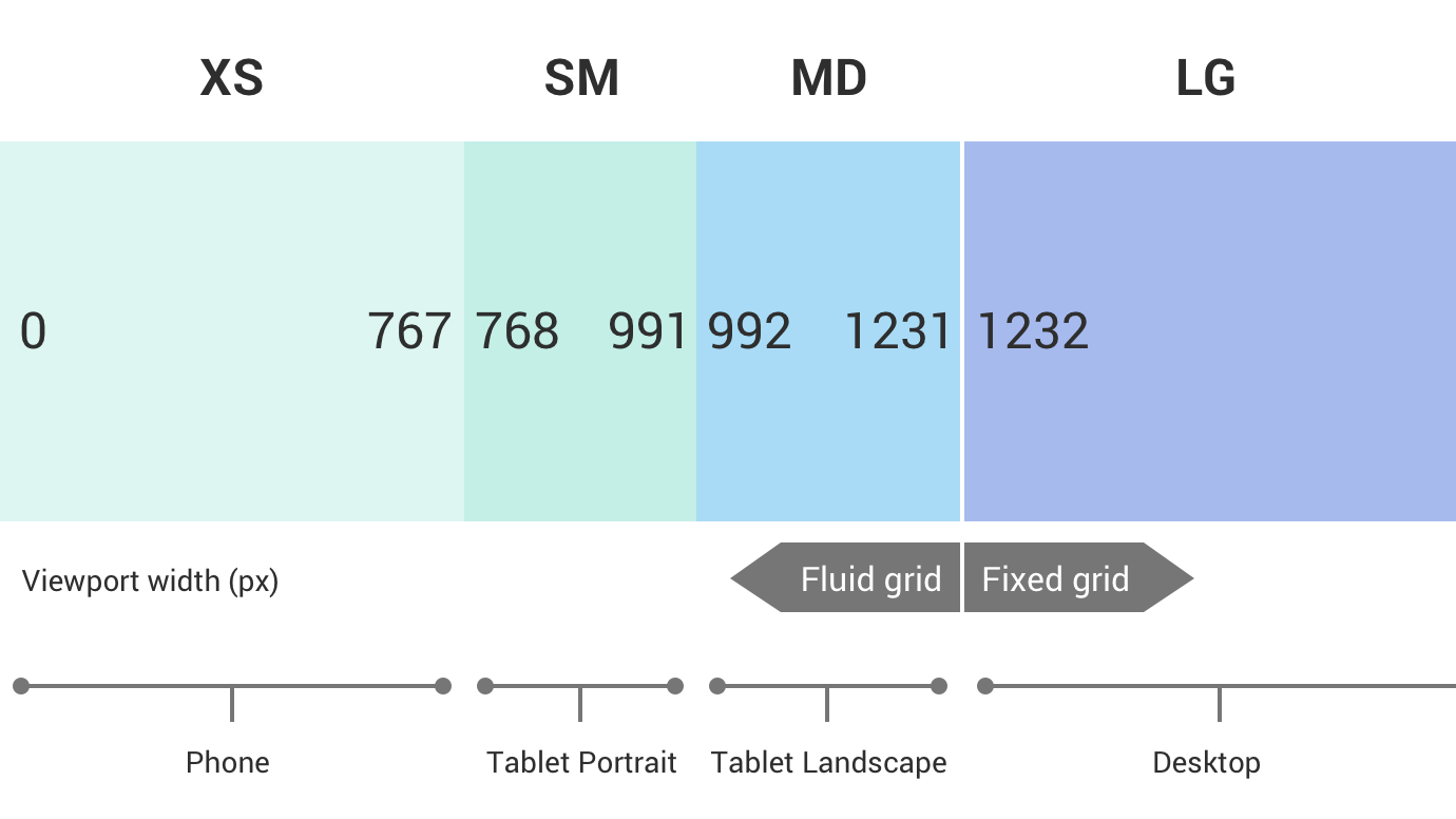
# Display Breakpoints
Cedar provides support for four layout screen widths: extra small, small, medium, and large.
These breakpoints set boundaries to be used by the media queries, providing ranges needed to ensure that your UI communicates what is most important to your customers for any screen size.
The responsive breakpoints do not provide any support for device detection, nor do they change the inherent functionality of elements at breakpoints.
# Design Tokens
The following design tokens are provided using the @rei/cdr-tokens package for breakpoint detection.
| Display size | Design Token | Value |
|---|---|---|
| Extra small | cdr-breakpoint-xs | 0px |
| Small | cdr-breakpoint-sm | 768px |
| Medium | cdr-breakpoint-md | 992px |
| Large | cdr-breakpoint-lg | 1232px |
For more information about using design tokens, visit the Design Tokens overview.
# SCSS/LESS Mixins
@rei/cdr-tokens provides the following responsive breakpoint media queries for our patterns, components, and layouts. These provide size ranges intended to help facilitate the changing of layout at various screen widths or orientations.
| Display size | Utility mixin | Range |
|---|---|---|
| Extra Small & Above | @include cdr-xs-mq-up {} | >= 0 |
| Extra Small Only | @include cdr-xs-mq-only {} | 0-767px |
| Below Small | @include cdr-sm-mq-down {} | < 768px |
| Small & Above | @include cdr-sm-mq-up {} | >= 768px |
| Small Only | @include cdr-sm-mq-only {} | 768px-991px |
| Below Medium | @include cdr-md-mq-down {} | < 992px |
| Medium & Above | @include cdr-md-mq-up {} | >= 992px |
| Medium Only | @include cdr-md-mq-only {} | 992px-1231px |
| Below Large | @include cdr-lg-mq-down {} | < 1232px |
| Large & Above | @include cdr-lg-mq-up {} | >= 1232px |
| Large Only | @include cdr-lg-mq-only {} | >= 1232px |
# Targeting the Utility Media Query with Class Names
To avoid confusion between an element’s size variant and its breakpoint name, Cedar has the following naming conventions:
- Element sizes are treated as modifiers and follow the BEM naming convention of
block__element--modifier - Breakpoints are denoted with the @(xs, sm, md, lg) and are appended to a class name. This convention is outside of the BEM naming convention
For example, cdr-button size="small@lg" will only apply the small button variant at the large breakpoint.
# Greater Than vs. Range Values
The cdr-media queries provide both “greater than” values and “ranges” for each breakpoint.
For example, a selector may target a small variant within the small breakpoint range like this:
.cdr-example {
  @include cdr-sm-mq-only {
    &--small\@sm {
      key: value;
    }
  }
}
2
3
4
5
6
7
Exploding the name cdr-sm-mq-only would read “cedar-small-media-query-only
Using the range ensures that the specified key:value pairs only applies to the .cdr-example--small@sm class name when it is displayed within the range of 768px-991px.
However, if you want to apply a value to the example that only needed to know when it was greater than the small breakpoint, you must use the root value query. This example allows you to update the display of the button when the display is at least 768px wide.
.cdr-example {
  @include cdr-sm-mq-up {
    &--small\@sm {
      key: value;
    }

  }
}
2
3
4
5
6
7
8
# Components and breakpoints
Components allow breakpoints to be passed as unique property variants.
When accepted, a breakpoint variant property will append the @(xs, sm, md, lg) to its name.
For example, to display the cdr-button-small variant at the small breakpoint:
<cdr-button size="small@sm">
  A primary button
</cdr-button>
2
3
Note that the Cedar components will always use the range breakpoints. If you intend a component to continue to use the breakpoint variant within a different breakpoint range, you will also need to account for it within the same property definition.
<cdr-button size="small@xs small@sm small@md">
  A primary button
</cdr-button>
2
3