Filmstrip
# Overview
Filmstrip allows users to preview multiple pieces of related content in a constrained container. Filmstrip is different from carousel because while filmstrip shows multiple pieces of content per view, carousel only shows one piece of content per view.
Filmstrip is not a traditional component that is functional out of the box. Designers and developers need to use this documentation to compose their own custom version of a filmstrip using the recommended components and guidance relevant to their specific use case.
# Getting Started Building a Filmstrip
There are two common examples documented below: Product Recommendation Filmstrip and Prominent Card Filmstrip.
Designers can get started by pulling one of these examples from the Figma library here. (opens new window) and then optionally customizing the header and subheader, content blocks, pagination controls, link to all content and/or overflow grid based on the needs of your use case.
Developers can use the following development guide which applies specific filmstrip requirements to basic cedar components as a starting point for your custom filmstrip.
Please feel free to share feedback with us by posting in the cedar-user-support slack channel (opens new window) or by coming to an office hours.
# Anatomy
Because the Filmstrip is a cookbook of multiple sub-components, its structure can be customized in a variety of ways.
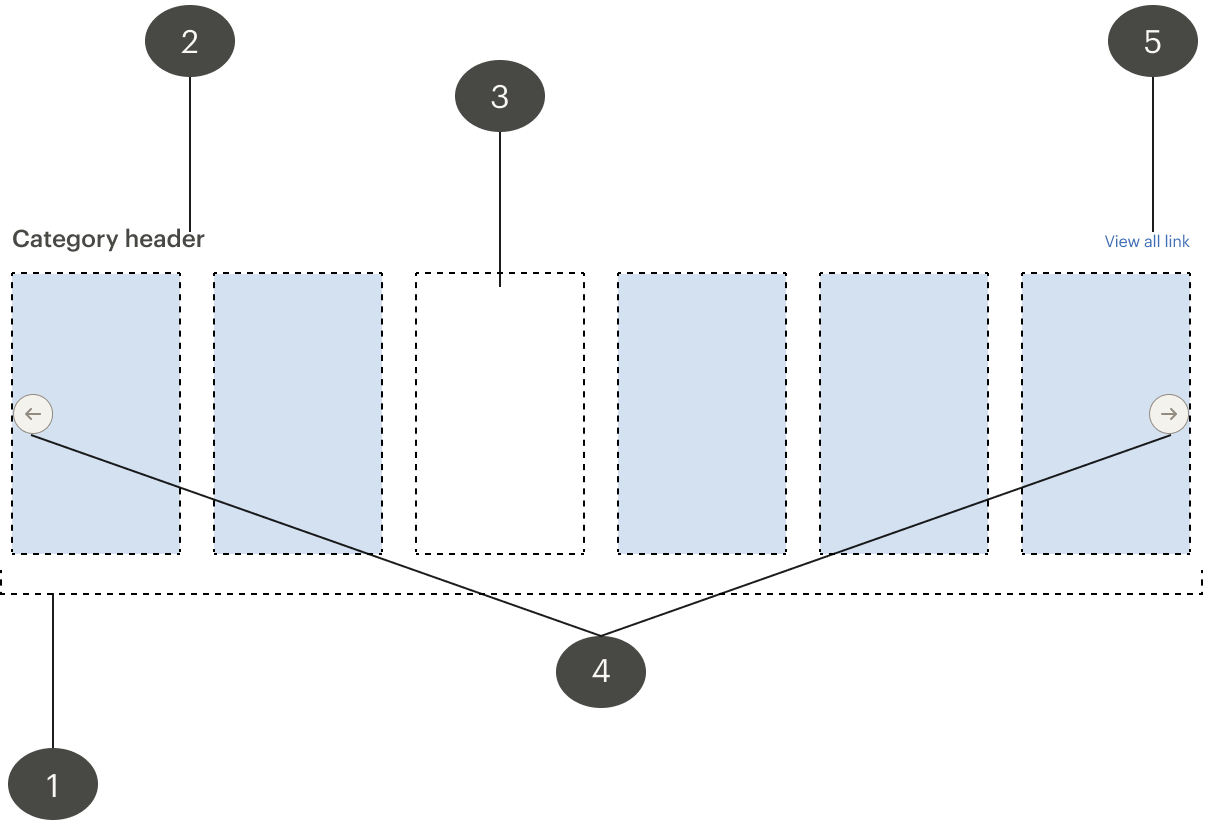
# 1. Wrapping container
The wrapping container is a required element to house the filmstrip structure. The end of the page container can be removed to allow for a filmstrip that visually overflows.
Must
Ensure all on-screen and touch target areas are at least 44 by 44 pixels
Include a skip link for keyboard and screen reading users to skip the filmstrip
# 2. Header and subheader (optional and customizable)
The header is a recommended element for many filmstrip use cases to prime the user on the content that is within the filmstrip. A subheader can be used if more information is needed to understand the content within the filmstrip.
Should
- Be short, informative and directly related to the content within the filmstrip
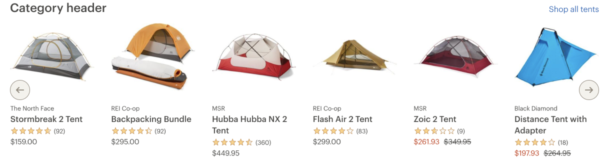
# 3. Content Blocks (customizable)
Content blocks can include any type of content such as images, product tiles, videos, gifs or cards. You can have 3-6 content blocks shown in a filmstrip at a time. Generally, the less content blocks a filmstrip has in a view, the greater the focus is on each content block in the filmstrip and the greater the filmstrip's general visual hierarchy is on the page. Choose the number of content blocks which corresponds with each individual content's importance and the importance that the filstrip has on the page as a whole.
On an X-axis, filmstrips items are linear and ordered, they start at item1 and end at item(n).
Must
- Be a set of like content. For example, a filmstrip with images should only show images while a filmstrip with videos should only show videos within its content blocks
# 4. Pagination Controls (optional)
Pagination controls are an optional element that allows the user to move from one display view to another. Pagination controls in the form of arrow buttons allow users to navigate from one view to the next or previous.
Behavior
- Pagination controls become disabled when the set of data reaches either end of the x-axis.
- A filmstrip has a defined beginning and end: if the user clicks a pagination control when it is disabled, a bouncing animation occurs.
- When a user moves to a new view, there will always be 1 content block that stays the same, allowing the user to understand how the new view relates to the last view seen (for example, when the user clicks the right pagination control, the last card becomes the first card and when the user clicks the left pagination control, the first card becomes the last card).
- The number of new content blocks shown on the last page is determined by the remainder of content blocks when the total number of content blocks is divided by the amount of content blocks per view (for example, if there are 9 total blocks of content in a filmstrip that shows 4 blocks of content per view, then only 1 new block of content will display in the last view along with 3 blocks of repeated content from the previous views).
Must
- Provide visual boundaries with a minimum of 3:1 contrast to the background
- For both keyboard focus and hover, it is important for the content to continue to have sufficient contrast, although it will depend on whether that content is text (relates to 1.4.3) or graphical (1.4.11) in nature
- Provide a way for someone to escape the filmstrip items once they enter
Should
- Use aria-hidden to remove controls from the tab and AT reading order
# 5. Link to all content (optional and customizable)
The view all link is a recommended element for filmstrip use cases that have more related content than is being shown in the filmstrip.
Should
# 6. Overflow Grid (customizable)
The overflow grid container is the heavy lifter of this pattern, this is where the filmstrip items will be displayed. It sets up how many items are in view at a time, the spacing between items, the hiding of all items not in view, and it provides the basic functionality of a horizontal scroll container.
Must
- Be able to receive tab focus
- Allow left and right arrow key scrolling
- Be assigned a
roleof “region” - Associate your filmstrip to the optional title by providing your filmstrip a heading as
aria-labelledby - Apply
aria-labelif you are not using an optional title to provide the filmstrip a meaningful name
# Development Instructions
These instructions will take you through three stages of filmstrip development. These stages are:
[Stage 1.](Stage 1: Developing a simple filmstrip Development of a simple filmstrip with an overflow container
Stage 2. Enhancing the simple filmstrip to address accessibility and performance issues
Stage 3. Extending and light refactoring of the filmstrip to include interactive controls
# Stage 1: Developing a simple filmstrip
The development of a simple filmstrip will require the use of a <cdr-grid> component and the addition of some CSS styling.
Step a) Create markup and populate content
Your markup should look something like this:
<cdr-grid class=”filmstrip”>

  <! --- Your grid items go here --->

</cdr-grid>
2
3
4
5
6
The individual grid items that you place inside the grid can be any type of content you wish as long as the size of each item is identical.
Step b) Add filmstrip styling
The next step will be to add CSS styling to your .filmstrip class so that it becomes a proper Cedar filmstrip.
.filmstrip {
  grid-template-columns: repeat(auto-fill, 25rem);
  grid-auto-columns: 25rem;
  grid-auto-flow: column;
  overflow: scroll;
}
2
3
4
5
6
Let’s break down what each of these properties do and why we chose these values for them:
grid-template-columns:
This property is doing most of the heavy lifting. The repeat() function here takes two arguments. The first argument can be a number (For example, we can use the number ‘9’ to create 9 columns to correspond with our 9 grid items). However, because we likely won’t know how many items our filmstrip will contain, we have chosen auto-fill as our value for this argument. auto-fill will essentially create as many columns as there are items within the grid for us automatically.
The second value that we pass to the repeat function is the size we want for each column. In this case we are using a fixed unit of rem. While you can use percentages or vw units you will find that your grid items get smaller as the viewport gets smaller, which will lead to very tiny looking filmstrips at mobile widths. Thus it is more manageable to decide upon fixed units for your column sizes and change them with media queries.
grid-auto-columns:
This will dictate the size of each item that doesn’t fit in the main container. If you don’t set this property you will notice that the grid items will be the size you specify for the repeat() function until the items reach the end of the container. After that they will be a different size.
grid-auto-flow:
The default behavior is to lay out each grid item by row, which means that after the container has been filled another row will be created. Because we want all our items in the same row, we are setting this property to column.
overflow:
This property is set to scroll so that we get the handy scrollbar at the bottom of the filmstrip.
Additionally, it's worth pointing out that no additional styling is needed to remove default styling from the list items.
# Is the filmstrip finished?
At this point you should have a simple functioning filmstrip which should be good enough for a demo or a proof of concept. However, there are a few accessibility and performance concerns that need to be addressed before using this in a production environment. We will go over these concerns in the next stage of our filmstrip development.
This example below is what you should have after completing stage 1:
# Stage 2: Enhancing filmstrip accessibility and performance
While the filmstrip looks good and seems to function smoothly, there are several accessibility and performance requirements that we need to address.
Step a) Keyboard Navigation Requirements
Keyboard navigation in web pages is the process by which keyboard or switch device (opens new window) users can navigate from one interactive element to another. Users can observe which element is active or focused by certain cues such as a blue outlined border around a form field or, as in the case of screen readers, an audio description of the element that is currently receiving focus.
Unfortunately, our filmstrip currently provides a suboptimal experience for users on screen readers and keyboards. The main issue that we need to address is that the filmstrip currently functions as a “keyboard trap (opens new window)”. If we don’t make any adjustments to our markup or our code, keyboard and screen reader users will have to tab through every single one of the links in your filmstrip before they will be able to move on to content outside of the filmstrip. This is not a great experience, especially if your filmstrip has a lot of content.
The filmstrip is what we would call a “composite widget”, a term that encompasses a single UI component with multiple focusable elements. As such, we should follow some established patterns when it comes to navigating the individual items of that widget.
Commonly used keys for navigation, activation, and/or selection within composite widgets are:
- Arrow Keys
- Space Bar
- Enter
- Escape
- Home / End
An example of a composite widget within Cedar are Radio button groups (opens new window). Before moving on, take a moment to try to navigate the some of these radio button groups using your keyboard. You’ll notice that using the tab key will only activate focus on a single element within that group and to select other elements within that group you’ll need to use arrow keys.
In order to reproduce this behavior in our filmstrip, we change the default focusable behavior of our filmstrip container and the individual items contained therein. Then, we must set up keyboard event listeners that will respond to arrow key events (and change focus accordingly).
First, we modify the default focusable behavior by changing the tabindex of both the filmstrip and the links inside the filmstrip.
Read more about the tabindex property on MDN (opens new window)
<cdr-grid class="filmstrip" tabindex="0" tag=”ul”>

  <li>
      <cdr-link

        v-for="item in items"

        href="http://example.path.to/a/page"

        alt="Check out this other webpage"

        tabindex="-1"
      >
        <cdr-img

          class="grid-item"

          src="https://via.placeholder.com/400/400"

        />
    </cdr-link>
  </li>
</cdr-grid>
2
3
4
5
6
7
8
9
10
11
12
13
14
15
16
17
18
19
20
21
22
23
24
25
The code example above is a slightly modified version of the code found in stage 1 of the filmstrip development process as we have wrapped the placeholder image in an anchor tag.
Note the tabindex attribute added to the <cdr-grid> element and to the <cdr-link> element. For the <cdr-grid> we have explicitly added tabindex=0 to let the browser know that we want this element to be focusable (it’s not by default). Conversely, we have added tabindex=-1 to each of the anchor tags in the filmstrip so they are not focusable by default.
At the moment, our work is only partway done. If you include this filmstrip on a page with other elements, you’ll find that you will be able to focus on the filmstrip using the tab key, but there is no way to currently focus on the individual items in the filmstrip.
The next step, then, is to add some event listeners which will listen for keydown events and focus on the appropriate elements much in the same way as the [radio button group] (http://cedar-docs.rei-cloud.com/rei-cedar-docs/components/radio/) we mentioned above.
Below is an example of what a keydown event handler method might look like. Written in pseudocode:
handleKeyDown(e) {

  //If the filmstrip or any of the filmstrip items don’t have focus, return;

  if (e.key === 'ArrowDown' || e.key === 'ArrowRight') {

    //If the filmstrip currently has focus, then change the tab index of the first filmstrip item to ‘0’

    //focus on the first filmstrip item

    //If an individual filmstrip item is focused (not the filmstrip itself), select the next filmstrip item.

    //Be sure to reset any filmstrip item currently not receiving focus back to -1

  }

  if (e.key === 'ArrowLeft' || e.key === 'ArrowUp') {

    // Do a similar implementation as above but select the previous item instead of the next item

  }

  if (e.key === 'Tab') {

    //If an individual filmstrip item has focus, the browser should naturally focus on the next 	element outside the filmstrip. Be sure to change the tab-index of the filmstrip item back 	to -1

  }
}
2
3
4
5
6
7
8
9
10
11
12
13
14
15
16
17
18
19
20
21
22
23
24
25
26
27
28
29
30
# What about nested filmstrip content?
It’s possible that you may have filmstrip items where one or more focusable elements are nested within the filmstrip item. An example of this is a filmstrip full of card components (opens new window). Here are a few additional rules that you should follow when responding to keydown events with nested content:
While the filmstrip or a filmstrip item has focus, arrow keys will select individual filmstrip items but not the content (buttons, links, etc.) nested within those items.
While a filmstrip item is selected, hitting the tab button will cycle through all the nested focusable content within that item.
If an element nested within a filmstrip item has focus, and there are no more elements within the filmstrip item to focus on, hitting tab will shift focus over to the first element outside the filmstrip.
If an element nested within a filmstrip item has focus, and there are no previous elements within the filmstrip item to focus on, hitting Shift-tab will shift focus over to the filmstrip item itself.
Step b) Proper semantic markup, aria-role, and aria-labels
It’s important that the markup we put on the page properly expresses what kind of content happens to be on the page. While this may seem evident to visual users, it may not be so apparent to those using screen readers. Furthermore, semantic HTML makes web page content more crawlable by search engines, thus ensuring that the page containing the filmstrip is properly indexed.
As it happens, we’ve already done some work making our markup semantically accurate in stage one by making the grid container a <ul> element and every filmstrip item within that container an <li> element. This makes sense because at its core a filmstrip really is just an unordered list of content items.
However, there’s more we can do to ensure that all users have the best experience possible with our filmstrip. Below is a possible example of what we can do.
<span id=”filmstrip-navigation” style=”display: none;”>
  This section will be read out loud by a screen reader. It is referenced via the id by the aria-describedby property of the cdr-grid element below. You might include a detailed description here like: Product gallery. Use arrow keys to navigate the individual items of the gallery. Use the tab key to access the links inside one of the gallery items.
</span>

<cdr-grid class=”filmstrip” tag="ul" aria-role=”region” aria-describedby=”filmstrip-navigation”>
  <li v-for="item in items" aria-label=”productname”>
    <cdr-img src="https://via.placeholder.com/400/400"/>
  </li>
</cdr-grid>
2
3
4
5
6
7
8
9
First of all, we’ve added an aria-role=”region” to the <cdr-grid>. This aria-role property ensures that screen readers will read out other attributes like aria-describedby should they exist. This may be needed in some cases, especially if you have complex navigation due to nested content within your filmstrip items.
In many cases, however, an aria-label=gallery should be enough. Choose either aria-label or aria-describedby depending on your needs. Do not include both. Below is an example with aria-label instead of aria-describedby.
<cdr-grid class=”filmstrip” tag="ul" aria-role=”region” aria-label=”gallery”>
2
3
In addition to the addition of aria-role, aria-label, and aria-describedby. It would be helpful to add an aria-label to the individual filmstrip items. Here, you may put a product name, or use aria-labelledby to reference a header tag within the filmstrip item. Whatever you choose for the aria-label for filmstrip items, be sure that the label succinctly and accurately describes the content within.
Step c) Lazy-loading of images
Although our <cdr-img> components use native lazy loading which is as simple as putting the loading= "lazy" attribute on them, this unfortunately won’t work for filmstrip images that happen to be hidden by the overflow container. Native lazy loading only works with the main viewport, so you will need to implement your own solution here.
# Stage 3: Adding interactive controls to the filmstrip
As an enhancement to the filmstrip you can add arrow button controls. In order to do this you will first need to modify the markup and styles so that the button can appear where we expect them.
Step a) Modify the markup for control placement
While a simple filmstrip requires only one CSS grid, you will need to use nested CSS grids in order to properly place the filmstrip buttons. Here’s what the markup should look like:
<cdr-grid class=”filmstrip”>

  <cdr-button

    @click="scrollLeft"

    ref="left-button"

    class="arrow-button__left"

    :icon-only="true"

    :with-background="true"

    :full-width="true"

    size="small"

    tabindex="-1"

  >

    <cdr-icon

      use="#arrow-left"

      inherit-color

      slot="icon"

    />

</cdr-button>

  <cdr-grid class="filmstrip__content" ref="filmstrip" tag="ul">

    <li v-for="(item, index) in items">

      <cdr-img src="https://via.placeholder.com/400/400"/>

    </li>

  </cdr-grid>

  <cdr-button

    ref="right-button"

    @click="scrollRight"

    class="arrow-button__right"

    :icon-only="true"

    :with-background="true"

    :full-width="true"

    size="small"

    tabindex="-1"

  >

    <cdr-icon

      use="#arrow-right"

      inherit-color

      slot="icon"

    />

  </cdr-button>

</cdr-grid>
2
3
4
5
6
7
8
9
10
11
12
13
14
15
16
17
18
19
20
21
22
23
24
25
26
27
28
29
30
31
32
33
34
35
36
37
38
39
40
41
42
43
44
45
46
47
48
49
50
51
52
53
54
55
56
57
58
59
60
61
62
63
64
65
66
67
68
69
70
71
72
73
74
75
76
77
78
79
In this example, we have 2 <cdr-grid> elements. The first element represents the outer grid which contains three columns: once column for each of the buttons and one column for the filmstrip content itself.
For buttons we are using the icon only with background (opens new window). The settings for the buttons in your filmstrip should be identical to those provided in the example markup above. The only deviation from the icon only with background pattern we have made is the tabindex=-1. As the buttons are really only here for mouse users, there is no reason to make these filmstrip controls focusable on a keyboard.
Next, let’s add the styling of the filmstrip itself:
.filmstrip {

  grid-template-columns: 1fr;

  &__content {

    grid-row-start: 1;

    grid-column: 1 / -1;

    scroll-behavior: smooth;

    z-index: 0;

    //These styles remain unchanged from stage #1

    grid-template-columns: repeat(auto-fill, 25rem);

    grid-auto-columns: 25rem;

    grid-auto-flow: column;

    overflow: scroll;
  }
}
2
3
4
5
6
7
8
9
10
11
12
13
14
15
16
17
18
19
20
21
22
23
24
25
26
27
Here we have two classes: .filmstrip represents the new outer grid, while .filmstrip__content represents the inner grid. The .filmstrip__content class, as noted by the comments, takes a lot of styles from the simple filmstrip and remain unchanged.
Let’s break down some of the new style rules we have created:
grid-template-columns:
We have added a property for grid template columns. Here we only need to define a single column because that’s all we’ll need to properly position the filmstrip and the filmstrip buttons. We have chosen 1fr to so that the single column will take up all the space within the container.
grid-row-start:
We want our buttons and our filmstrip content to occupy the same row. Without specifying this property, you will find new rows being created for each individual button and the filmstrip content. By giving all buttons and the filmstrip content a grid-row-start value of 1, you will avoid new row creation.
grid-column:
Additionally, we don’t want new columns created for both the buttons and and the filmstrip. By setting this property to 1 / -1 this will ensure that the filmstrip column will start at the very first grid line and end at the very last grid line. Because of this, no new implicit columns will be created.
scroll-behavior:
This property is optional. You will find this property helpful when implementing scroll behavior in the buttons. When you set this property, you will find the filmstrip smoothly transitions to a new scroll position when you invoke the Element.scrollTo() method. However, you may find a more appropriate solution for your needs that doesn’t require the use of this property.
z-index:
While the default z-index for any element is zero, we found some issues with filmstrip buttons not consistently firing click events. Explicitly setting the z-index of the filmstrip to zero container solves this issue.
Next, let’s look at the styling for the buttons:
.arrow-button {

  grid-row-start: 1;

  align-self: center;

  z-index: 1;

  &__left {

    @extend .arrow-button;

    justify-self: start;

    grid-column-start: 1;

  }

  &__right {

    @extend .arrow-button;

    justify-self: end;

    grid-column-end: -1;

  }

  &[aria-disabled="true"] {

    color: $cdr-color-text-button-secondary-disabled;

    cursor: not-allowed;

    background-color: $cdr-color-background-button-secondary-disabled !important;

    box-shadow: inset 0 0 0 0.1rem $cdr-color-background-button-default-disabled !important;

    fill: $cdr-color-text-button-secondary-disabled !important;

    border: none !important;

  }
}
2
3
4
5
6
7
8
9
10
11
12
13
14
15
16
17
18
19
20
21
22
23
24
25
26
27
28
29
30
31
32
33
34
35
36
37
38
39
40
41
42
43
44
First let’s go over the styles that the two buttons have in common.
grid-row-start:
We want the buttons to occupy the same row as the filmstrip and each other, thus we must explicitly set this property.
align-self:
This property sets alignment for the buttons on the y-axis. The default value for this property is stretch which will make the buttons look like elongated stretched ovals spanning from the top to the bottom of the filmstrip. We set it to center here so the buttons retain their preferred dimensions as well as positions themselves conveniently in the center of the row they occupy.
z-index:
We’re setting z-index to 1 to ensure that the buttons appear above the filmstrip content.
Now for the properties the with different values:
justify-self:
This property sets alignment for the buttons on the x-axis. The default value for this property is stretch which will make the buttons look like elongated stretched ovals spanning from the left to the right of the filmstrip. For the left button the property value is set to start because we want the button to be positioned at the beginning of the filmstrip. Likewise, we have set the value for this property to end for the right button because we want it positioned at the end of the filmstrip.
grid-column-start/grid-column-end:
If we don't set these properties for the left and right buttons the grid will want to create new columns for each of the buttons. Since we don’t want this, we specify the grid line where we want the left button to start and the grid line where we want the right button to end. This will position the left and right buttons at the beginning and end of the one column we’ve created the one column grid we’ve created for the buttons and the filmstrip content.
Step b) Disabled button styles:
Finally, while disabled styles come out of the box for the icon button, disabling the filmstrip buttons will make it so they don’t capture click events. While normally we want that, in some cases you may want to trigger a “bounce” animation as a cue to users that you are at the end of filmstrip. In order to fire this event you’ll need to disable the button in a different way. Using the [aria-disabled=”true”] should serve this purpose for you.
Step c) Additional Enhancements:
At this point we have set up a filmstrip with buttons as well as attach click listeners on each. As a developer, it’ll be up to you to write the methods to handle the click events. Below is a list of high level suggestions for the rest of your filmstrip implementation:
- Implement a
scrollLeft()andscrollRight()function. As part of your implementation of these functions you will need to calculate the number of pixels to scroll left/right which will change depending on the size of the container. - Include methods to determine if user has scrolled to the end of the filmstrip (either the left or the right end). These methods will be needed to determine the enabled/disabled state of the left and right buttons.
- Implement
bounceLeft()andbounceRight()methods which will produce a bouncing animation when clicking a disabled left or right button. - Ensure that the methods mentioned are called when a
@wheelevent (this is similar to a scroll event) is fired. This happens a lot so you will need to debounce or throttle (opens new window) the event to ensure that the methods are only called as often as needed.
Below is an example of a filmstrip with left and right buttons:
# Examples
The following are two common use cases that can be followed. Designers can copy and paste these examples from the Figma library.
# Product Recommendation Filmstrip
Use the product recommendation filmstrip pattern to showcase relevant and related products or services.
This pattern commonly displays six content blocks per view and does not require more than 5 clicks or swipes to view all of the content within it.
# Prominent Card Filmstrip
Use the prominent card filmstrip pattern to display larger categories of content.
This pattern commonly displays 3 to 4 content blocks per view to emphasize the fact that each piece of content has more prominence than individual products. This pattern should not require more than 5 clicks or swipes to view all of the content within it.

# Guidelines
# Use When
- Providing a teaser of products, events, articles or categories to users
# Don't Use When
- The content blocks will not link to a destination or contains no actionable elements
- The information contained within the filmstrip is not related
- The content will exceed a maximum of 5 swipes to preview all the content
- The user will need to focus on 1 piece of content at a time. Instead, use a carousel
- There will be more than 5 full filmstrip views worth of content. Instead, consider using Links
# Do/Don't
Do display a minimum of 3 content blocks per view
Don’t display less than 3 content blocks per view
Do display a maximum of 6 content blocks per view
Don’t display more than 6 content blocks per view
Do include up to 5 clicks or swipes per filmstrip
Do not allow the user to click or swipe excessively to view content in the filmstrip
Do give the filmstrip a defined start and endpoint
Do not allow the filmstrip to infinitely loop
Do use like content for content blocks within the same filmstrip
Do not present different types of content within the same filmstrip
# Behavior
- A tab user will focus first on the filmstrip container
- The container should be scrollable via left and right arrow keys
- A screen reader user will not hear the arrow controls but should hear the filmstrip container (Use aria-hidden to remove controls from the tab and AT reading order)
# Accessibility
# Overflow and Focus problem
- Firefox puts an overflowing container into the tab order, making it reachable and its content scrollable. Because it has no focus styles, it is not obvious
- Chrome, Chrome-based Edge and Safari do not add overflow containers to the tab order. By default, overflowing content on these browsers is not scrollable with the keyboard
# Overflow and Focus solution
- Add
tabindex="0"to the overflowing container to make it baseline keyboard accessible. - Show this keyboard accessibility to users by applying focus styles (Cedar token mixin)
- "Promote" the
<div>to a landmark region by both applying role="region" and supplying an accessible name, by using aria-label, for example. By doing so, you provide much-needed context to screen reader users - because they suddenly discover a focusable element that is not interactive in the classic sense (like a link or button would be).