Pagination
Pagination, CdrPagination
Allows users to navigate to next or previous page when content is split into several pages
# Overview
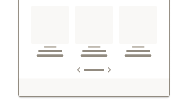
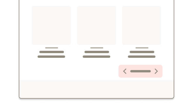
# Pagination @ sm, md, lg
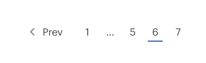
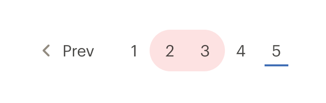
At the sm, md, and lg breakpoints, pagination displays as a list of number text links. Prev and Next links are also added when applicable.
# Intra-Page Navigation
By default, CdrPagination assumes that you are navigating through pages on a site and will update the URL on change. For content that requires pagination but is part of a larger page the linkTag and forLabel properties can be used to render a button based pagination. Set linkTag to be "button" and set the forLabel to describe what element is being paginated, for example "Pagination for user reviews"
# Overriding Default Navigation
By default pagination uses anchor elements which navigate the users web browser when clicked. This behavior can be overriden by adding a handler to the navigate event which emits (currentPage, currentUrl, event) and calling event.preventDefault() in the handler function. The currentPage and currentUrl can then be used to implement router based navigation or programmatically navigate the page. This can also be used in conjunction with the link-tag property to render a button based pagination.
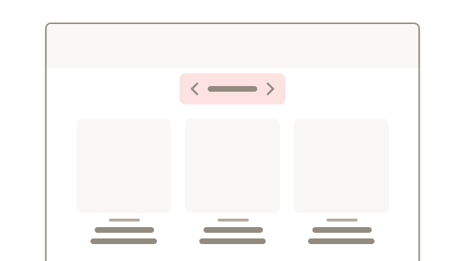
# Pagination @ xs
At the xs breakpoint, pagination adapts to a Select component using the native UI dropdown menu.

# Accessibility
This component complies with accessibility guidelines by doing the following:
- Wraps the pagination links in a
<nav>element to let screen readers recognize the pagination controls - Sets
aria-label="pagination"to describe the type of navigation. - Indicates the active page by adding
aria-current="page"to the link that points to the current page
If you are building an intra-page button based pagination, the forLabel property must be used to indicate what content is being paginated. For example,
<div>
  <div>{{ reviews content }}</div>

  <cdr-pagination
    link-tag="button"
    for-label="pagination for reviews"

    :pages="pages"
    :total-pages="5"
    v-model="page"
  />
</div>
2
3
4
5
6
7
8
9
10
11
12
13
This component has compliance with WCAG guidelines by:
- WCAG 2.4.8 (opens new window): Information about the user's location within a set of Web pages is available
- WCAG 3.2.3 (opens new window): Navigation patterns follow a consistent pattern. Only position pagination component at the bottom of the page
- WCAG 2.4.3 (opens new window): Focus state receives focus in an order that preserves meaning
- WCAG 2.4.7 (opens new window): Focus is visible
- WCAG 2.5.5 (opens new window): Target size for pagination links are large enough for users to easily activate them
# Guidelines
# SEO
For best SEO support, use of pagination requires additional markup and logic in the <head> of the page.
See REI's SEO Confluence page on pagination (opens new window) for information on implementing this correctly on your page.
Note that REI has chosen HTML <link> elements instead of HTTP headers. Make sure to use fully qualified absolute URLs in the <link> elements instead of relative URLs.
# Use When
- Providing navigation to break apart large quantities of content
- Breaking up search result pages into manageable sections
# Don't Use When
- Using lazy load or infinite scroll within an experience
- Switching between slides or content in a carousel
- Displaying editorial content. Instead, show entire article on one page
# Behavior
- Page number links are truncated as follows: [first] ... [current-1] [current] [current+1] ... [last]
- If there are 7 pages or fewer, all page number links will be shown
- Prev or Next text links are removed when the first or last page are active
Within pagination, link styles are adapted
- Text links are displayed as the primary text color
- Prev and Next links use the small size for the caret-left and caret-right icons
# Do / Don't
By default, pagination is center aligned under category or search results content.
The primary placement for pagination is at the bottom of a page that displays rows of content.

Use pagination logic to truncate link list, when possible.
# Responsiveness
Pagination adapts to a Select component with a native UI dropdown menu on XS breakpoints to provide a mobile-friendly experience.
# API
View it on Github: https://github.com/rei/rei-cedar-vue-2/tree/next/src/components/pagination# Props
pages
name
array
type
N/A
default
Array of objects containing pagination data. Objects have structure of { page: number, url: string }. Required.
totalPages
name
number
type
null
default
Sets the total number of pages for displaying "Page x of <totalPages>". Sometimes the total number of pages is different than total page data objects in the pages array. For example, if only the next and previous pages are provided.
linkTag
name
string
type
a
default
Sets which tag type is used to render pagination elements. Possible values: { 'a' | 'button' }
forLabel
name
string
type
N/A
default
Used to customize the aria-label for the root pagination element. For page-level pagination (i.e, pagination that updates the entire page content and changes the URL) this property should be omitted. For intra-page navigation this property should describe the element being paginated, for example: `Pagination for sub-content`
# Events
input
name
pageNumber, event
arguments
$emit event fired when page prop value is updated.
navigate
name
pageNumber, url, event
arguments
$emit event fired when page changes based on user interaction by clicking a link or selecting an option from the select on mobile. `event.preventDefault()` can be used to override the default link navigation behavior