Tabs
Tab Panels, CdrTabs
Container used to organize and group related content into smaller sections navigable within a single container
# Overview
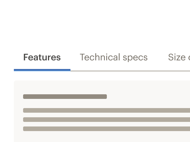
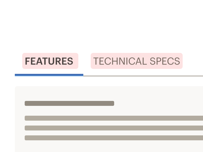
# Default (Medium)
Tabs align left and bottom border expands to full width of container.
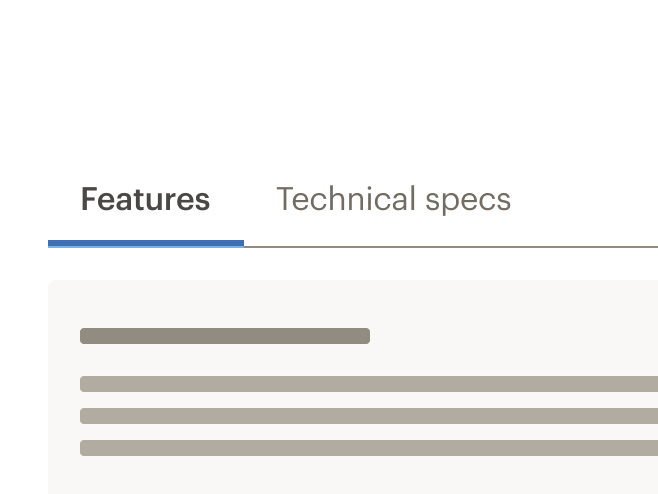
# Compact (Small)
Reduced spacing around the tabs to create a denser visual design.
# Full Width
Tabs space evenly across the container.
# No Border
Bottom border of tab header list is removed.
# Centered
Centered tab header content.
# Active Tab
Tabs using the active-tab property to make the third element active on page load.
# Auto
Tabs using height="auto" to render with variable height based on content size.
# Accessibility
Tabs component maintains these keyboard interactions:
- Left arrow and Right arrow keys: Moves user between tabs
- Down arrow: Moves user into the content within the active tab section
- Up arrow: Returns user to the selected tab
This component has compliance with WCAG guidelines by:
- Using text color with a Level AA contrast ratio of 4.5:1 contrast between the text color and the background (but only when displayed on light backgrounds)
- Includes tablist role in tabs header container
- Includes tab role in tab header element
- Includes tabpanel role in tab content element
# Guidelines
# Use When
- Organizing related content in a single container
- Flipping between multiple panes or sections
- Grouping content to display horizontally
- Content can be broken into discrete parts
# Don't Use When
- Grouping content to display vertically. Instead, use Accordion
- Creating primary navigation that links to other pages
- Comparing related content. Instead, use Table
# The Basics
- Keep tabs in the same order, even when some tabs are disabled
- Keep to no more than 6 tabs
- Never display fewer than 2 tabs
- Avoid changing the order of the tabs often. If your content changes frequently and needs to be selectively displayed, consider adopting a Filter pattern as in Product Display (https://www.rei.com/c/mens-climbing-shoes)
# Content
- Order the tabs by priority or importance from left to right
- Keep tab labels short and meaningful. Between 1-2 words is best and written in plain language
- Ensure that each tab label is unique
- Never truncate tab labels
- Use title caps for tab labels
- Tab headers can be animated, but tab content should not be
# Behavior
- The first tab section is selected by default
- Only one tab can be selected at a time
- Currently selected tab is always highlighted
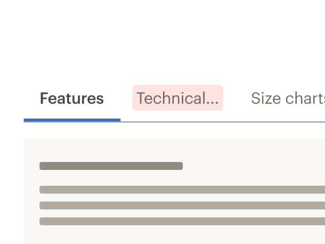
- Tabs are scrollable by default and do not wrap to a second line
- Tabs become scrollable when the length of the labels exceed the width of the container
- Inactive tab panels are rendered for SEO purposes
# Do/Don't


# Responsiveness
- Tabs can change styles based on breakpoint
- Example: Default at MD/LG, Compact and Full Width at XS/SM
- Tabs labels never wrap to two lines
- Scroll is set by default:
- If tabs exceed width of viewport, a gradient is added to the end (right) of tab container
- When scrolled to end of tabs, a gradient is added to the beginning (left) of tab container
- Maintain layout for tabs when switching to smaller viewports. Do not replace the tab component with the accordion component
- Switching between tab component and accordion component is not supported in Cedar components library
# Important
Linking to a specific tab or accordion has SEO costs. If you still wish to implement these changes for your project, reach out to the SEO team at the #team-seo and #team-ia Slack channels.
# API
View it on Github: https://github.com/rei/rei-cedar-vue-2/tree/next/src/components/tabsTabs are built from two components: CdrTabs and CdrTabPanel. These are meant to be used together.
# Props
# CdrTabs
height
name
string
type
240px
default
Sets height of the tabs container element. Passing a `px` value will render tabs with a static height, passing `auto` will render tabs with variable height based on content size.
activeTab
name
number
type
0
default
Sets the index of the tab that should be active on initial page load. Note that this property is zero-indexed.
modifier
name
string
type
N/A
default
Modifies the style variants for this component. Possible values: { 'centered' | 'compact' | 'full-width' | 'no-border' }
backgroundColor
name
string
type
$cdr-color-background-primary
default
For CdrTabs that are rendered on non-primary backgrounds. Pass the background-color into the component to ensure that the scrolling gradients render correctly.
# CdrTabPanel
name
name
string
type
N/A
default
Sets tab display name. Required and must be unique for each tab. If id prop not provided, this value will be used as the reference identifier.
id
name
string
type
N/A
default
Sets reference identifier for tab content. This property is required and is necessary for accessibility. Must be unique for each tabPanel, and cannot be the same as the `aria-labelledby` property.
aria-labelledby
name
string
type
N/A
default
Sets reference identifier for tab header. This property is required and is necessary for accessibility. Must be unique for each tabPanel, and cannot be the same as the `id` property.
# Events
tab-change
name
state, tabId
arguments
$emit event fired when the active tab has been changed.
# Usage
The cdr-tab-panel name property sets the tab display value and is used for reference.
 <cdr-tabs>
   <cdr-tab-panel name="tab1">Tab 1 Content</cdr-tab-panel>
 </cdr-tabs>
2
3
# Modifiers
Following variants are available to the cdr-tabs modifier attribute:
| Value | Description |
|---|---|
| 'centered' | Centers the tab header content |
| 'compact' | Sets the tabs styling for smaller screen sizes |
| 'full-width' | Sets the tab header to display evenly across the entire width instead of left justified |
| 'no-border' | Removes the bottom border of the tabs header |