Prominence
# Overview
# How designers create depth
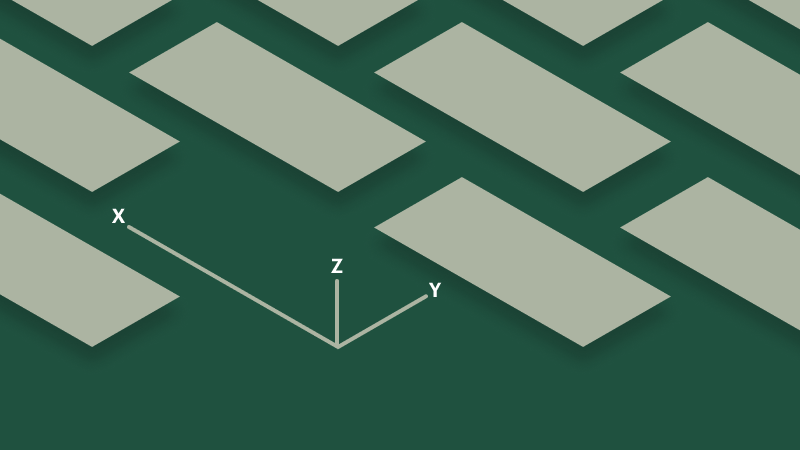
Most digital interfaces are inherently flat—which is to say all objects within an interface are constrained by two spatial dimensions: width (x) and height (y). To add additional dimensionality designers must create an illusion of depth (z). While there are several techniques to achieve this, designers typically will use varying degrees of a drop shadow. The ranges of depth created are used to strengthen spatial relationships and provide additional interaction affordances.
While there are some parallels between an object's elevation and its z-index—specifically regarding overlapping content—the system chooses to not create dependencies between the two. The reasons are two-fold: 1) there are not enough tokenized elevation options to account for the wide range of z-index values, and 2) elevation may be applied to objects that are not intended to stack on top of or otherwise interfere with adjacent objects—forcing a z-index value in these cases could yield unpredictable results.
# Best practices
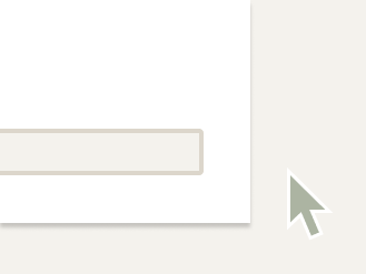
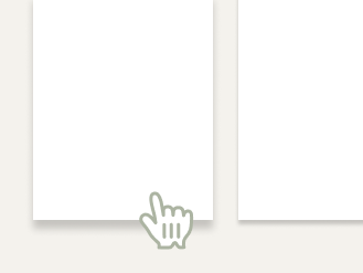
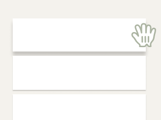
# Why designers chose to elevate interface objects
The shadow cast by an elevated object helps to communicate aspects of interactivity, order, and priority by drawing from real-world conventions. More specifically, designers use this implied sense of depth to:


# Application
# Tokenized options
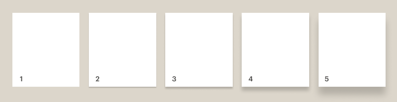
- Flat: cdr-prominence-height-flat
- Raised: cdr-prominence-height-raised
- Elevated: cdr-prominence-height-elevated
- Floating: cdr-prominence-height-floating
- Lifted: cdr-prominence-height-lifted
# When to use
- Do use prominence to emphasize and respond to interaction or a change of state
- Do use prominence to reinforce the hierarchy of a page
- Do use a stronger prominence value for elements that overlap other areas of the UI
# When to use a different approach
- Don't use prominence as the only means of conveying actionability
- Don't rely solely on a drop shadow to meet accessibility contrast requirements
- Don't elevate large proportions of the UI at the same time