Radius
# Overview
# Basics
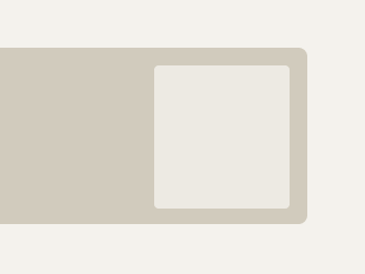
# Nested objects
# Application
# Tokenized options
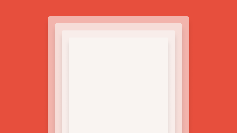
Cedar components include appropriate radii values applied by default. Use tokens to apply radii values to bespoke elements or containers.
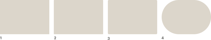
- Sharp:
cdr-radius-sharp - Soft:
cdr-radius-soft - Softer:
cdr-radius-softer - Round:
cdr-radius-round
# When to use
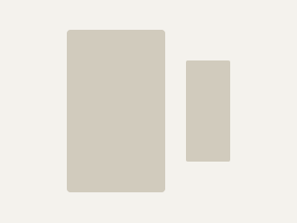
- Do choose a radius that's proportional to the size of the element
- Do use rounded corners for actionable components like buttons, cards, and chips
# When to use a different approach
- Don't use roundness as the only means of conveying actionability
- Don't round the corners of small, non-interactive pieces of UI
- Don't overuse rounded corners, consider the whole page