Tooltip
CdrTooltip
Floating label used to clarify interface actions
# Overview
CdrTooltip is a wrapper component that accepts a trigger element and tooltip content. When the trigger element is hovered or focused, the tooltip content is rendered. Event bindings between the trigger and the tooltip are set up automatically. The tooltip will dynamically update its position property to ensure that it renders on screen, though this functionality can be disabled by setting autoPosition to false.
# Custom Trigger
CdrTooltip can also be controlled programmatically using the open prop. However, doing so means that you must implement certain behavior yourself:
- The CdrTooltip element and the trigger element must be wrapped in a div with
position: relativeandwidth: max-content. - The
openproperty should be toggled to true onmouseoverandfocus, and toggled to false onblurandfocus. - The trigger element should set its
aria-describedbyproperty set to the ID of the CdrTooltip.
# Accessibility
To ensure your usage of this component complies with accessibility guidelines you are responsible for the following:
- Set an
idproperty on the CdrTooltip. The component will automatically link thatidto the trigger element. - Content passed into the
triggerslot must be an actionable element such as a button. - Tooltip content should directly describe the element that triggers it. For example, providing more information or context about what an input does, or adding a textual description of an icon-only buttton.
- Avoid rich content. Formatting such as bold text, italics, headings, icons, etc. will not be conveyed through aria-describedby or aria-labelledby.
- No interactive content. Any interactive content such as links or buttons should not be placed within a tooltip.
- Do not put essential information in tooltips.
- Do not use a timeout to hide the tooltip.
This component complies with WCAG guidelines by:
- Adds hover and focus handlers to trigger element to manage tooltip state.
- Dynamically sets
aria-described-byon the trigger element to point to the id of the tooltip. - Adds
role="tooltip"to the tooltip content. - Tooltip content is visible to screen readers even when it is closed.
- Tooltip content can be hovered over without the tooltip closing.
- Tooltip can be closed by removing focus from the trigger, removing hover from the trigger or content, or by pressing the
esckey.
# Guidelines
# Use when
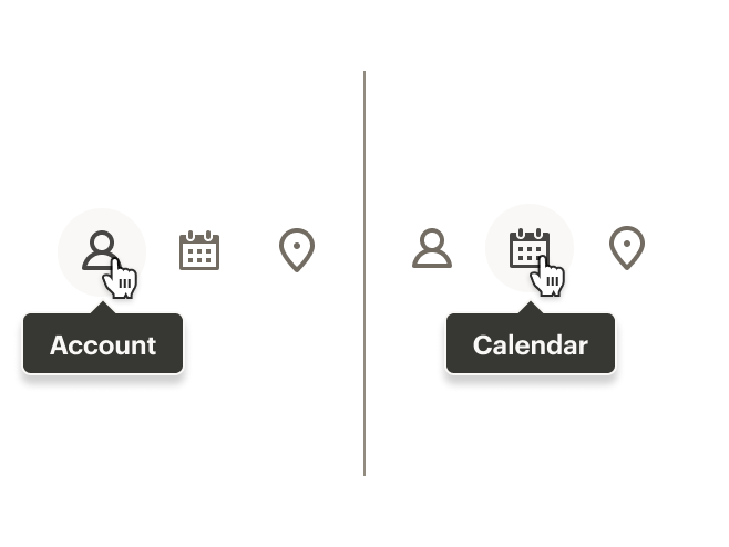
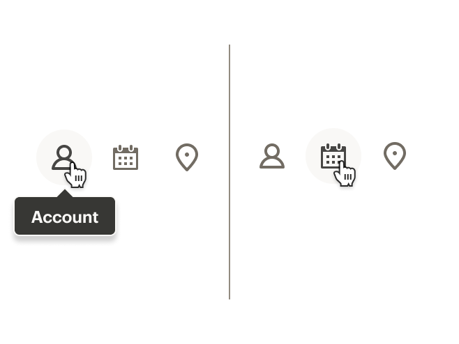
When an interface action is expressed solely through iconography, use a tooltip to clarify the action. Only interactive elements should trigger tooltips. The descriptions provided by tooltips should only contain one or two words: “close”, “clear”, or “save” are common examples.
Examples:
- A text input uses an icon to show that the field can be cleared. Use a tooltip to describe the action: “Clear”
- An icon-only button is used to close a modal. Use a tooltip to describe what acting upon the button will do: “Close”
- A toolbar within a content editor contains multiple icon-based actions. Use a tooltip to describe what each action does: “Left-align”
- A quantity counter uses ‘-’ and ‘+’ symbols to increase or decrease the number of items that will be added to a user’s cart. Use a tooltip to describe the actions: “Decrease quantity” and “Increase quantity”
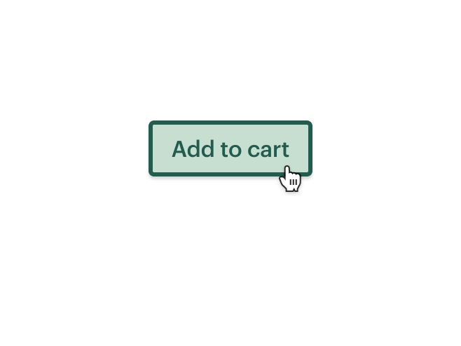
# Don’t use when
- Don’t use a tooltip to provide additional context for form fields. Instead, use a Popover
- Don’t add actions or links inside a tooltip. Instead, use a Popover
- Don’t use a tooltip to describe a button that already describes itself through copy
Example:
- A credit card security field needs to describe, in detail, where to find the card information. A popover should be used to contain the graphic and card-specific details, not a tooltip
# Do / Don't
# API
View it on Github: https://github.com/rei/rei-cedar-vue-2/tree/next/src/components/tooltip# Props
id
name
string
type
default
Id for the CdrTooltip element. Required for accessibility.
position
name
string
type
'top'
default
Sets the position where the tooltip will render relative to the trigger element. Possible values: 'top' | 'bottom' | 'left' | 'right'
autoPosition
name
boolean
type
true
default
If set to `true`, tooltip will attempt to dynamically set it's position to ensure it renders within the visible browser window. If `false` the tooltip will always render in the provided `position`.
contentClass
name
string
type
default
Adds a custom class to the tooltip content wrapper. Allows for overriding it's size, styling, etc.
open
name
boolean
type
default
Used to programmatically control the tooltip state. Does not need to be set if you are using the `trigger` slot. See the Custom Trigger examples for more info.
# Slots
Find more information about using Slots in the article Installing Cedar.
default
name
Slot for CdrTooltip content.
trigger
name
Slot for the element that triggers the tooltip. Element should be a button and must be the first and only child of this slot. Event handlers are bound to this element automatically.
# Events
closed
name
$emit event fired when tooltip is closed.
opened
name
$emit event fired when tooltip is opened.