Chip
CdrChip
Allows users to make selections, filter content, or trigger actions
# Overview
Chips are compact elements that represent a selection, attribute, or dynamic action.
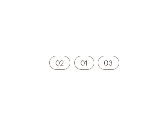
# Default
Use chips to directly specify, dynamically categorize or immediately perform a discrete action.
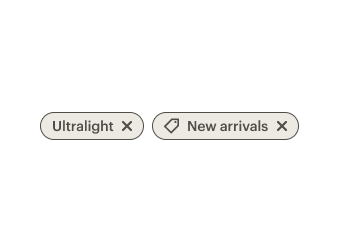
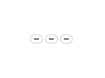
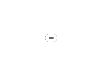
# Icon Slots
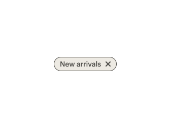
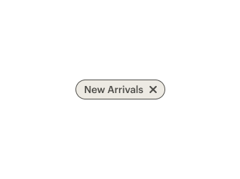
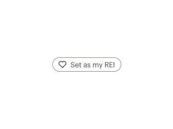
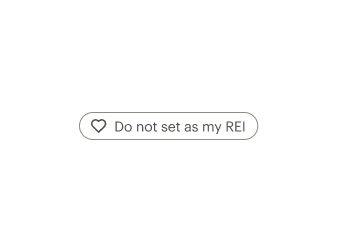
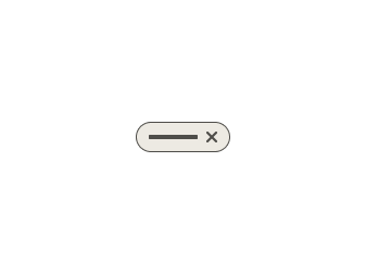
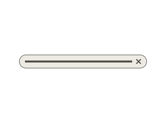
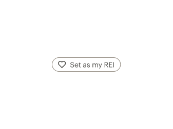
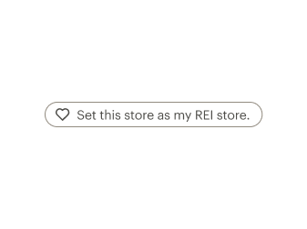
Use icon-left or icon-right slots to pass icons into a chip. Place the X remove icon in the icon-right slot only. Place other icons in the icon-left slot. Use only one icon per chip.
# Stateful Chips
Use stateful chips to update settings immediately or trigger an immediate action while staying on the same page.
For chips that toggle a single selection on and off, use the click event and dynamic properties in order to change the label or state of a chip. The aria-pressed attribute should be used to designate the state of the toggle.
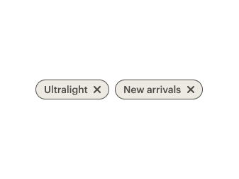
# Filter Chips
Filter chips add a visual representation of user selected filters. Filter chips that represent user selections that can be dynamically removed should include an X icon in the right icon slot and be linked to the ID of the input it controls using aria-controls. The aria-pressed property should be set to true to designate that this selection is active. Filter chips that are linked to a checkbox should appear selected and be included in the same form group as the checkboxes.
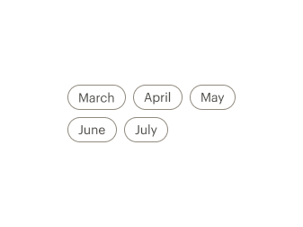
# Selection Chips
Use selection chips to allow users to make a single select choice or a multiple select choice. Single select chip groups are a more prominent alternative to radio buttons while multiple select chip groups are a more prominent alternative to checkboxes.
# Single Select
For single select chip groups, apply role='radio' to each chip and role='radiogroup' to the group. Use aria-checked="true" and tabindex="0" to designate the selected chip, and apply aria-checked="false" and tabindex="-1" to the other chips. The chip elements should be grouped directly inside a CdrChipGroup element to ensure keyboard navigation is properly managed. The CdrChipGroup element requires a label property or slot be passed in which describes the chip group. This label is visually hidden by default.
# Multiple Select
For multiple select chip groups, apply role='checkbox' to each chip, use aria-checked="true" to designate the selected chip, and apply aria-checked="false" to the other chips. The chip elements should be grouped directly inside a CdrChipGroup element to ensure keyboard navigation is properly managed. The CdrChipGroup element requires a label property or slot be passed in which describes the chip group. This label is visually hidden by default.
# Accessibility
Many WCAG requirements are contextual to their implementation. To ensure that usage of this component complies with accessibility guidelines:
- For a group of chips related to a single selection, use
role="radio",aria-checked, andtabindexon each chip and wrap the group in a CdrChipGroup component. The selected chip should havearia-checked="true"andtabindex="0"set, while the rest of the chips should havearia-checked="false"andtabindex="-1". - For a chip that controls a selection made elsewhere on the page, set
aria-controlson the chip to point to the ID of the input being modified - For a chip that toggles a selection on and off, use
role="switch"andaria-checkedto designate its state. - For other uses of CdrChip please reach out in Slack at #cedar-user-support
CdrChip and CdrChipGroup implement the following accessibility requirements:
- CdrChip uses a button tag
- CdrChipGroup implements keyboard navigation for a group of CdrChips
# Guidelines
Chips allow users to make selections, filter content, or trigger actions. While buttons are expected to appear consistently and with familiar calls to action, chips should appear dynamically.
# Use when
- Dynamically categorizing content based on descriptive words
- Representing a checkbox group with more emphasis
- Representing a radio button group with more emphasis
- Clearly delineating and displaying options in a compact area
- Offering dynamic and contextual actions related to primary content
- Allowing the user to trigger an immediate action while staying on the same page
- Allowing users to update or configure settings immediately
# Don’t use when
- Navigating a user. Instead, use Buttons or Links
- Displaying non-interactive elements
- Displaying more than two rows of chips. Instead use horizontal scrolling or Selects
- Representing page tags
# The Basics
One chip container style is available: pill.
When arranging chips horizontally:
- Left align chip group
- Separate each by cdr-space-half-x

When stacking chips vertically:
- Make sure chips overflow based on the width of the chip group area
- Separate each by cdr-space-half-x

# Content
When using chips in a group:
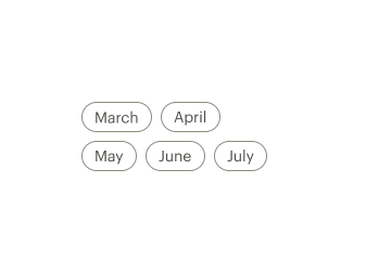
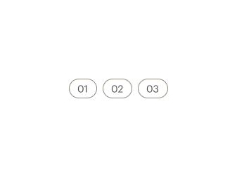
- Use a logical order, whether it’s alphabetical, numerical, or time-based
- Clearly communicate the effect of selecting the option
- Provide a link or include a subtitle for more information. Don’t rely on tooltips to explain a radio button
Chip text should:
- Start with a capital letter
- Use sentence case
- Avoid long labels
- Be written as sentence fragments
- No terminal punctuation
# Do / Don't

# Behavior
Stateful chips used to dynamically perform a discrete action:
- Can show confirmation feedback.
Chips used for single selection:
- Selecting a single choice automatically deselects all other chips in the group.
- Include more than one option per chip group.
Chips used for multiple selection:
- Selecting one chip shouldn’t change the selection status of another chip in the list.
Filter chips:
- Can optionally include an X remove icon.
When making decisions about whether to use a button, links or chips, consider the following:
| Buttons | Links | Chips |
|---|---|---|
| Toggling a display to full screen | Navigating user to a new page or view | Representing a filtered list of content that appear on the same page |
| Opening a modal window | Changing the URL | Offering a choice or representing a filter |
| Triggering a popup menu | Causing a browser redraw or refresh | Immediately changing a setting on the page |
# Resources
- WebAIM: Keyboard Accessibility (opens new window)
- WebAIM WCAG 2.0 Checklist (opens new window)
- W3C: WCAG 3.0 Guidelines (opens new window)
# API
View it on Github: https://github.com/rei/rei-cedar-vue-2/tree/next/src/components/chip# CdrChip
# Slots
Find more information about using Slots in the article Installing Cedar.
default
name
Slot for CdrChip content.
# CdrChipGroup
# Props
label
name
string
type
'default'
default
Sets a label that describes the chip group and what it is selecting. By default this label is visually hidden and only made available to screen readers.
hide-label
name
boolean
type
'true'
default
Visually hides the chip group label but makes it accessible to screen readers.
# Slots
Find more information about using Slots in the article Installing Cedar.
label
name
Slot for overriding CdrChip label content with a custom element.