Buttons
CdrButton
Invokes and communicates an action that will occur
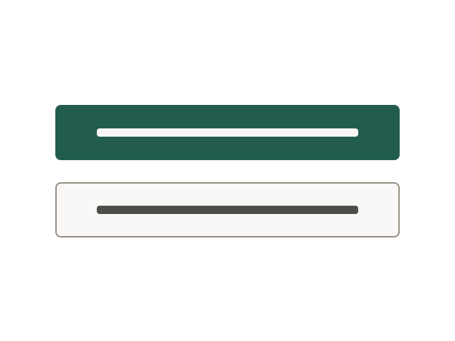
# Overview
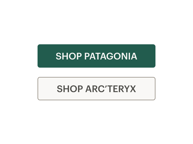
# Primary
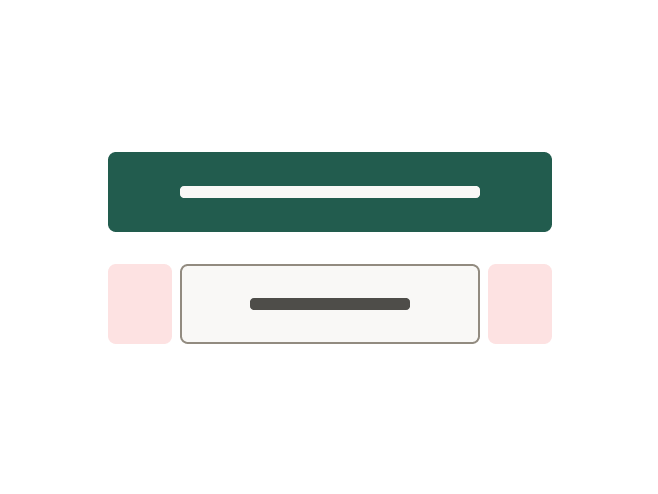
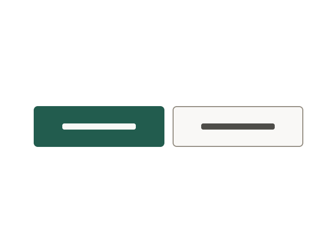
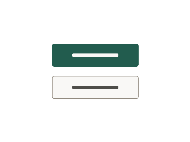
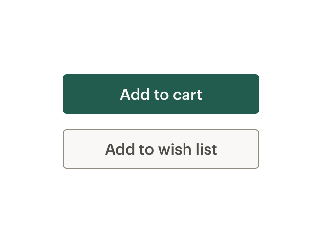
Use primary buttons for actions to complete a task or to move forward in a process such as "Add to cart." There is only one primary action per major page section.
# Secondary
Use secondary buttons for all actions that do not move the user to the next step or require additional user actions such as "Add to wish list" or "Find a campout near you."
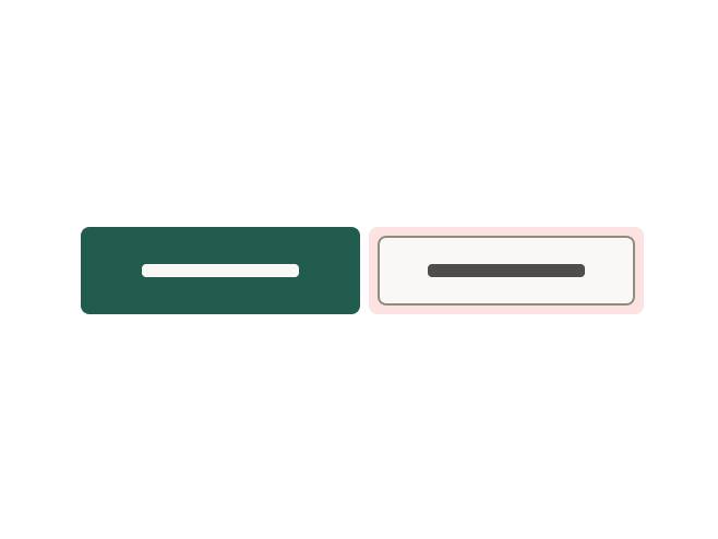
# Alternative Styles
Use sale or dark for alternative button styling.
# Link Style
Use link modifier to render a button that is styled like a CdrLink. This can be used to create links with the padding and sizing options of a button. Can be used with the tag property set to the default "button" or "a". For rendering a link inline with text, use CdrLink. To render a button that behaves like a link, use a CdrButton with link tag.
# Text and Icon
Pair an icon with text to improve recognition about an object or action.
# Icon Only
Use icons to visually communicate an object or action in a limited space. Include alternative text to describe what the button does.
# Icon Only With Background
Use with-background property in conjunction with the icon-only property to make icon buttons more identifiable. Include alternative text to describe what the button does.
# Stateful Button
For buttons that trigger asynchronous actions, use the click event and dynamic properties in order to change the label or state of a button.
# Full Width
Displays at full width of its container.
# Button With Link Tag
For a CdrButton that looks like a button but behaves like a link, set tag="a" and pass an href.
# Sizing
Change the button size based on where the button is used. The default size is medium.
# Accessibility
Many WCAG requirements are contextual to their implementation. To ensure that usage of this component complies with accessibility guidelines you are responsible for the following:
- For icon-only buttons, provide
aria-labeltext that describes the button's action - If activating the button does not dismiss the current context, then focus typically remains on the button after activation, e.g., an Apply or Recalculate button.
- If a description of the button's function is present, the button element has
aria-describedbyset to theIDof the element containing the description. - If the button is a toggle button, it has an
aria-pressedstate. When the button is toggled on, the value of this state is true, and when toggled off, the state is false. - If the button action indicates a context change, such as move to next step in a wizard or add another search criteria, then it is often appropriate to move focus to the starting point for that action.
- Apply keyboard interaction patterns as described on REI universal design and accessibility: Buttons (opens new window)
- Clearly and concisely describe the button's action or destination when the button is clicked or tapped:
- For example, if the button text is "Shop now", the
aria-labelmight read: "Shop our <specific advertising category> now"
- For example, if the button text is "Shop now", the
- Avoid using "click here" or "start here" for buttons. If screen space for text is minimal:
- Provide text that can be read by screen readers
- Use an inline element for hidden text with the
cdr-sr-onlyclass
<cdr-cta>
  Start here <span class="cdr-sr-only">for help finding the proper sleeping bag</span>
</cdr-cta>
1
2
3 - For buttons with the
tagset to"a", always providing anhrefattribute. Emptyhrefattributes are not considered true links
This component has no specific WCAG compliance attributes built into the control. It is possibile to define this component as a link or button:
- Select the semantically-correct element, which will ensure that assistive technologies have correct instructions for how to interact with the component
- Use the CdrLink component to make a button that looks like a link
- Do not use
divorinputelements - Do not add
role="button"to the CdrButton component
# Guidelines
# Use When
- Triggering an action
- Enabling a “final” action
- Progressing or regressing a user through a step in a flow
- Submitting requested information
- Confirming the completion of a flow or cancelling out of it
- Use
tag="a"andhrefwhen navigating to another page on the site
# Don't Use When
- Taking users to a different part within the same page. Instead, use Links
# The Basics
Three button sizes are available: Small, Medium, and Large. Medium is the default size.
Generally, buttons should be sized based on their content and used to convey the importance of actions.
- Use Large buttons for primary page actions
- Use Small buttons for supplemental user actions
- For Mobile screens using XS grid, use Large buttons set to full width
When stacking buttons vertically:
- Align left borders
- Display all with the same width
- Separate each by stack-1-x spacing

When arranging buttons horizontally:
- Align top borders
- Display all with the same height
- Separate each by standard inline-1-x spacing

# Do / Don't
When grouping buttons, match button sizes either horizontally or vertically.

# Content
- Clearly and concisely label with 1–3 words and fewer than 20 characters, including spaces
- Start with a verb, if possible. Labels must be action-oriented and set expectations for what the user will see next
- Never repeat the context of a label when the context is already clear. For example, for a "Save" button, do not expand to "Save Account Information"
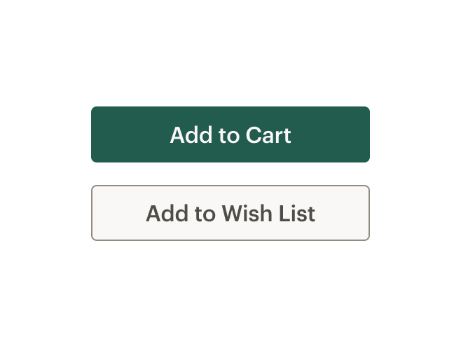
- Use sentence case. Do not use all caps, title caps, or all lowercase
To construct consistent and universal Calls to Action across the site:
- If leading to a Brand, Category, or Activity Landing page, UI text for Call to Action should be Explore Brand/Category/Activity Name
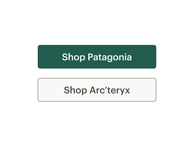
- If leading to a Product Detail page, UI text for Call to Action should be Shop product name
- If leading to a Collection or search result, UI text for Call to Action should be Shop all Brand/Category/Activity Name
# Do / Don't
# Choosing a Button or a Link
When making decisions about whether to use a link or a button, consider the following:
| Links | Buttons |
|---|---|
| Answers the question, "Where can I go" | Answers the question, "What can I do" |
Search engine crawlers can follow anchors for links (<a>) | Search engine crawlers cannot follow links that are submitted by input or button |
| Default keyboard behavior is triggered using the Enter key | Default keyboard behavior is triggered using the Space or Enter key |
| Cannot be disabled like buttons but can be made inert with tabindex="-1" and aria-hidden="true" | Can be disabled with disabled attribute |
Apply the following use cases when deciding when to use links as anchors or buttons:
| Links | Buttons |
|---|---|
| Navigating user to a new page or view | Toggling a display to full screen |
| Changing the URL | Opening a modal window |
| Causing a browser redraw or refresh | Triggering a popup menu |
| Supporting internal page jumps | Can be disabled with disabled attribute |
# Resources
# API
View it on Github: https://github.com/rei/rei-cedar-vue-2/tree/next/src/components/button# Props
This component will bind any attribute that a native HTML button element (opens new window) accepts.
tag
name
string
type
'button'
default
Renders CdrButton as a <button> or <a> element. When using the value of <a>, this element renders as an anchor link. Possible values: { 'button' | 'a' }
type
name
string
type
'button'
default
Sets the button type. Possible values: { 'button' | 'submit' | 'reset' }
fullWidth
name
boolean
type
false
default
Sets button width to 100%. Setting this value to true will set the button width to 100% of the parent container. Use the 'fullWidth' prop with the 'size' prop to control top and bottom padding.
size
name
string
type
'medium'
default
Sets the button size; values can target responsive breakpoints. Breakpoint values are: xs, sm, md, and lg. Examples: { 'small' | 'medium' | 'large' | 'large@sm' }
iconOnly
name
boolean
type
false
default
Renders an 'icon-only' button. When this value is true, it will override the size and 'responsiveSize' props. Can be used in conjunction with 'with-background'
withBackground
name
boolean
type
false
default
Renders an 'icon-only' button with a background color and border. Must be used in conjunction with the 'iconOnly' prop.
modifier
name
string
type
N/A
default
Modifies the style variant for this component. Possible values: { 'primary' | 'secondary' | 'sale' | 'dark' | 'link'}
# Slots
Find more information about using Slots in the article Installing Cedar.
default
name
Sets the innerHTML for CdrButton'. This is the readable text of the button. Leave empty if icon-only.
icon
name
Sets the innerHTML for CdrButton icon-only button.
icon-left
name
Sets the innerHTML for CdrButton with icon to the left of text content.
icon-right
name
Sets the innerHTML for CdrButton with icon to the right of text content.
# Events
All event listeners are passed through to/from the component.