Toggle Button
CdrToggleButton
Permits user to switch two or more options on and off
# Overview
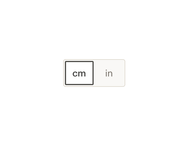
Toggle buttons are a set of two or more options, each of which functions as a button. They can be used to switch between alternative views of similar or related content in a contextual setting. For instance, the component allows users to toggle between a grid or list view, or to toggle between centimeters or inches.
# The Basics
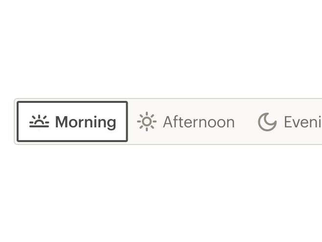
The Toggle Button has at least two selections, with a default option selected. The component can also be extended to include more than two. Take care in using Toggle Buttons that include more than five selections, as space on mobile is limited. Consider checking that the Toggle Button will work on Cedar’s XS breakpoint to ensure usage.
# Default (Full Width)
Default toggle button that expands to the full width of its container
# Custom Width
Default toggle button with custom styles added to limit width
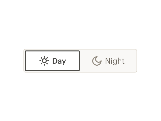
# Icon with label
Default size toggle button with icon and label
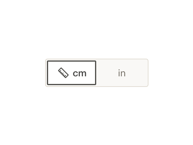
# Icon
Default size toggle button with just an icon
# Large
Size can be changed to large based on where the component is being used.
# Accessibility
To ensure that usage of this component complies with accessibility guidelines:
- Always provide a
toggleValueprop. The value of this property will be used as anaria-labelattribute. This can be useful to spell out abbreviated values (ie "centimeters" instead of "cm") for screen readers, as well as provide a label when only an icon is slotted to the toggle button
This component complies with WCAG guidelines by:
- Setting the role of the unordered list to
radiogroup - Setting the role of the individual toggle buttons to
radio - Providing an
aria-checkedproperty for each toggle button
# Guidelines
# Use When
- Providing choices that affect an object, state, or view
- Displaying two or more mutually exclusive options
- Changing contextual information
- The change needs to take immediate effect
# Don't Use When
- Displaying content that while related, isn’t the same type, which should be separated completely. Instead, use tabs
- Content should be separated completely. Instead, use tabs
- Allowing the user to take an action, such as add and remove. Instead, use a button
- Content can’t fit on the smallest breakpoint (too many options can be hard to scan and navigate). Aim for five options at most. Instead, use radio buttons or select
# Choosing the right component
Switches, checkboxes, radio buttons, and toggle buttons are all similar types of selection controls, but are generally not interchangeable. If you're not sure which one to use for a certain scenario, here's a table that might help.
| Radio Button | Checkbox | Single Checkbox | Switch | Toggle Button | |
| Selections available | At least two | At least one | Just one | Only two (on or off) | At least two (this or that) |
| Default option | Yes | No | Yes | Yes | Yes |
| Choices | Mutually exclusive | Independent of each other | Mutually exclusive | Mutually exclusive | Mutually exclusive |
| Takes effect | After a user clicks a submit button | After a user clicks a submit button | After a user clicks a submit button | Immediately | Immediately |
# Content
- Use nouns or noun phrases for labels
- As much as possible, use content with a similar character count in each segment
Use text only when:
- Text/copy adequately informs the user of the expected content
- There is no CdrIcon to properly inform the user of represented content
Accessibility note: As with any graphic or image, be sure to provide a toggleValue attribute. This attribute will be used for people who use screen readers.
# Do / Don't
# API
Toggle Button is built from two components: CdrToggleGroup and CdrToggleButton. These are meant to be used together.
# Props
# CdrToggleGroup
size
name
boolean
type
default
When true, this prop will make the toggle buttons larger than the default size.
# CdrToggleButton
toggleValue
name
string
type
default
When a toggleButton is selected, this prop provides the selected value for the parent CdrToggleGroup. It also provides a label if no text is slotted to the toggleButton.
# Slots
# CdrToggleGroup
Find more information about using Slots in the article Installing Cedar.
default
name
Slot for individual cdr-toggle-button elements
# CdrToggleButton
Find more information about using Slots in the article Installing Cedar.
default
name
Slot for a toggle button label. Can either be text or an icon or both.
# Usage
The parent CdrToggleGroup contains all the child CdrToggleButton components. This component will track the value of the selected toggle button among all the toggle buttons slotted to it. CdrToggleGroup requires v-model to track the value of the selected child CdrToggleButton.
<template>
   <cdr-toggle-group v-model="units">
      <cdr-toggle-button toggleValue="centimeters">cm</cdr-toggle-button>
      <cdr-toggle-button toggleValue="inches">in</cdr-toggle-button>
    </cdr-toggle-group>
</template>
2
3
4
5
6
The toggleValue prop of the selected CdrToggleButton will determine the modelValue of the selected toggle button. If no text or icon has been slotted to the toggle button, the string provided for the required toggleValue prop will be displayed as the button text. In cases where the slotted text and the toggleValue are different, as shown above, it will be the slotted text which gets displayed in the browser.
The modelValue of the CdrToggleGroup will always be determined by the toggleValue prop of the selected CdrToggleButton. Also, screen readers will choose to read the toggleValue over the slotted text, which can be handy in the case of abbreviations like in the example above.