Rating
Rating, Stars, Reviews, CdrRating
Provides insights into user opinions for products, experiences and expert information
# Overview
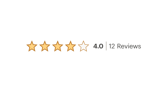
# Default (Medium)
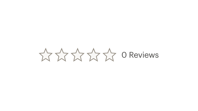
Shows review rating with up to 5 stars highlighted. If rating is zero, star icons are displayed using the grey outline star icon.
# Linked
Creates a link to the corresponding review content if on the same page.
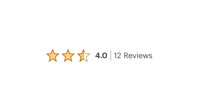
# Compact (Small)
Removes the word "Reviews" from the label for limited space layout.
# Sizing
Change size for the star icon and text. Default size is medium.
# Accessibility
Many WCAG requirements are contextual to their implementation. To ensure that usage of this component complies with accessibility guidelines you are responsible for the following:
- When linking the rating component be sure to provide a valid
hrefvalue
This component has compliance with WCAG guidelines by:
- Providing screen reader text customized to each available variant
- Using text color with a Level AA contrast ratio of 4.5:1 contrast between the text color and the background (only when displayed on light backgrounds)
- Replacing icon stars with utf-8 characters when images are disabled
- Text links displays:
- Underline text style for mouse usage
- Focus state for keyboard usage
# Guidelines
# Use When
- Providing a tool for comparing others’ opinions
# Don't Use When
- Displaying a range of data
# Content
- Always display the number of reviews next to the star rating
- Use accompanying text label ‘Reviews’ when space allows
# Behavior
- Rating appears with grey outlined stars when no reviews are available
- Link to the corresponding review content if on the same page
# Do / Don’t


# Resources
# API
View it on Github: https://github.com/rei/rei-cedar-vue-2/tree/next/src/components/rating# Props
rating
name
number
type
0
default
Sets the rating values between 0 and 5. Required.
count
name
number
type
0
default
Displays the total number of reviews.
compact
name
boolean
type
false
default
Hides the word 'Reviews' if true.
href
name
string
type
N/A
default
Sets the rating component (icons and text) to display inline and wraps them in an anchor tag.
size
name
string
type
medium
default
Sets the rating component size; Breakpoint values are: xs, sm, md, and lg. Examples: { 'small' | 'medium' | 'large' | 'large@sm' }
# Usage
By default the CdrRating component renders the icons in medium size (24px) with the total number of reviews.
# Rating Values
- The count for reviews will always be visible
- Ratings are rounded to the nearest .25 because icons are represented in 25% increments
- Screen reader text is provided which reads, “Rated [ rounded ] out of 5 with [ count ] reviews”