Spacing
Cedar Design System provides predefined spacing values that help reduce redundancy, declutter prototypes and style sheets, and utilize common terminology.
By design, Cedar elements are self contained and provide no spacing outside of their border and box shadows. This means that content elements will not stack one on top of another without the use of spacing elements.
# Concepts
# Box Model
The Cedar spacing system is built around HTML’s foundational layout principle known as the box model. Every webpage is made of boxes and includes the ‘box within a box’ structure. The following graphic shows how the box model defines the structure and layout for all elements on a page.
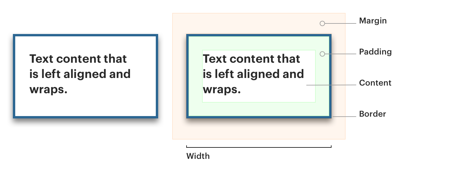
Content: In most cases, any content inside a box, text, or other boxes will wrap to its parent container’s width and push down to increase its parent container’s height dynamically.
Padding: Padding is the space around the content inside a container. This spacing does not affect the total dimension of an element, but rather shrinks the working space within it. For example, a 300px wide container with cdr-space-inset-one-x padding will allow its content to grow to 268px wide.
Borders: Borders function like padding but with color. Cedar uses borders that are only 1px thick.
Margins: Margins provide the spacing around an element or container, pushing sibling content away. Margins do not contribute to an element’s width.
# Spacing Margins
Spacing is a unit of white space that pushes visual elements away from each other. Spacing is primarily used as margin, but can also be used as padding where inset padding does not apply. Spacing can be used to distribute content horizontally or vertically.
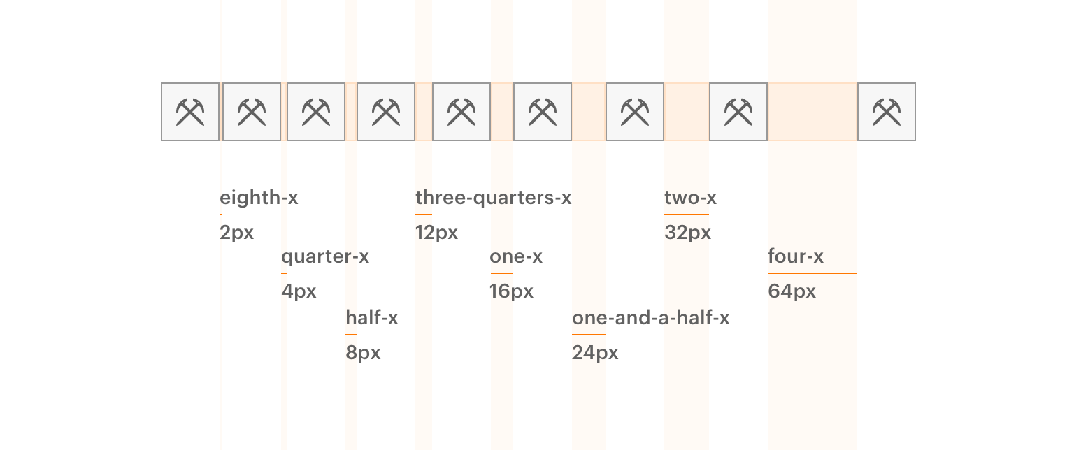
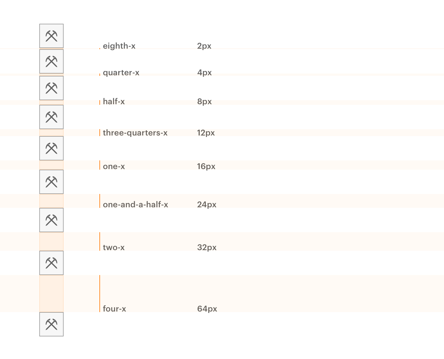
The Cedar spacing system is based on 1.6rem or 16px units. There are 8 spacing values derived from a 16px base.
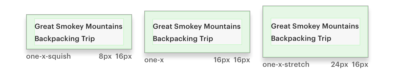
# Inset Padding
An Inset padding is intended to provide consistent space within the content container. It defines how the typography, images, icons, and any content is spaced from the edge.
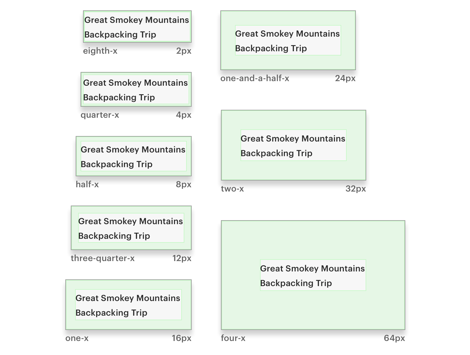
Cedar provides three different variants for each inset token size:
- Default: All four sides match in size, resulting in consistent spacing within the content container
- Squish: Reduces top and bottom spacing by 50%, resulting in a vertically condensed visual display
- Stretch: Increases top and bottom spacing by 50%, resulting in a vertically expanded visual display
# Breakpoints
Like text size and other dimensions, Spacing and Inset can change based on screen width breakpoints. For more information on breakpoints, visit the Responsive Layout article.
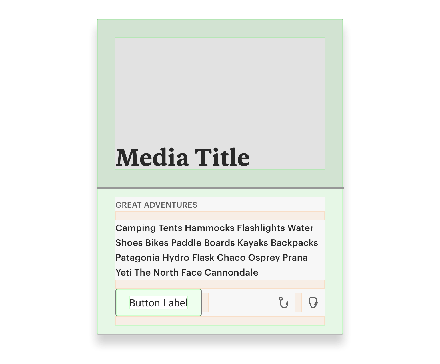
# An Example
Spacing and Insets should be combined to create compositions.
# Usage Overview
Use space tokens to apply the Cedar spacing convention within your stylesheets using SCSS or LESS. For a full list of available tokens and information on how to use them in your projects, visit the Design Tokens article.
# Spacing Tokens
The following are the available spacing token values:
| Space token | Pixel values | Rem values |
|---|---|---|
| cdr-space-eighth-x | 2px | 0.2rem |
| cdr-space-quarter-x | 4px | 0.4rem |
| cdr-space-half-x | 8px | 0.8rem |
| cdr-space-three-quarter-x | 12px | 1.2rem |
| cdr-space-one-x | 16px | 1.6rem |
| cdr-space-one-and-a-half-x | 24px | 2.4rem |
| cdr-space-two-x | 32px | 3.2rem |
| cdr-space-four-x | 64px | 6.4rem |