Validation Notifications
Form errors and warning responses based on user input
# Overview
Validation notifications provide important feedback to users during and after form submission. These notifications include in-line feedback at or near the form controls and overall summaries that are typically provided after form submission.
While error messages are the most usual and critical use for validation notifications, success messages are also important to confirm task completion.
# Form Control Validation Notification
This notification is an error detection response to incorrect or incomplete data entered into a form control, such as an input, checkbox, radio, or select.
Notifying the user of a form control's validation status can manifest in many ways, from adding iconography to signify success, altering the color of border text or background, and/or providing detailed instruction. Regardless of the means they all have the goal of communicating information back to the user. To ensure this happens effectively the following requirements and best practices should be accounted for.
| Priority | High |
|---|---|
| Expectancy | Unexpected |
| Purpose |
|
| Interaction | Non-blocking, Required |
| Information | Meaningful instruction |
| Location | In an associated section of the effected required form field |
# Use When
- On Input
- A user is typing into a form control which has complex formatting requirements
- On Change
- Providing errors or warning UI related to user entered formatting or invalid selections
- Providing errors or warning messaging related to user entered formatting or invalid selections
- Providing success confirmations related to a user entered form control which complies with formatting requirements
- On Submit
- Providing errors or warning messaging related to user entered formatting, incomplete inputs, or invalid selections
- Elevating error or warning UI that already provided via OnChange or OnInput validation
# Don't Use When
- Confirming that a task or process initiated by the user was completed successfully (see Transient Status Notifications)
- Providing contextual information on the page processes (see Transient Status Notifications)
- Providing summaries of errors, warnings, or success messaging related to form submission (see Validation Summaries)
- Page usage should be blocked until the user takes an action within the message or exits (see User Confirmation Alerts)
# Anatomy of a Validation Notification
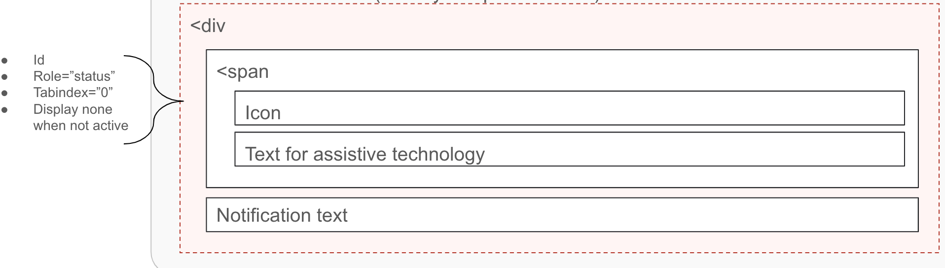
# Validation Notification Container
- Must
- Ensure the message container can receive focus
- Include the
aria-liveorrole=”status”markup to announce the notification without interrupting the page flow of the user - Be visible
- Ensure the instruction is visible to all users
- Avoid moving the form fields up or down when displaying validation
- Display instruction at the right place:
- For a singular form element, directly below the field in error, replacing the bottom helper text if present
- For a group of elements such a form group of checkboxes, below the fieldset container
- Use meaningful colors and iconography
- Should
- Be visually and programmatically adjacent to the element
- Display within the context of the action
- May
- Be hidden until the user requests them if the notification instructions are not critical
# Validation Notification Instruction
- Must
- Provide suggestions (when known) to correct the errors
- Be available as programmatically-discernible text
- Be meaningful
- Use clear and simple language
- Use meaningful colors and iconography
- Be as concise as possible
- Must Not
- Rely solely on references to sensory characteristics (for example, "round button" or "button to the right")
- Should
- Provide the state of the error, if using visual cues for error, warning, success, or info - that text should be provided via screen reader accessible text
- Provide instruction that is as specific as possible
- Clearly state errors:
- What happened
- What’s the next step the user should take to succeed
- Avoid using technical jargon
- Confirm successful submission of data
- Use language that conveys REI's Brand
- Avoid uppercase text as it gives the visual impact of shouting
- Should Not
- Rely solely on visual cues to indicate an error
- Remove incorrect data entered by the user
- Provide validation messages for unfilled inputs until the users attempts to submit the form
- Use technical language
- Shame the user for the error
- Joke with the user about the error
- Use cute language
- May
- Provide instruction that changes progressively to guide the user through the error process
# Implementation
# Grouping Controls
Form groups are a collection of elements, defined by a shared label using the legend tag.
It is not recommended to require elements with a form group as logically there should be no incorrect answer for these elements. They are either true or false. When designing a form where a user must make a selection consider a select control. However, it is common to see these groups have the following needs:
- Require the user to select one of the set of options
- Require that the user select at least one but only to 'x' amount of options
As of now there seems to be no way to link one message to a group of controls with a form group that will communicate clearly to all users.
We need to do some extra work with these groups to make sure they work for all our users.
Tennon.Io's article on this topic (opens new window) found that the best solution for support
on a broad range of assisted tech solutions was achieved by dynamically injecting the error text into the legend. This forgoes the recommendation to add the aria-describedby attribute to the fieldset or legend.
Additionally the addition of aria-invalid to each control was not recommended as it may lead to user confusion.
- Should
- Dynamically inject the error instruction as a
spaninto the form-group legend
- Dynamically inject the error instruction as a
- Should Not
- Add
aria-describedbyto thelegend, linking to a span out of the form-group. This produces mixed results across the assisted tech matrix. - Use
aria-describedbyto thefieldset, linking to a span out of the form-group. This produces mixed results across the assisted tech matrix. - Add the
aria-invalidattribute to form-group controls as this may cause user confusion on if all or just one item are required
- Add
# Validation Summary
Up to this point we have been going over best practices and requirements for individual form controls and form groups such as a singular text input or group of checkboxes. This type of inline validation works well as users are provided feedback immediately. However, for various reasons a user may lose sight of the problems needing remediation and become stuck on submit.
A validation summary outlines, informs and directs users to all existing errors that need to be fixed on the page. The summary should be an additive error indication, summarizing pre-existing form control notifications. As this may be the only error notification within a user's viewport, providing links to each specific error is recommended.
| Priority | High | |
|---|---|---|
| Expectancy | Unexpected | |
| Purpose |
| |
| Interaction | Non-blocking, Required | |
| Information | Guided summary, reiterating validation notifications | |
| Location | Client validation: below the form | Server validation: at the top of the page |
# Use When
- To summarize and direct users back to existing errors
- To increase visibility of existing errors
- For server-returned instruction
# Don't Use When
- Confirming that a task or process initiated by the user was completed successfully (see Transient Status Notifications)
- Providing contextual information on the page processes (see Transient Status Notifications)
- Providing errors, warnings, or success messaging related to user entered formatting, incomplete inputs, or invalid selections (see Validation Notifications)
- Page usage should be blocked until the user takes an action within the message or exits (see User Confirmation Alerts)
- As the only indication of an error
# Anatomy of a Validation Summary
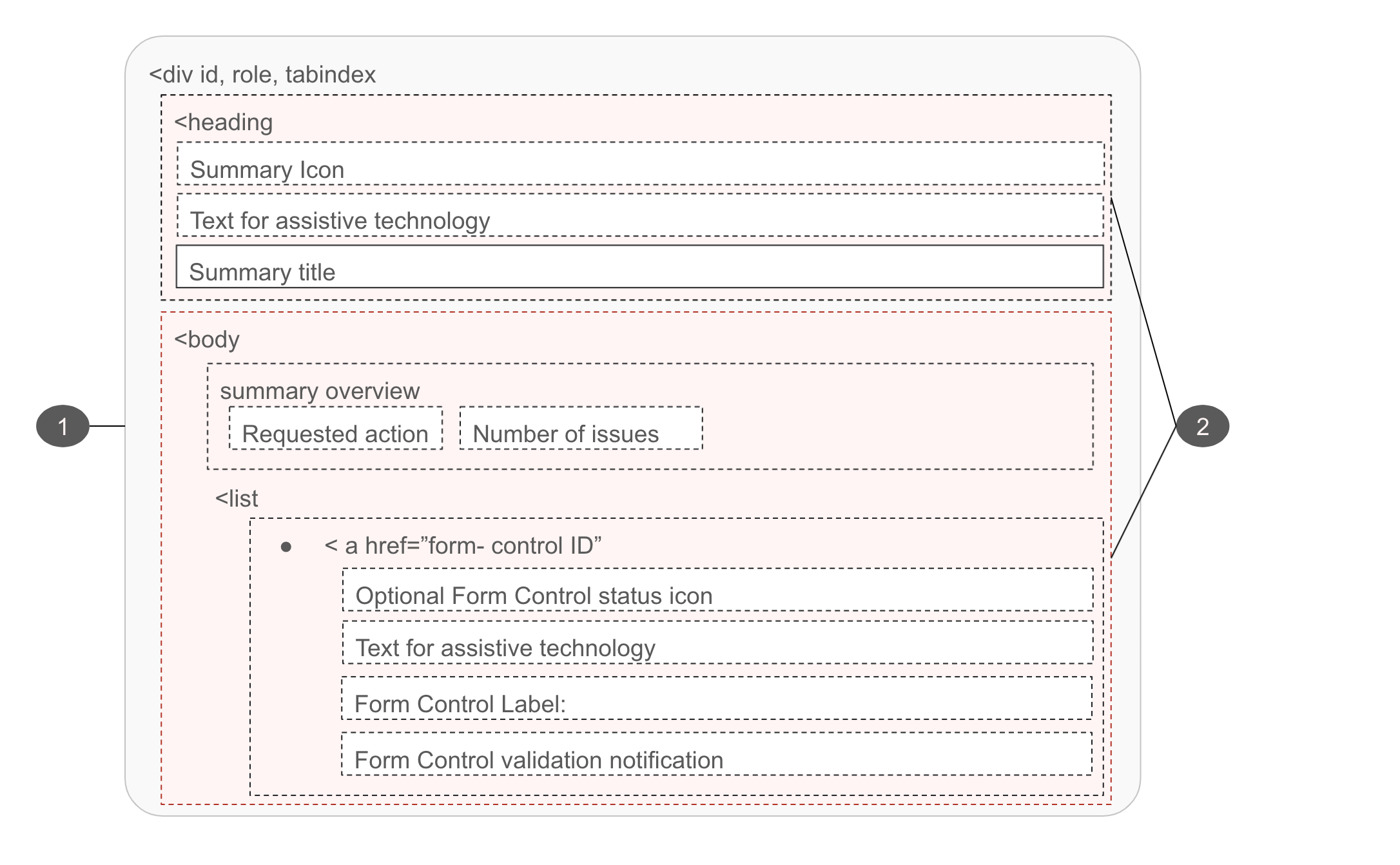
# Validation Summary Container
- Must
- Ensure the message container can receive focus
- Move user focus to this summary when presented
- Focus can be set to the message with client-side scripting
- Include an anchor name in the URL for server-returned summaries
- Ensure the instruction is visible to all users
- Use meaningful colors and iconography
- Use role="alert" to assertively reiterate existing page errors if the summary is presented prior to page reload
- Should
- Be presented adjacent to the form when the summary is presented prior to page reload
- Be presented at the top of the page when the summary is provided post form-submit
- May
- Be hidden until the user requests them if the notification instructions are not critical
# Validation Summary Instruction
- Must
- Indicate the fact that there was a validation problem
- Summarize existing errors
- Be available as programmatically-discernible text
- Be meaningful
- Use clear and simple language
- Use meaningful colors and iconography
- Be as concise as possible
- Must Not
- Rely solely on references to sensory characteristics (for example, "round button" or "button to the right")
- Should
- Direct users back to existing errors
- Provide the states of the items within the summary, if using visual cues for error, warning, success, or info - that text should be provided via screen reader accessible text
- Provide instruction that is as specific as possible
- Clearly state errors:
- What happened
- What’s the next step the user should take to succeed
- Avoid using technical jargon
- remove items from the summary as they are resolved
- Use language that conveys REI's Brand
- Avoid uppercase text as it gives the visual impact of shouting
- Should Not
- Use technical language
- Shame the user for the error
- Joke with the user about the error
- Use cute language
# References
- Accessibility - find more information on this topic in the following resource:
- Accessible Notifications (opens new window)
- WCAG status messages 4.1.3 (opens new window)
- WCAG Labels or Instructions 3.3.2 (lvl A) (opens new window)
- WCAG Error Suggestion 3.3.3 (lvl AA) (opens new window)
- Form Notifications (opens new window)
- Use aria-live (opens new window) to indicate that an element will be updated. It describes the types of updates the user agents, assistive technologies, and user can expect from the live region.
- Use aria-atomic (opens new window) to indicate whether assistive technologies will present all, or only parts of the changed region based on the change notifications defined by the aria-relevant attribute.
- Grouping Controls (opens new window)
- UX/UI