Radio Buttons
Radios, CdrRadio
Permits user to select only one option from a list of two or more
# Overview
# Default (Medium)
Default and standard spacing for radio buttons.
# Size
Different sizing for radio buttons.
# Custom
Custom styles for radio buttons.
# Validation
Render a radio group with validation and error state
# Accessibility
Many WCAG requirements are contextual to their implementation. To ensure that usage of this component complies with accessibility guidelines you are responsible for the following:
- Each radio button must be focusable and keyboard accessible:
- When radio button has focus, the Space key changes the selection
- Tab key moves to next element in list
CdrFormGroupshould be:- Used when associating group of radio buttons
- Identified or described as a group using the
labelproperty or slot
- Avoid nesting
CdrFormGroup - Custom radio buttons maintain accessibility requirements. The radio button icon is only visually hidden and replaced with custom style
This component has compliance with WCAG guidelines by:
- Wrapping the input in a label element and label is automatically associated with it
For more information, review techniques and failures for:
- WCAG 2.0, 1.3.1 Info and Relationships (opens new window)
- WCAG 2.0, 3.3.2 Labels and Instructions (opens new window)
# Guidelines
# Use When
- Selecting only 1 choice from a list is allowed
- Viewing all available options is needed
- Comparing between list of selections is desired
# Don't Use When
- Selecting from a list when multiple choices are allowed. Instead, use Checkboxes
- Providing a single selectable option. Instead, use Checkboxes as a stand-alone checkbox
# Content
When using radio buttons in a list:
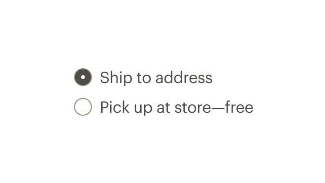
- Use a logical order, whether it’s alphabetical, numerical, or time-based
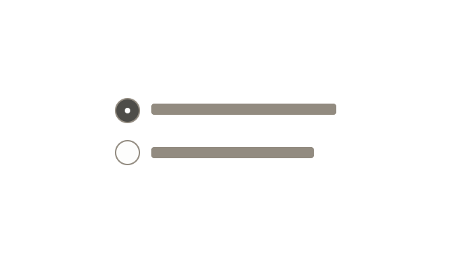
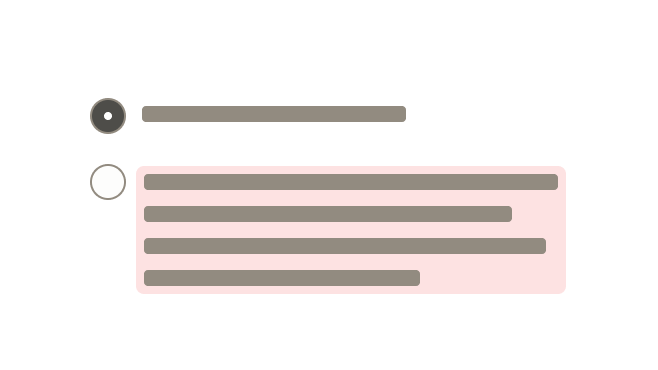
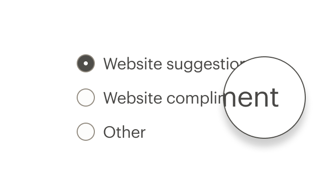
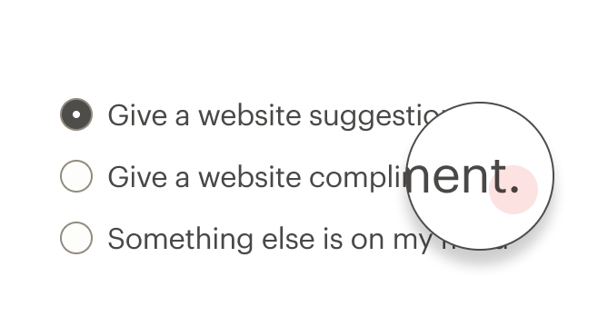
- Labels should have approximately equal length
- Clearly communicate the effect of selecting the option
- Provide a link or include a subtitle for more information. Don’t rely on tooltips to explain a radio button
Radio button labels should:
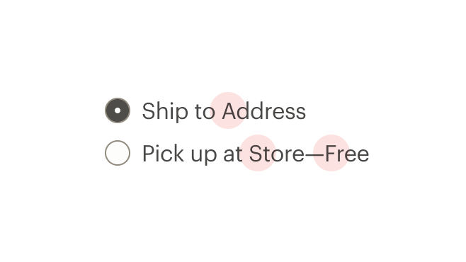
- Start with a capital letter
- Use sentence case
- Avoid long labels
- Be written as sentence fragments
- No terminal punctuation
# Do/Don't
# Resources
# API
View it on Github: https://github.com/rei/rei-cedar-vue-2/tree/next/src/components/radio# Props
This component will bind any attribute that a native HTML radio element (opens new window) accepts.
labelClass
name
string
type
N/A
default
Adds CSS class to the label for custom styles.
inputClass
name
string
type
N/A
default
Adds CSS class to the input for custom styles.
contentClass
name
string
type
N/A
default
Adds CSS class to the slot wrapper for custom styles.
name
name
string
type
N/A
default
Sets the name of the radio button. Required.
customValue
name
string, number, boolean, object, array, symbol, function
type
N/A
default
Sets the value of the radio button. Required.
modifier
name
string
type
N/A
default
Modifies the style variants for this component. Possible values: { 'hide-figure' }
size
name
string
type
'medium'
default
Sets the radio size; values can target responsive breakpoints. Breakpoint values are: xs, sm, md, and lg. Examples: { 'small' | 'medium' | 'large' | 'large@sm' }
# Slots
Find more information about using Slots in the article Installing Cedar.
default
name
Sets the innerHTML for CdrRadio. This is the readable text for the <label> element.
# Events
change
name
value, event
arguments
$emit event fired on radio selection.
input
name
value
arguments
$emit event fired on radio selection.
# Component Variables
# Usage
The CdrRadio component requires v-model to track the value of selected radios.
# Modifiers
Following variants are available to the cdr-radio modifier attribute:
| Value | Description |
|---|---|
| 'hide-figure' | Hides the radio button icon |
Use the hide-figure modifier to hide the radio button itself, which leaves text label as the clickable element. Add appropriate custom styles to convey selected and unselected states.
<template>
  <cdr-radio
    name="example"
    custom-value="model1"
    v-model="model"
    modifier="hide-figure"
    input-class="no-box"
    content-class="no-box__content"
  >
    Add to cart
  </cdr-radio>
</template>
<style>
.no-box:checked ~ .no-box__content {
   color: green;

   &::after {
     content: '(checked)';
   }
 }
</style>
2
3
4
5
6
7
8
9
10
11
12
13
14
15
16
17
18
19
20
21