Skeleton
CdrSkeleton, CdrSkeletonBone, skeleton, bone
Visually communicates content is in the process of loading
# Overview
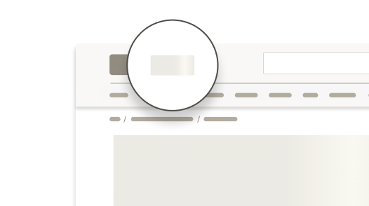
Skeleton components are intended for use on initial page load to loosely represent a container-based user interface that is not fully loaded. A skeleton should never take the place of static content.
Use skeletons to represent regions or sections of a page, such as search results or a product tile filmstrip, rather than specific interactive elements like a standalone button or image.
Skeletons serve to reduce cumulative layout shift (CLS) and improve user-perceived load times. They should be temporary and not visible for more than a few seconds before being replaced by content.
A complete skeleton requires the CdrSkeleton wrapping component and at least one CdrSkeletonBone component.
# Demo
# Types
At its core, CdrSkeleton is essentially a paint brush you can use to create any UI shape your application requires. However, there are several presets to allow quick assembly of basic UI elements. All type options are fluid and will expand to fit their container.
# Default
<CdrSkeleton>
  <CdrSkeletonBone />
</CdrSkeleton>
2
3
# Heading
<CdrSkeleton>
  <CdrSkeletonBone type="heading" />
</CdrSkeleton>
2
3
# Line
Repeated lines within a skeleton will automatically change their length
<CdrSkeleton>
  <CdrSkeletonBone type="line" />
  <CdrSkeletonBone type="line" />
  <CdrSkeletonBone type="line" />
</CdrSkeleton>
2
3
4
5
# Rectangle (4:3)
<CdrSkeleton>
  <CdrSkeletonBone type="rectangle" />
</CdrSkeleton>
2
3
# Square (1:1)
<CdrSkeleton>
  <CdrSkeletonBone type="square" />
</CdrSkeleton>
2
3
# Motion
Skeletons use motion in a left to right gradient to convey the UI is still loading and the page is not frozen. This effect can be disabled.
<CdrSkeleton>
  <CdrSkeletonBone :motion="false" />
</CdrSkeleton>
2
3
# Accessibility
# What Cedar provides
- Skeleton wrapper adds
aria-busy=trueandaria-live=”polite” - The motion effect is disabled automatically if a user has indicated they prefer reduced motion
# Development responsibilities
A skeleton should not be visible for more than 5 seconds so a fallback is needed if loading is delayed or fails.
# Guidelines
# Use When
- Representing the shape of your UI with generic shapes
- Loading multiple items within a dynamic section of your page
- Representing container-based components like cards, tiles, or tables
# Don’t Use When
- Communicating that an actionable item is busy (like processing a user request)
- Representing isolated dynamic content (like a page title or personalization data)
- Showing loading for in-context operations. Instead, consider using a spinner.
# Content
# Do / Don’t


# API
View it on Github: https://github.com/rei/rei-cedar/tree/main/src/components/skeleton# Props
# CdrSkeleton
CdrSkeleton is used to provide a visual placeholder while content is loading.
motion
name
Boolean
type
'true'
default
Toggle animation on/off. When `true`, animated gradient will be used while loading. When `false` a static background color will be used.
# CdrSkeletonBone
CdrSkeletonBone is used to provide a visual placeholder for a single line of content while content is loading.
type
name
String
type
'default'
default
Available types are `default`, `heading`, `line`, `rectangle`, and `square`.
# Slots
# CdrSkeleton
Find more information about using Slots in the article Installing Cedar.
default
name
Sets the innerHTML for CdrSkeleton.
# Usage
A skeleton can be used in conjunction with other Cedar components to construct whatever UI approximation your app requires.
<CdrSkeleton v-if="contentLoading">
  <CdrCard class="skeleton-card">
    <section>
      <CdrSkeletonBone type="rectangle" />
      <div class="inset">
        <CdrSkeletonBone type="heading" />
        <div class="skeleton-card--body">
          <CdrSkeletonBone type="line" />
          <CdrSkeletonBone type="line" />
          <CdrSkeletonBone type="line" />
        </div>
      </div>
    </section>
</CdrSkeleton>
<CdrCard v-else>
  <!-- True UI/Content  -->
</CdrCard>
2
3
4
5
6
7
8
9
10
11
12
13
14
15
16
17
18
# Suspense
CdrSkeleton can be used with Vue's built-in suspense component (opens new window) component to render a fallback for asynchronous components.
<Suspense>
  <!-- component with nested async dependencies -->
  <MyAsyncComponent />

  <!-- loading state via #fallback slot -->
  <template #fallback>
    <CdrSkeleton>
      <CdrSkeletonBone />
    </CdrSkeleton>
  </template>
</Suspense>
2
3
4
5
6
7
8
9
10
11