Update and Loading Notifications
Loading and inline page content updates
# Overview
Update and Loading Notifications inform users of the current working state of their request and help reduce uncertainty. These notifications update pre-existing, inline page content.
Often a Loading Notification will precede an Update Notification, affecting the same content element on a page and intentionally paired together to communicate to users the ongoing status of their request. When not pairing Loading and Update Notifications, remember to create sufficient visual feedback as many Update Notifications will be unassociated to their triggering actions.
# Update Notifications
Update Notifications inform users of advisory information that enhances the site experience such as quantity updates or busy states. These notifications update a specific part of an inline content section, such as the number of items in a cart.
| Priority | Low |
|---|---|
| Expectancy | Expected / Assumed |
| Purpose |
|
| Interaction | Non-blocking, Not Required |
| Information | Passive state changes |
| Examples |
|


# Use When
- Incrementing results or items
- Adding or removing items from a list
- Changing inline content based on user selection
# Don't Use When
- The notification relates to an actionable element in a busy state (see Loading Notifications)
- Confirming that a task or process initiated by the user was completed successfully (see Transient Status Notifications)
- Providing contextual information on the page processes (see Transient Status Notifications)
- Providing errors, warnings, or success messaging related to user entered formatting, incomplete inputs, or invalid selections (see Validation Notifications)
- The content added to the page is critical and needs immediate attention (see Alerts)
- Page usage should be blocked until the user takes an action within the message or exits (see User Confirmation Alerts)
- User interaction is required or content is critical to the user flow (see Modal)
- The message contains a rich UI experience (see Modal)
- During the appearance or disappearance of content following a user's interaction which is also announced to assistive technology such as the following:
- Tab
- Accordion
- Dialog
- Popover
- Tooltip
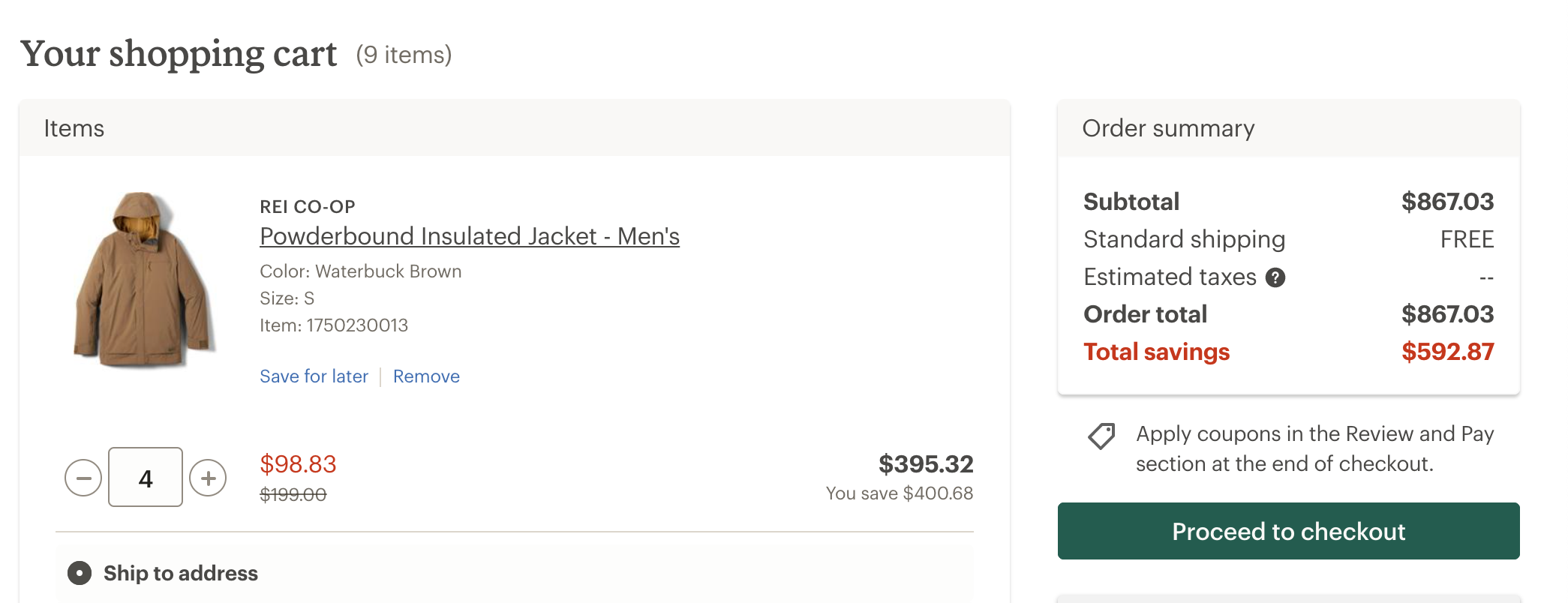
# Anatomy of a Update Notification
# Content Container
The Update Notification content container wraps both the element being updated and any assistive technology helpers such as screen reader text. It may be a pre-existing section of a page or dynamically added upon user action.
Design
- Should ensure the Update Notification does not receive focus as a result of a change in status
- Should ensure sufficient visual feedback is provided to inform users that an update that may not be associated with the element they have interacted with has been updated
- Should not overuse Update Notifications as they may interrupt the user experience
- May be stacked with a Loading Notification
Development
Must ensure the container generating the update is able to receive focus
Must define pre-existing page sections where content may be updated as a WAI-ARIA live region
Must use the
aria-liveattribute on the container of the content that may be updated or, in special cases, use one of the WAI-ARIA special live region roles:<!-- EXAMPLE: while stable --> <div aria-live="polite" role="region" aria-labelledby="shopping-cart"> 4 <span class="sr-only">items in your cart</span> </div>1
2
3
4
5<!-- EXAMPLE: when updated --> <div role="status" aria-live="polite" role="region" aria-labelledby="shopping-cart"> <span class="sr-only">there are now</span> 5 <span class="sr-only">items in your cart</span> </div>1
2
3
4
5
6
7May use
role=”status”in place of or in addition toaria-liveMay include aria-atomic (opens new window) markup attribute to define what content will be presented to assistive technologies
May include
aria-relevantto define what type of changes are being announced to assistive technologies
# Content Control
The Update Notification content control may be any actionable element, such as a link or button.
Design
- Should not move focus to the notification automatically
- May open or update content in locations unrelated to the action which caused the notification to appear
Development
- Should use the aria-controls attribute if another part of the page controls what appears in the notification
# Loading Notifications
Loading Notifications signal to users that loading is occurring, but do not give any specific indication of progress. Use Loading Notifcations to communicate the busy state of the page or content element, reassuring users that that page is not frozen and their request is in progress.
Transitions should also notify assistive technology to temporarily ignore changes to an element. This can be added in the form of additional element attributes that communicate to assistive technology, though consider if the action without context will create any cognitive dissonance for our visual users.
| Priority | Low |
|---|---|
| Expectancy | Expected / Assumed |
| Purpose |
|
| Interaction | Blocking, disabling |
| Information | User requested state changes |
| Examples |
|

# Use When
- Refreshing data in a live region
- Loading additional page content
- Providing loading icons or states
- Informing users that the application is busy
# Don't Use When
- The notification does not relate to an actionable element in a busy state
# Anatomy of a Loading Notification
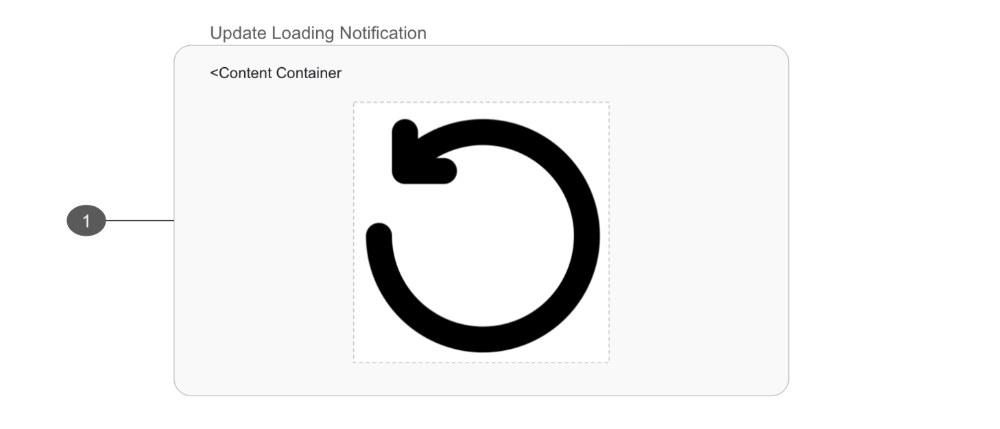
- Should define pre-existing page sections where content may be updated as a WAI-ARIA live region
- Should use the
aria-busyattribute to indicate an element is being modified and that assistive technologies may want to wait until the modifications are complete before exposing them to the user